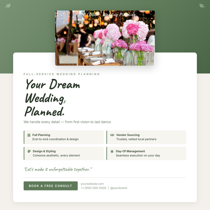
💍 Wedding Planner Flyer
A sage-green botanical social square layered with a lifted photo frame, Caveat handwritten accents, and an Inter-driven services grid. Built for boutique wedding planners and event stylists who need an intimate yet polished Instagram post or consultation lead-gen card. The three-step cream-to-white interior keeps the layout airy while brand greens anchor every decorative detail.
What our users say
Join thousands of satisfied users who trust AIFlyer for their design needs
I actually checked this out because I was curious. I randomly thought something together and aiflyer.ai did a pretty good job. I did a simple prompt for a Birthday Brunch Invitation for April 4th @12:30 I was impressed the text was accurate. DALLE still has trouble sometimes. So great job!
Aovythegreat
Event Planner
As a small business owner, I was skeptical about AI design tools, but AIFlyer exceeded my expectations. The designs are beautiful and the process is incredibly intuitive.
Michael
Small Business Owner in Austin, TX
AIFlyer.ai has been a game-changer for our marketing team. We've been able to create beautiful flyers and social media posts in no time.
Fun_Cobbler1939
Social Media Manager
Hi, I just subscribed for AIFlyer and was really impressed. Game-changer for our marketing team! We need to make a lot of flyers for our social media campaigns and this has been so helpful.
David
Marketing Manager
No credit card needed
More Templates to Explore
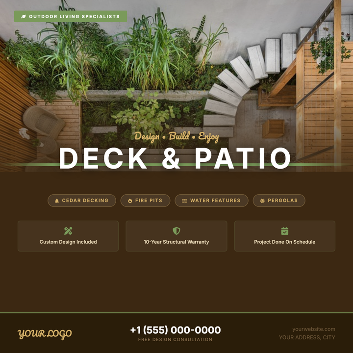
🪵 Deck & Patio Flyer
A warm rustic-modern layout built for deck builders and patio contractors. A full-bleed outdoor photo fades into a cedar-brown panel via a dark gradient scrim, anchored by a sage-green divider strap. Pacifico script paired with a bold all-caps Inter headline draws the eye immediately, while a structured feature grid and pill-style callouts keep the offer clear and conversion-ready.
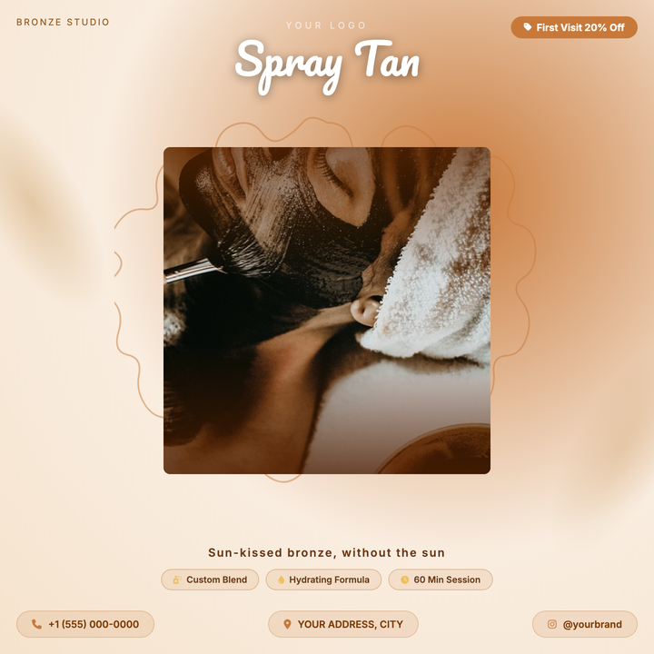
🌿 Spray Tan Flyer
A warm bronze-and-cream square flyer built for tanning salons and boutique beauty services. Features a Pacifico headline at 52px over a dark vignette scrim, a hand-drawn scallop medallion frame, and amber pill callouts for service highlights. Ideal for first-visit discounts, summer campaigns, or appointment-based promos where lifestyle photography takes center stage.
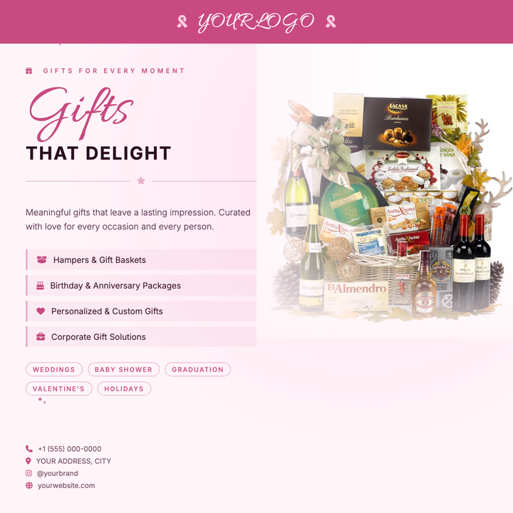
🎁 Gift Shop Flyer
A warm blush-to-cream layout built for boutique gift shops and artisan retailers. A deep-rose ribbon banner anchors the brand at the top, while an Allura script headline floats in front of a soft-blended product photo. Specialty item lists and occasion tags make it easy to highlight curated offers for Valentine's Day, Mother's Day, or holiday promotions.
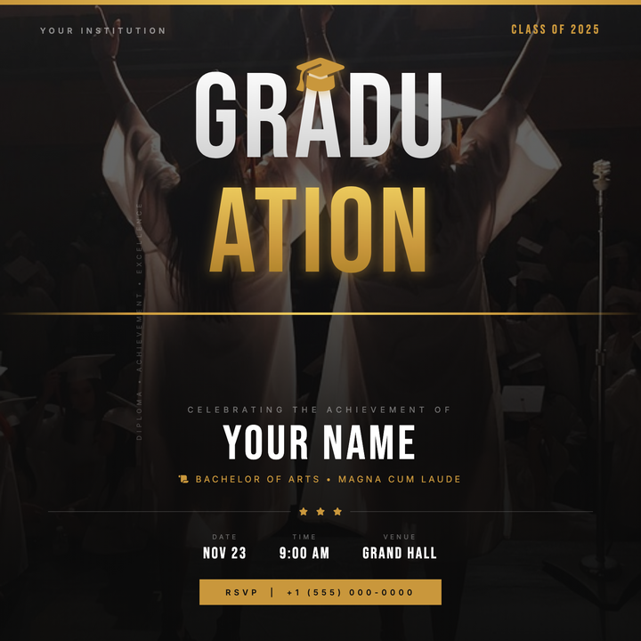
🎓 Graduation Party Flyer
A cinematic, dark-themed graduation flyer built around a split gold-and-white Bebas Neue wordmark, full-bleed photo texture, and a deep graphite-to-black radial background. Gold accent bars, a centered cap icon, and a structured lower panel highlight the graduate's name, degree, and event details with institutional polish. Ideal for commencement announcements, honors night invites, and senior class celebration posts.
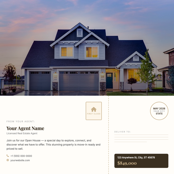
🏡 Real Estate Postcard
A direct-mail-style postcard layout split into a full-bleed property photo with a dark gradient scrim and bold Playfair Display typography, above a warm paper-toned back panel with agent details, address lines, and a decorative postmark. The perforated tear-edge strip and antique gold accents give it a boutique-brokerage feel. Built for just-listed announcements, open-house invites, and just-sold pieces where a strong hero photo leads the pitch.
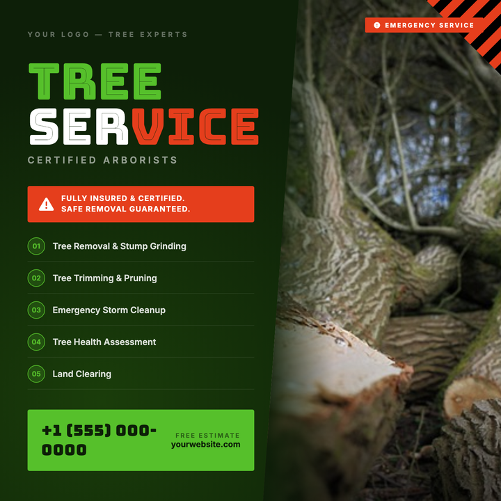
🌲 Tree Service Flyer
Bold Bungee Inline typography at 80px commands attention against a deep forest-dark radial gradient, while a diagonal-clipped photo bleeds into the canvas for a rugged, seamless look. Hazard-stripe accents in red and black signal urgency, and a vivid lime-green CTA block anchors a direct phone callout at the bottom. Built for arborists, tree removal crews, and storm-response companies who need to drive immediate calls.
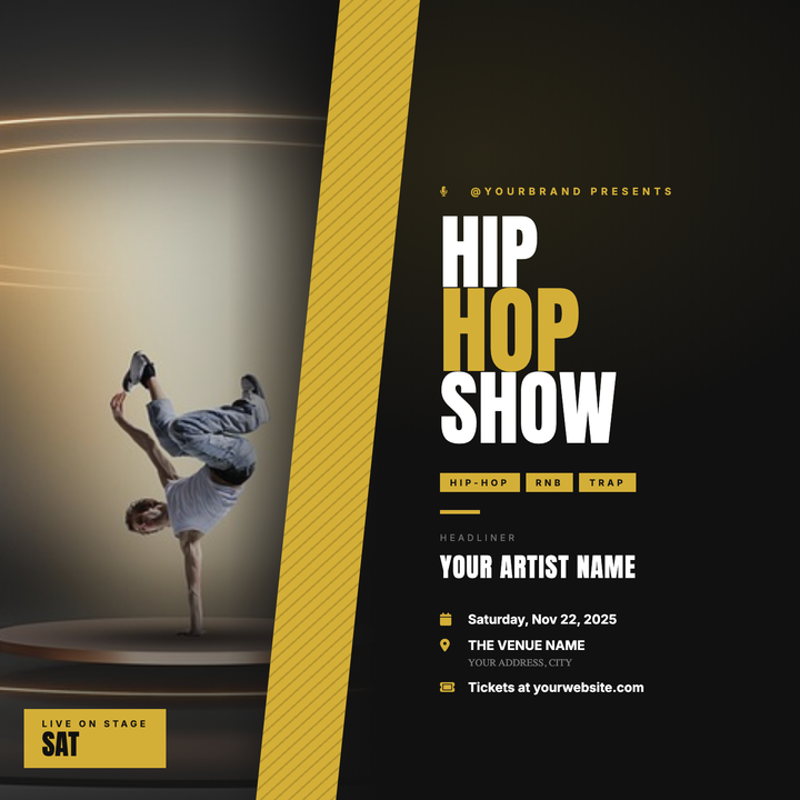
🎤 Hip-Hop Show Flyer
A split-panel layout pairs a full-height artist portrait with bold Anton headlines, separated by a gold diagonal slash that drives the eye across the design. Dark #111 backgrounds and antique-gold accents deliver a premium nightlife aesthetic built for rap showcases, RnB nights, and DJ residencies. Artist name, genre tag, and event info stack cleanly on the right panel for instant readability at a distance.
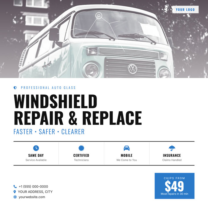
🪟 Windshield Repair Flyer
Built for mobile auto glass operators and dealership service departments, this template leads with a full-bleed vehicle photo and a signature SVG fracture overlay that instantly signals the service. Condensed Oswald headlines, a bold blue price box, and a four-pillar feature row communicate urgency and value at a glance. Clean white content area with icon-driven contact lines makes it ready for social ads, paid campaigns, or in-shop POS posters.
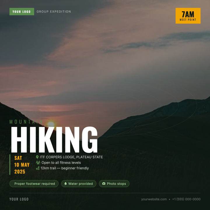
🥾 Hiking Group Flyer
Built on a deep forest-green canvas, this template layers a full-bleed trail photo under a directional scrim and subtle topographic contour overlay for rugged depth. A monumental 120px headline commands attention instantly, while the amber time badge and green-accented details row keep logistics clear. Ideal for outdoor clubs, trail runs, and guided summit meetups promoting on social squares.
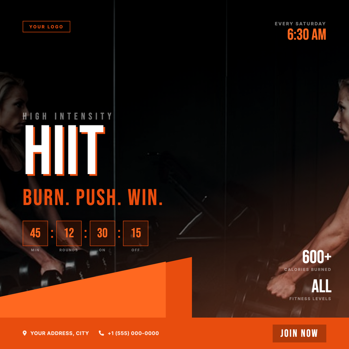
🏋️ HIIT Class Flyer
A dark, high-energy canvas built for HIIT classes, bootcamps, and interval training events. Diagonal orange slashes (#e84d0e/#ff6820) cut across a grayscale action photo with a dark-to-orange vignette scrim, while a 160px Bebas Neue headline with a hard drop-shadow commands the center. A countdown-clock row and session time stamp give athletes the details they need at a glance.
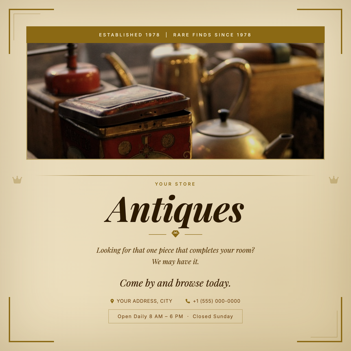
🏺 Antique Store Flyer
A heritage-forward flyer built around warm parchment gradients, sepia edge vignettes, and gilt corner frames that evoke aged paper and provenance. A deep antique-gold top banner anchors the header, while italic serif typography and a fleur-de-lis ornament divider create a refined typographic pyramid below. Ideal for antique shops, estate sales, or vintage boutiques announcing open hours, seasonal sales, or new inventory arrivals.
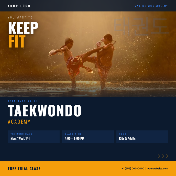
🥋 Taekwondo Class Flyer
A bold, photo-driven layout split between a full-width hero image and a deep navy lower zone, seamlessly blended by a gradient scrim. Oswald display type commands attention with a 68px headline over the photo, while an amber bottom strip and vivid blue info cards deliver schedule details and a high-urgency CTA. Built for dojos and academies running enrollment drives, seasonal launches, or free-trial campaigns.
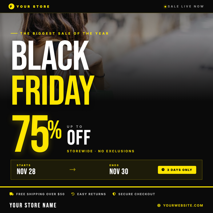
🖤 Black Friday Sale Flyer
Bold Bebas Neue headlines and an oversized percentage numeral dominate this electric-yellow-on-black square flyer, built for instant discount impact. A full-width photo band fades into the near-black background behind the headline stack, while a structured date strip and gold-bordered footer anchor event details. Ideal for retailers in electronics, fashion, or footwear running time-limited Black Friday or flash-sale promotions.
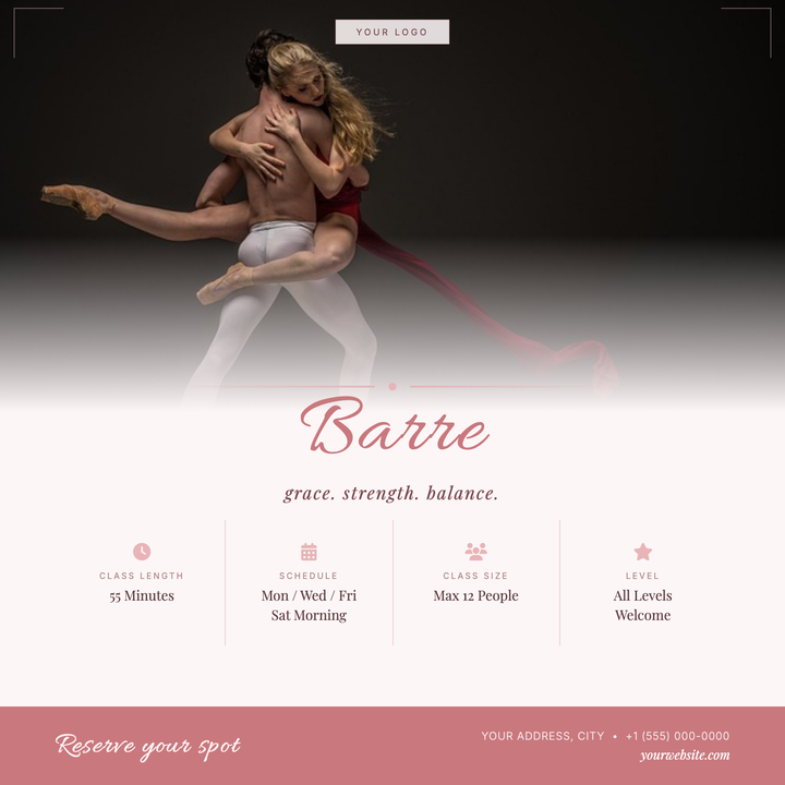
🩰 Barre Class Flyer
A soft rose and warm cream layout built for boutique barre and ballet-inspired fitness studios. The Allura script headline and Playfair Display accents give it an artisanal, elevated feel, while a four-column info grid keeps class details — schedule, location, pricing — clean and scannable. Ideal for class launches, recurring schedule promos, or small-group sign-up campaigns.
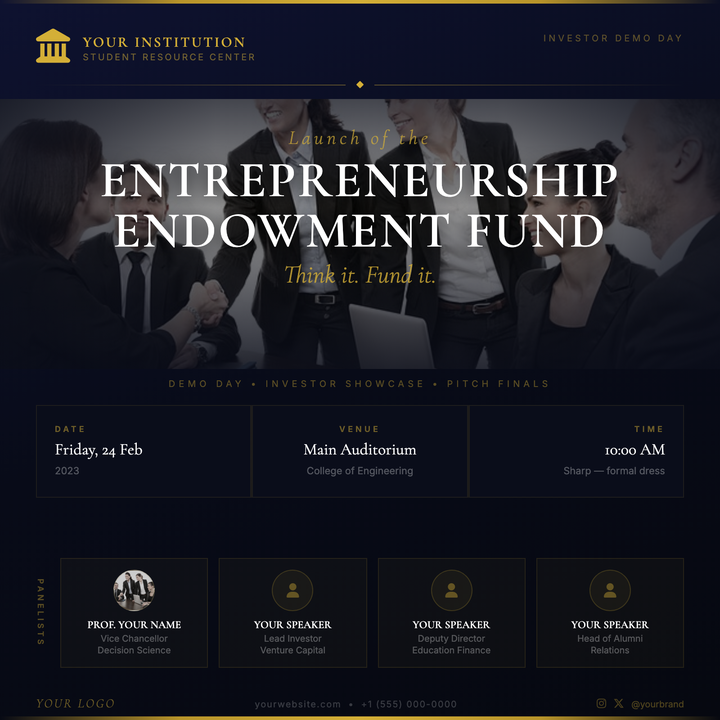
🏛️ Investor Demo Day Flyer
A ceremonial deep-navy canvas anchored by antique gold horizontal rules and Cormorant Garamond display typography gives this template an almost heraldic authority. A full-bleed photo band with a four-sided gradient scrim frames the event title, while a three-column info grid keeps logistics legible at a glance. Built for university demo days, alumni investor showcases, and venture-pitch finals where the design must feel institutional, not generic.
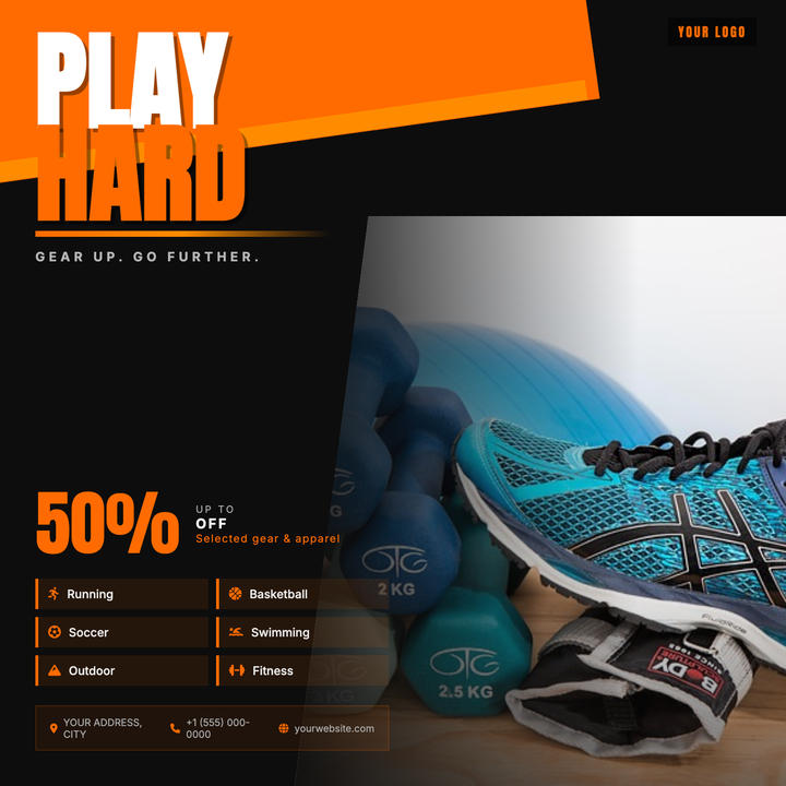
🏋️ Sporting Goods Store Flyer
Bold dark-field layout with kinetic orange diagonal slashes and oversized Anton numerals that punch sale figures at 72 px. A diagonal-clipped athlete photo bleeds into the near-black background, kept legible by a dual-gradient scrim. Built for seasonal sales, product launches, and clearance events at sporting goods shops, fitness studios, and outdoor brands targeting active, younger audiences.
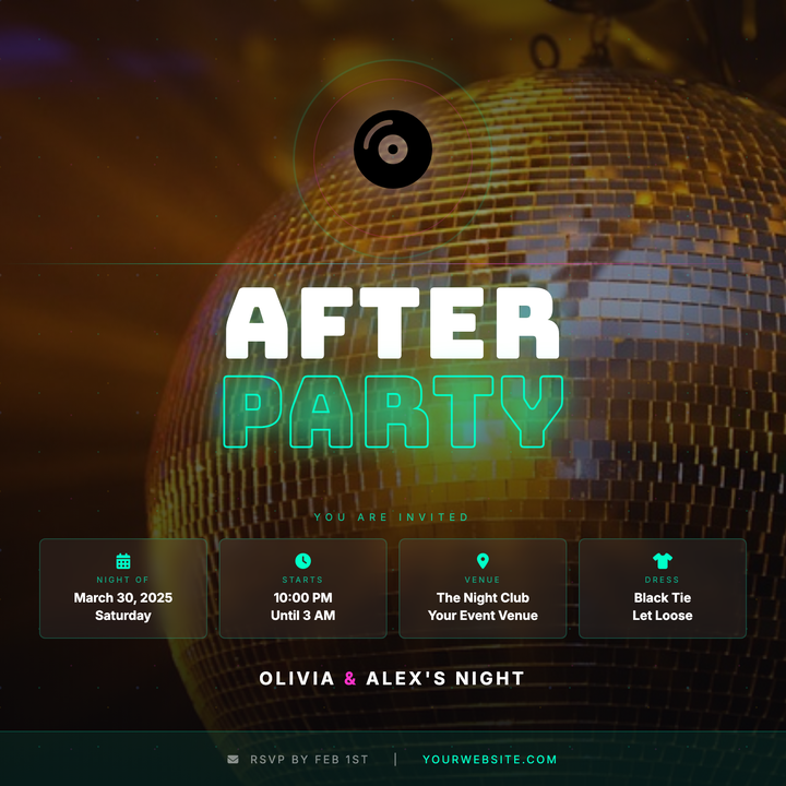
🪩 Wedding After-Party Flyer
A dark, club-ready flyer built on a near-black background with a full-bleed disco photo and neon scrim. Stacked 100 px Bungee display type contrasts solid white with a cyan-outlined "PARTY" word, while frosted info chips and a disco-ball icon keep event details sharp. Built for couples throwing a high-energy late-night celebration after the main reception.
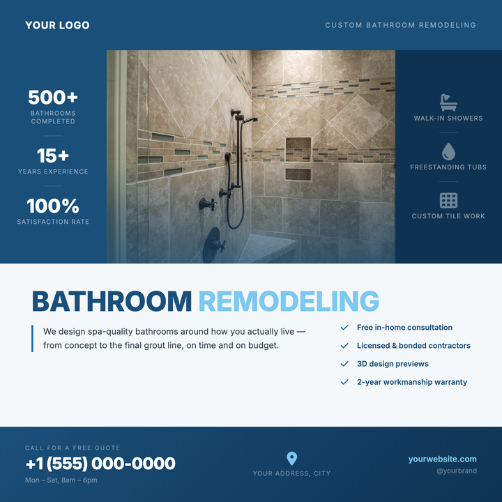
🛁 Bathroom Remodel Flyer
Built around a hero project photo flanked by symmetrical navy side panels packed with stats and credentials, this template gives remodeling contractors a polished leave-behind that earns trust fast. A sky-blue gradient scrim, bold 800-weight headline, and a dedicated bottom-bar CTA zone keep the phone number front and center. Ideal for contractors, tile showrooms, or fixture suppliers targeting homeowners ready to invest.

🚀 Startup Launch Flyer
Innovative startup templates featuring milestone timelines, founder stories, and investor highlights for new business unveilings. These attention-grabbing designs generate buzz by showcasing unique value propositions, early-bird offers, and media coverage with bold infographics and testimonial pull-quotes. Essential for product launches, crowdfunding campaigns, and incubator demo days needing to communicate complex ideas simply.
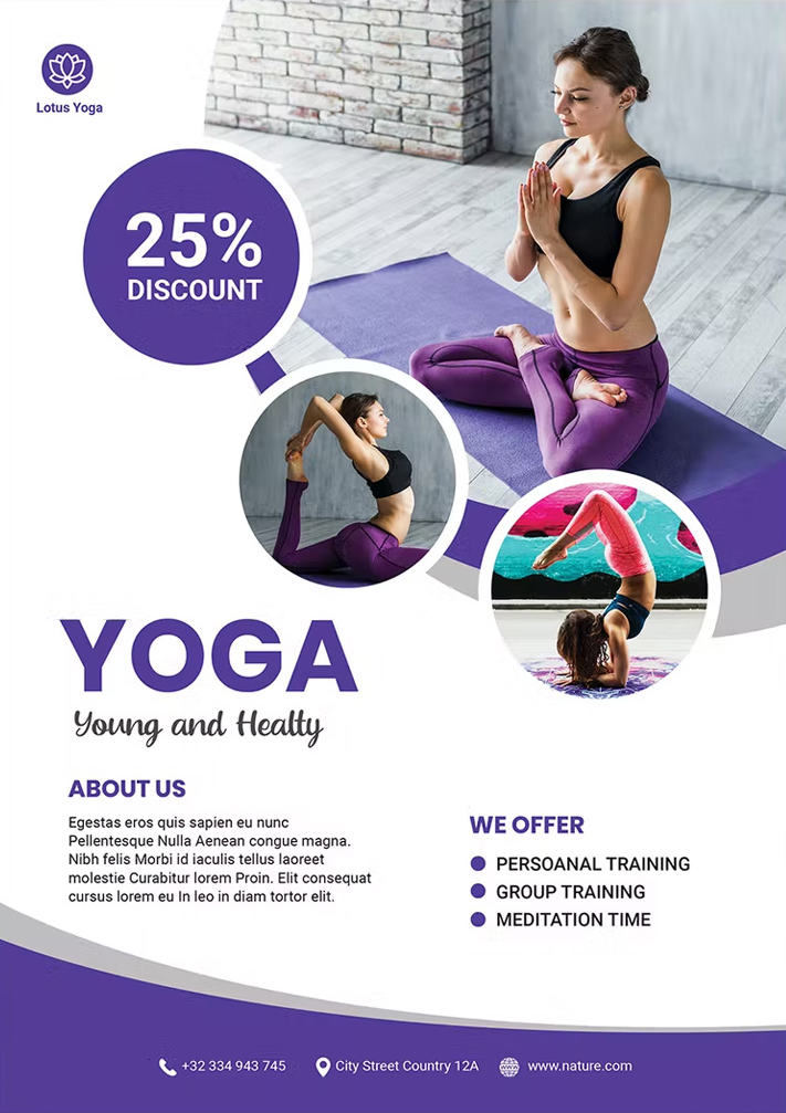
🌿 Yoga Class Flyer
Serene yoga flyer templates featuring peaceful nature backdrops, pose sequences, and mindfulness quotes for studios and instructors. These calming designs help promote class schedules, workshop series, and retreat packages while highlighting benefits like stress reduction and improved flexibility.

🎨 Art Exhibition Flyer
Creative exhibition flyer templates featuring artwork previews, artist statements, and gallery maps for cultural events. These sophisticated designs help drive attendance by highlighting opening night details, curator talks, and limited-edition prints available for purchase during the show.
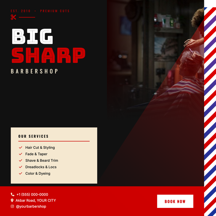
💈 Barbershop Flyer
Bold red-on-black design built for urban and classic barbershops. An animated barber-pole strip, oversized Bungee Inline headlines, and a red atmospheric light-cone over the model photo create instant attitude. Use it for grand openings, seasonal promos, or booking-drive posts where one strong call to action needs to own the frame.
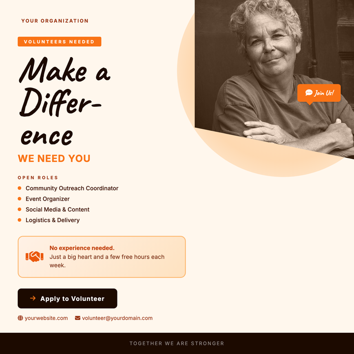
🤝 Volunteer Recruitment Flyer
A warm cream-and-orange layout built for nonprofits, food banks, and civic groups looking to draw in community volunteers. The oversized Caveat headline commands attention, while a diagonal photo clip, handshake motif, and role-listing callouts communicate approachability and urgency. A bold CTA button and footer bar drive sign-up action without feeling institutional.
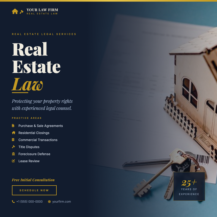
⚖️ Real Estate Lawyer Flyer
A navy-and-gold split-layout flyer built for law firms and legal advisors specializing in real estate. A full-bleed photo column blends into the dark background via a gradient scrim, while a 64px Playfair Display headline with italic gold accents commands immediate authority. Gold icon bullets list six practice areas, and a bordered CTA button drives consultation bookings.
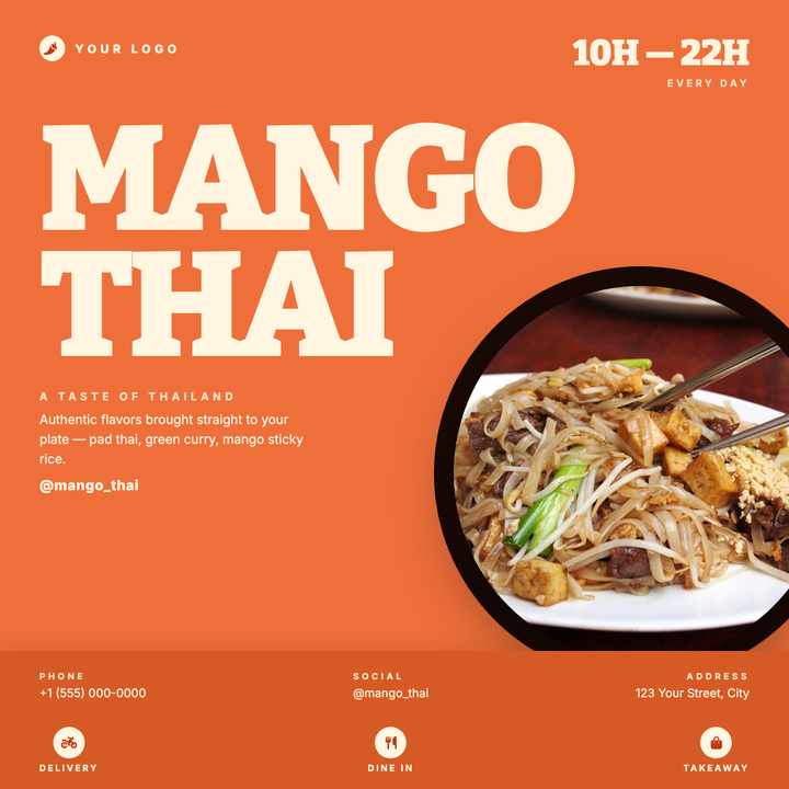
🍜 Thai Restaurant Flyer
A high-energy 800×800 flyer built around a massive two-line Bitter 900 headline and a right-bleeding circular food photo that instantly signals bold flavor. The vivid orange (#ef6f3a) canvas is split into a headline zone, a brand-and-hours header, and a darker contact panel footer — keeping every detail organized without sacrificing visual punch. Built for grand openings, lunch specials, and seasonal menu drops at casual or fast-casual Thai spots.
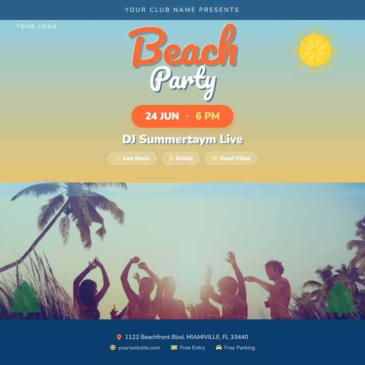
🏖️ Beach Party Flyer
A sky-to-sand gradient backdrop sets a tropical mood without needing a hero photo, while bold Pacifico script headlines — coral-orange "BEACH" stacked over white "PARTY" — grab attention instantly. A photo band with a blue-tinted scrim, flanking palm accents, and a navy footer panel keep the layout grounded and legible. Built for beach bars, pool parties, summer festivals, and end-of-term socials.

🏫 School Event Flyer
Engaging school templates featuring mascot graphics, permission slip reminders, and volunteer sign-ups for academic institutions. These trustworthy designs improve participation by highlighting STEM fair projects, parent-teacher conference slots, and fundraiser goals with easy-to-scan schedules and contact information. Perfect for PTA meetings, sports tryouts, and after-school program registrations requiring parent engagement.

📅 Community Calendar Flyer
Organized event templates featuring monthly grids and location pins to promote neighborhood activities and local happenings. These clear designs highlight festival dates, volunteer opportunities, and contact details with community-centric visuals that encourage civic participation and social connections.
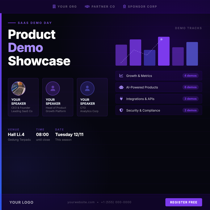
🚀 SaaS Demo Day Flyer
Built for SaaS demo days, product launches, and startup pitch events where speaker credibility and track lineup must share a single square asset. Deep-space violet-indigo gradients, horizontal grid lines, and an inline data-chart motif project a high-energy tech atmosphere. Speaker cards, event details, and a bold 48px headline keep all critical callouts organized at a glance.
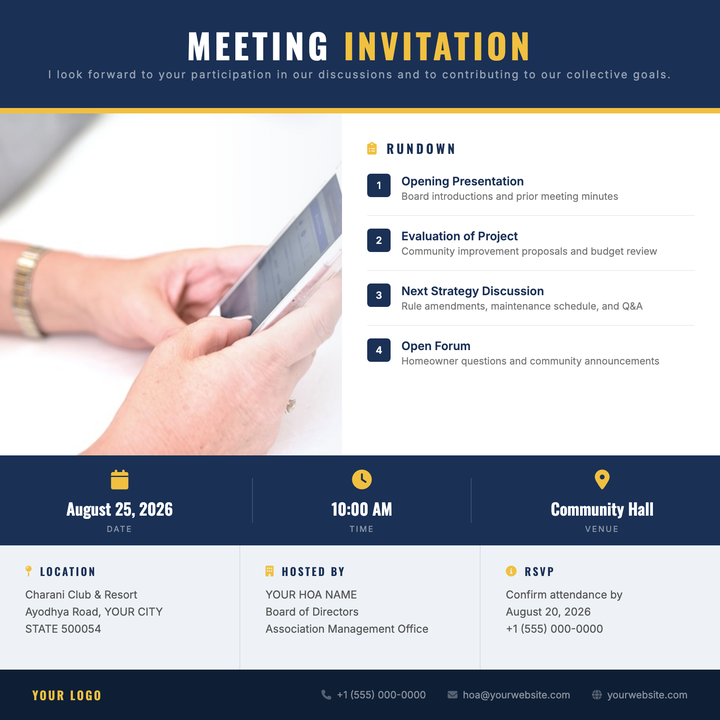
🏘️ HOA Meeting Flyer
A structured, navy-and-amber flyer built for homeowners associations, condo boards, and neighborhood councils. Bold Oswald headers and numbered agenda items give the layout institutional authority, while a full-bleed photo column with a soft scrim adds visual weight. Logistics — date, time, location — are spotlighted in a high-contrast info band for at-a-glance clarity.