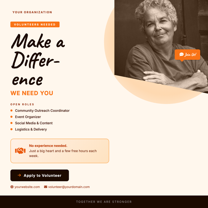
🤝 Volunteer Recruitment Flyer
A warm cream-and-orange layout built for nonprofits, food banks, and civic groups looking to draw in community volunteers. The oversized Caveat headline commands attention, while a diagonal photo clip, handshake motif, and role-listing callouts communicate approachability and urgency. A bold CTA button and footer bar drive sign-up action without feeling institutional.
What our users say
Join thousands of satisfied users who trust AIFlyer for their design needs
I actually checked this out because I was curious. I randomly thought something together and aiflyer.ai did a pretty good job. I did a simple prompt for a Birthday Brunch Invitation for April 4th @12:30 I was impressed the text was accurate. DALLE still has trouble sometimes. So great job!

Aovythegreat
Event Planner
As a small business owner, I was skeptical about AI design tools, but AIFlyer exceeded my expectations. The designs are beautiful and the process is incredibly intuitive.

Michael
Small Business Owner in Austin, TX
AIFlyer.ai has been a game-changer for our marketing team. We've been able to create beautiful flyers and social media posts in no time.

Fun_Cobbler1939
Social Media Manager
Hi, I just subscribed for AIFlyer and was really impressed. Game-changer for our marketing team! We need to make a lot of flyers for our social media campaigns and this has been so helpful.

David
Marketing Manager
No credit card needed
Frequently Asked Questions
More Templates to Explore
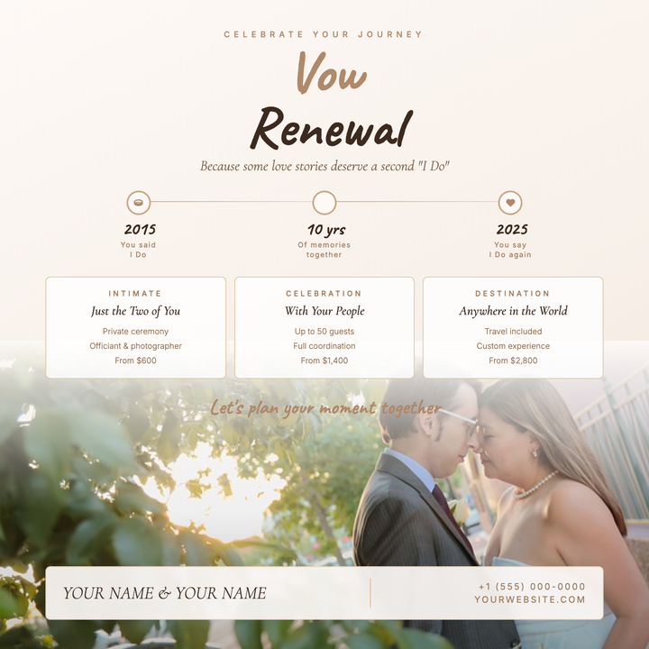
💍 Vow Renewal Flyer
A warm cream canvas with a diagonal blush gradient flows seamlessly into a full-bleed mood photo at the base, unified by a soft scrim. Caveat hand-script headlines and Cormorant Garamond italics set an intimate tone, while a timeline strip and three package cards organize your ceremony details elegantly. Built for small-event planners, photographers, and venues offering vow renewals, anniversary ceremonies, or boutique elopement packages.
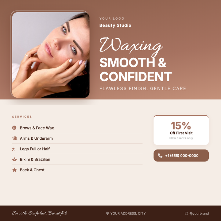
💆 Waxing Salon Flyer
A warm terracotta-to-cream layout built for waxing studios, brow bars, and small salons running new-client promotions. Allura script paired with bold Inter sans-serif creates an approachable luxury feel, while a layered photo frame and sienna accent details draw the eye to your services list and promo offer. Ideal for social media posts or printed in-salon displays.
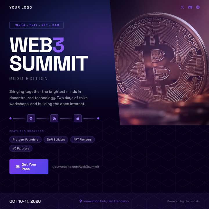
⛓️ Web3 Summit Flyer
Built for crypto conferences, DeFi launches, and NFT drops, this template pairs a deep indigo base with a neon-purple accent system and diagonal photo clip for a futuristic, high-energy look. A hexagon grid motif, aurora glow, and Space Grotesk typography reinforce the builder-first aesthetic. Speaker chips, chain callouts, and a violet-to-indigo CTA button give organizers all the key event details at a glance.
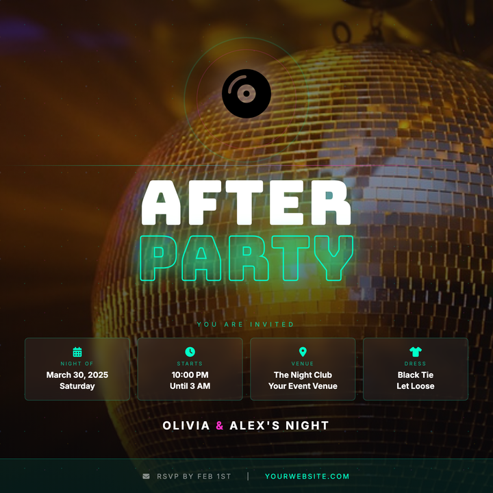
🪩 Wedding After-Party Flyer
A dark, club-ready flyer built on a near-black background with a full-bleed disco photo and neon scrim. Stacked 100 px Bungee display type contrasts solid white with a cyan-outlined "PARTY" word, while frosted info chips and a disco-ball icon keep event details sharp. Built for couples throwing a high-energy late-night celebration after the main reception.
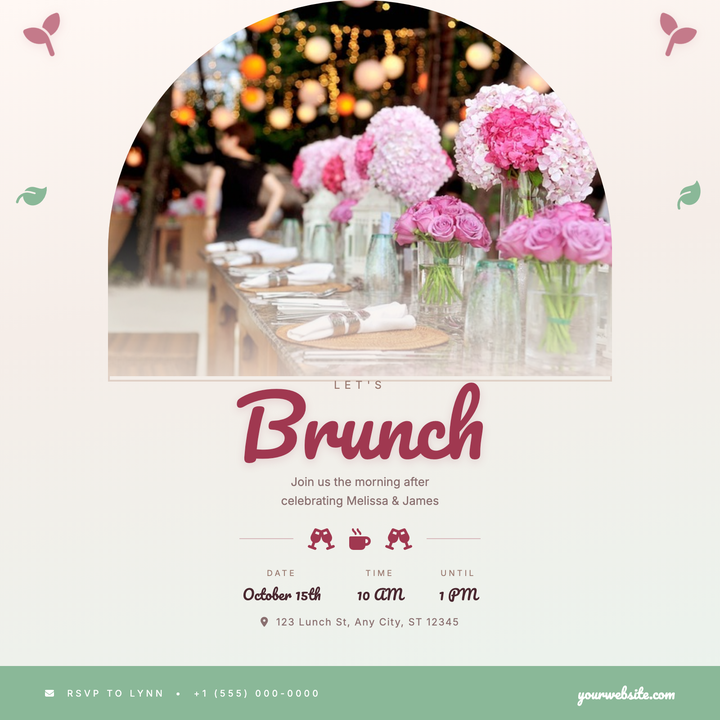
💍 Wedding Brunch Flyer
An arch-cropped hero photo anchors this warm, romantic flyer, framed by botanical corner accents in dusty rose and sage. Pacifico script headlines pair with lightweight Inter text across a peach-to-sage gradient for effortless daytime elegance. Ideal for post-ceremony brunches, bridal showers, or day-after wedding gatherings.
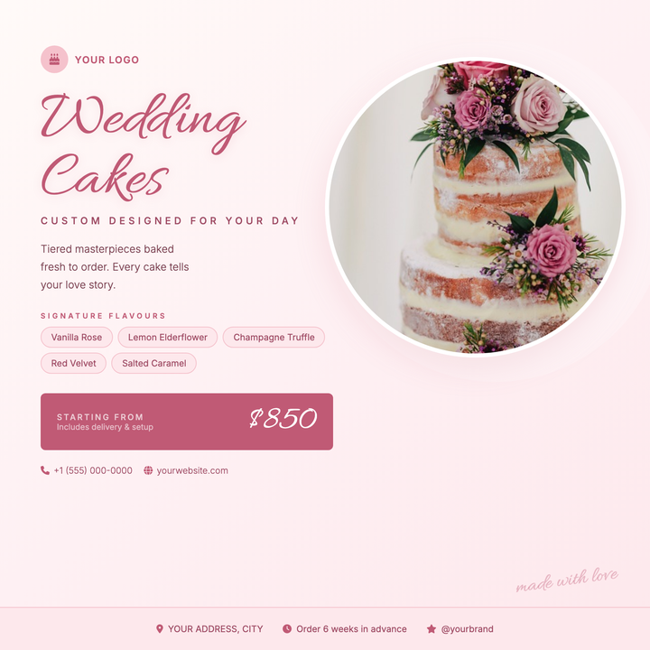
🎂 Wedding Cake Flyer
A warm cream-to-blush diagonal gradient and circle-cropped cake photo create an instantly romantic focal point. Script headline in dusty rose (#c05a75) pairs with structured body copy and pastel flavor tags to guide brides from inspiration to booking. Built for wedding cake studios, bespoke patisseries, and bridal dessert services promoting tastings or seasonal menus.
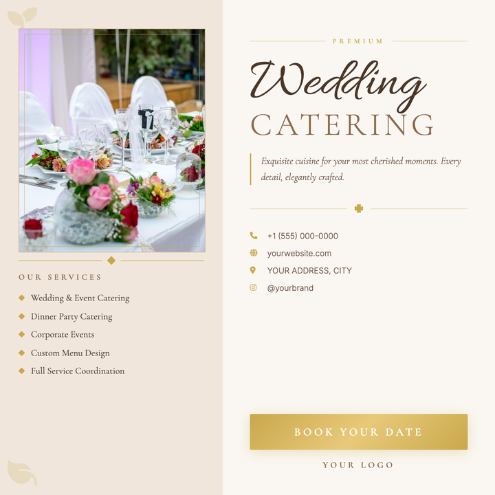
🍽️ Wedding Catering Flyer
A split-panel layout in soft blush and warm ivory, anchored by a gold-framed photo rect and Allura script headline paired with Cormorant Garamond small-caps. Antique gold accents — diamond dividers, ribbon flourishes, and icon callouts — carry an air of ceremony throughout. Built for boutique caterers and private chefs promoting upscale wedding packages or tasting menus.
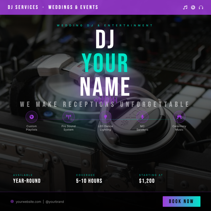
🎧 Wedding DJ Flyer
A bold, concert-poster-style flyer built for wedding DJs and reception entertainment packages. Deep-black layered backgrounds, dual purple-and-cyan neon glows, and Bebas Neue headlines at 100px command attention on social feeds. Five icon-feature tiles, a scannable event-details grid, and a neon-gradient CTA button handle all the booking essentials in one square format.
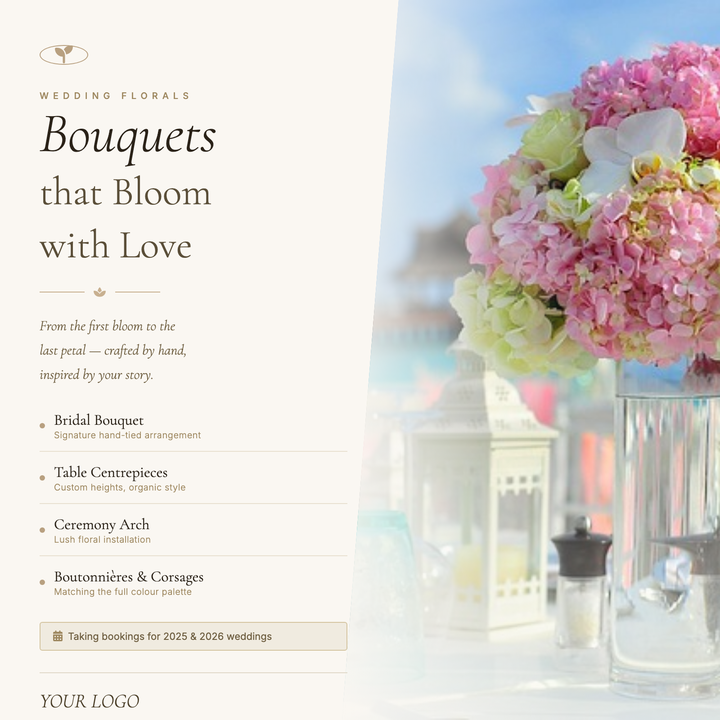
💐 Wedding Florist Flyer
A warm parchment-toned square layout with a diagonal photo split and italic Cormorant Garamond headline — built for boutique floral studios announcing seasonal bookings or promoting studio services. The angled parallelogram image panel and seven-tone cream-to-gold palette signal high-touch craftsmanship. Ideal for social ads, printed studio cards, or seasonal booking announcements.
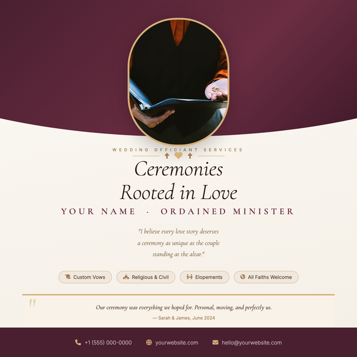
💍 Wedding Officiant Flyer
A warm parchment-toned flyer built for solo officiants and ordained celebrants. A deep burgundy arch frames a gold-bordered oval portrait at the top, while Cormorant Garamond italics carry the headline and ceremony quote below. Gold ornament dividers, service pills, and a footer strip with contact details give the layout a credentialed, artisanal feel.
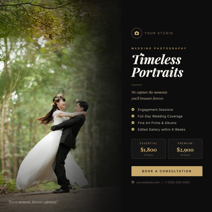
📷 Wedding Photographer Flyer
A moody, editorial layout split between a full-bleed cinematic photo and a near-black right panel with warm gold accents. Playfair Display headlines, structured service tiers, and a gold CTA button project a luxury brand voice. Built for boutique photographers promoting seasonal bookings, new packages, or a studio rebrand on Instagram or Facebook.
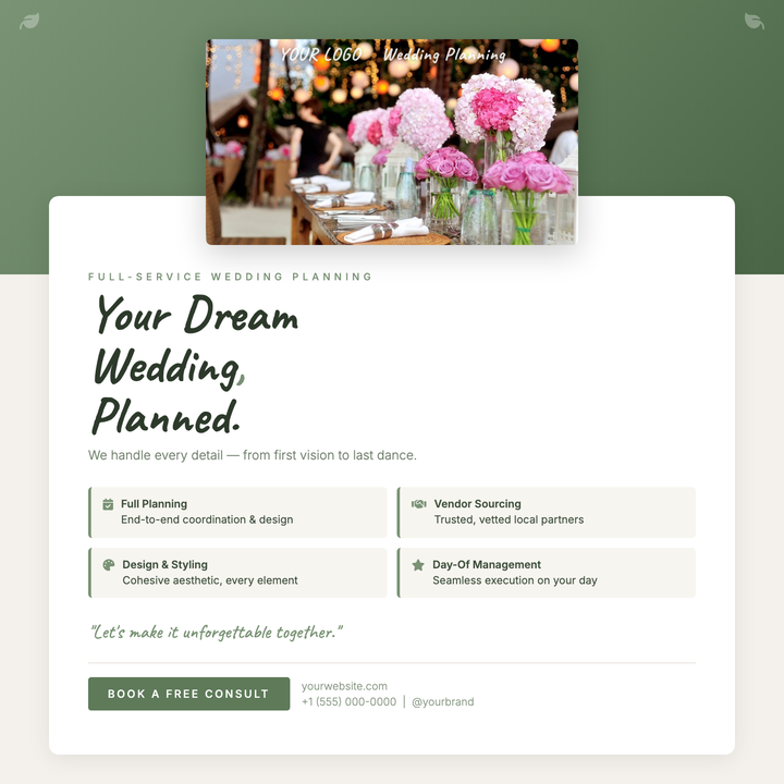
💍 Wedding Planner Flyer
A sage-green botanical social square layered with a lifted photo frame, Caveat handwritten accents, and an Inter-driven services grid. Built for boutique wedding planners and event stylists who need an intimate yet polished Instagram post or consultation lead-gen card. The three-step cream-to-white interior keeps the layout airy while brand greens anchor every decorative detail.
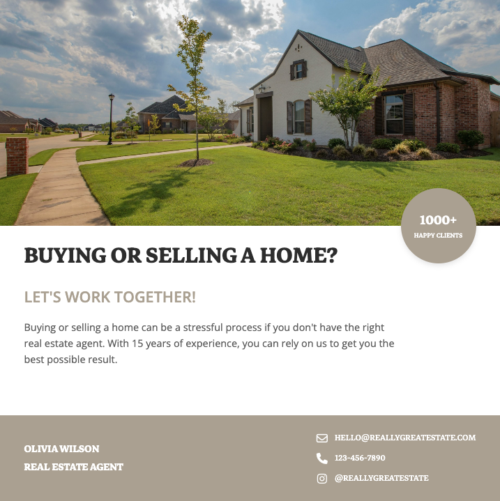
🏠 Real Estate Flyer
Professionally designed real estate flyer templates that showcase properties with high-resolution photos, virtual tour QR codes, and compelling property details. Perfect for real estate agents looking to attract buyers with visually stunning listings that highlight square footage, amenities, and neighborhood highlights for maximum engagement.
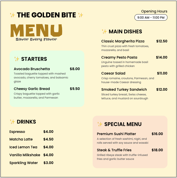
🍴 Restaurant Menu Design
Appetizing restaurant flyer templates featuring food photography that highlights your signature dishes, specials, and happy hour deals. These customizable menu designs help restaurants increase orders with clear pricing, dietary labels, and scannable QR codes linking to online ordering systems or reservation platforms.
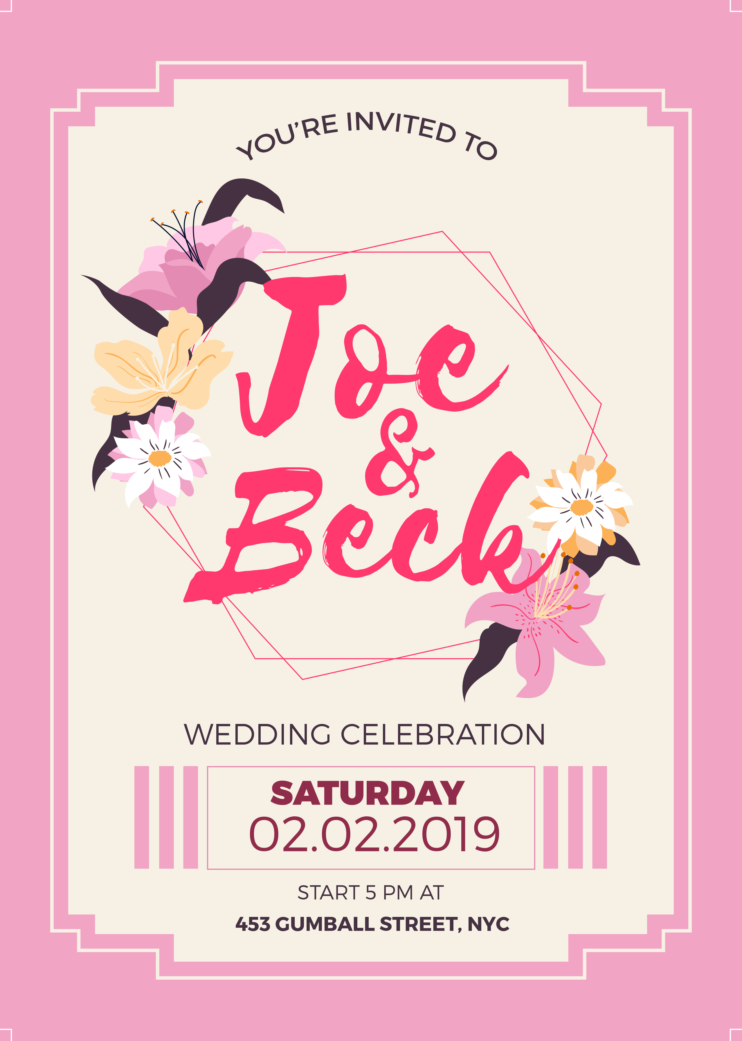
💍 Wedding Invitation
Elegant wedding flyer templates featuring romantic typography, floral motifs, and premium paper textures for save-the-dates, invitations, and RSVP cards. These designs help couples communicate wedding details like venue maps, dress codes, and registry information while setting the tone for their special day.

🎓 Graduation Flyer
Celebratory graduation flyer templates featuring academic motifs like diplomas, caps, and school colors for announcements, party invites, and ceremony programs. These designs help schools and families highlight graduate achievements, event schedules, and memorable quotes while incorporating photo collages of school memories.

🛍️ Retail Sale Flyer
High-converting retail flyer templates showcasing products with clean grids, discount badges, and limited-time offer countdown timers. These promotional designs help stores drive foot traffic and online sales by highlighting bestsellers, bundle deals, and loyalty program benefits with attention-grabbing visuals.
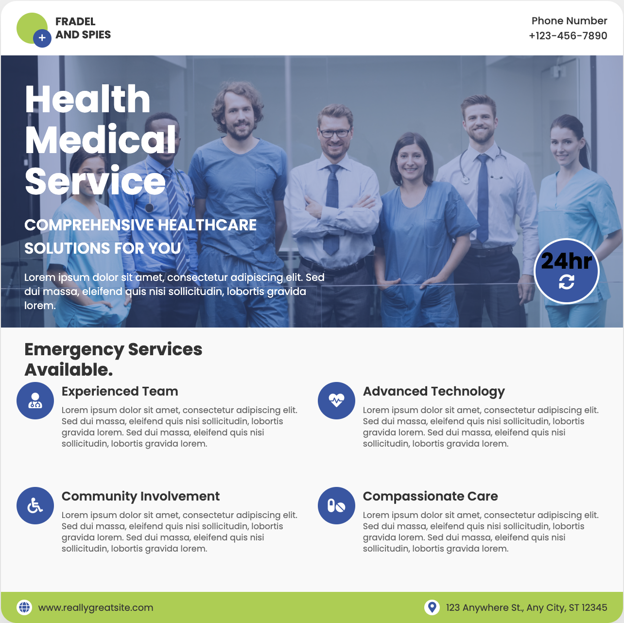
🏥 Medical Practice Flyer
Trust-building medical flyer templates featuring clean layouts, doctor profiles, and service icons for clinics, dentists, and specialists. These HIPAA-compliant designs help healthcare providers explain treatment options, showcase patient testimonials, and promote wellness events with professional yet approachable aesthetics.

🎭 Theater Event Flyer
Dramatic theater flyer templates featuring play titles in bold typography, cast headshots, and moody lighting effects for performances. These artistic designs help venues sell tickets by highlighting show dates, venue maps, and critic reviews while capturing the essence of dramatic productions.

🚗 Auto Repair Flyer
Professional auto repair flyer templates featuring service checklists, coupon cutouts, and vehicle diagrams for mechanics and detailers. These designs help shops promote oil change specials, brake inspections, and seasonal maintenance packages with easy-to-scan service menus and warranty information.
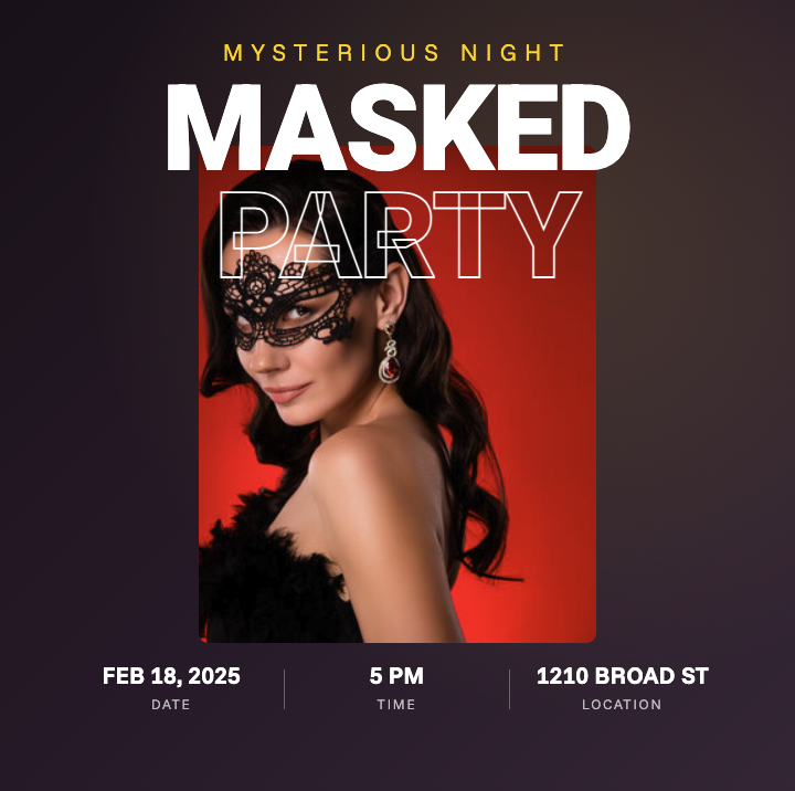
🎂 Birthday Party Flyer
Vibrant birthday flyer templates featuring age-appropriate themes from cartoon characters for kids to elegant motifs for adults. These customizable designs help hosts communicate party details like RSVP deadlines, gift registries, and dress codes while incorporating fun photo booths and activity schedules.
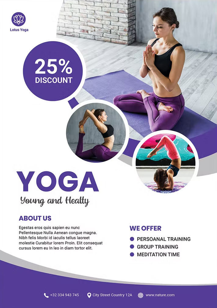
🌿 Yoga Class Flyer
Serene yoga flyer templates featuring peaceful nature backdrops, pose sequences, and mindfulness quotes for studios and instructors. These calming designs help promote class schedules, workshop series, and retreat packages while highlighting benefits like stress reduction and improved flexibility.
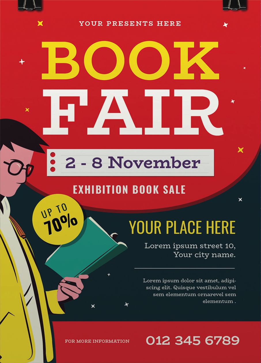
📚 Book Sale Flyer
Engaging book flyer templates featuring literary motifs, author spotlights, and reading lists for libraries, bookstores, and literary events. These designs help promote book signings, reading challenges, and seasonal sales while highlighting new releases, staff picks, and exclusive discounts for book club members.

🎵 Music Concert Flyer
Energetic concert flyer templates featuring artist photos, tour dates, and venue maps for bands, DJs, and music venues. These eye-catching designs help sell tickets by highlighting lineup details, ticket tiers, and VIP packages while capturing the genre's vibe through bold typography and color schemes.

✂️ Hair Salon Flyer
Stylish salon flyer templates showcasing haircut transformations, color services, and seasonal promotions for beauty professionals. These designs help attract clients by featuring stylist portfolios, package deals, and loyalty programs with before/after visuals and QR codes for online booking.
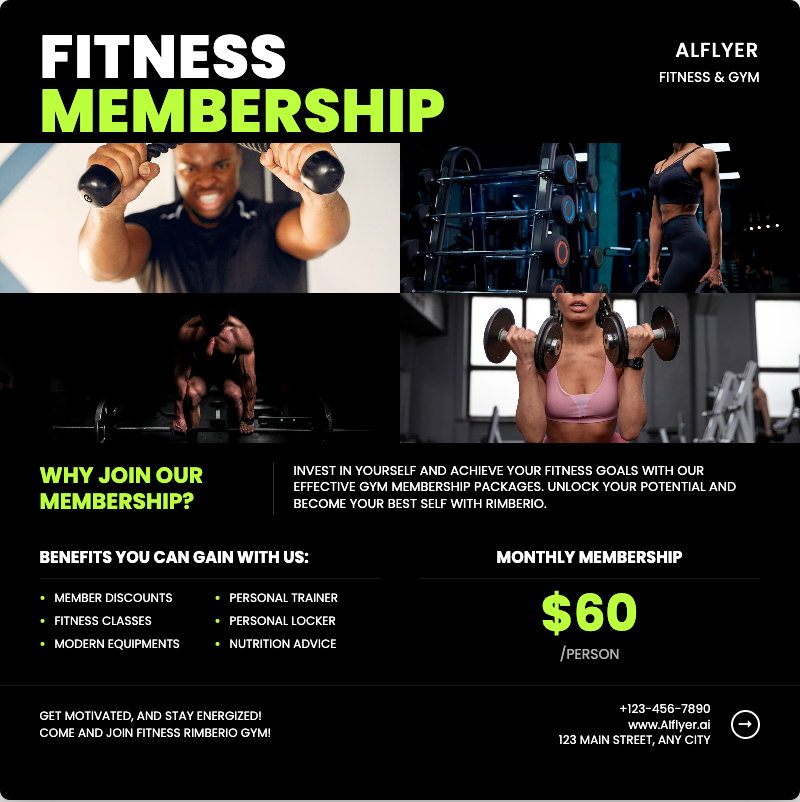
🏋️ Gym Membership Flyer
Motivational gym flyer templates featuring equipment photos, trainer bios, and transformation stories for fitness centers. These high-energy designs help convert leads by highlighting class schedules, membership perks, and limited-time enrollment specials with compelling stats about health benefits.

🎨 Art Exhibition Flyer
Creative exhibition flyer templates featuring artwork previews, artist statements, and gallery maps for cultural events. These sophisticated designs help drive attendance by highlighting opening night details, curator talks, and limited-edition prints available for purchase during the show.
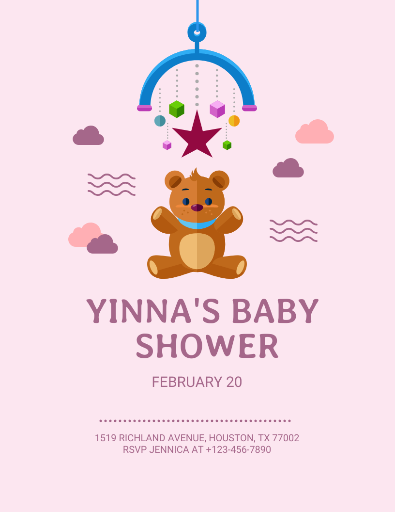
👶 Baby Shower Flyer
Adorable baby flyer templates featuring nursery themes, gift registry info, and playful illustrations for gender reveals and showers. These heartwarming designs help hosts coordinate events by including RSVP deadlines, venue directions, and themed activity details like diaper raffles or onesie decorating stations.

🏡 Home Cleaning Flyer
Professional cleaning flyer templates featuring service checklists, pricing tables, and satisfaction guarantees for maids and janitorial services. These trustworthy designs help convert leads by highlighting eco-friendly products, bonded staff, and recurring service discounts with before/after home visuals.

🍷 Wine Tasting Flyer
Sophisticated wine flyer templates featuring vineyard photos, varietal notes, and pairing suggestions for tastings and wine clubs. These elegant designs help boost RSVPs by highlighting sommelier-led events, exclusive vintages available for purchase, and gourmet food pairing menus with registration deadlines.