🥾 Hiking Group Flyer
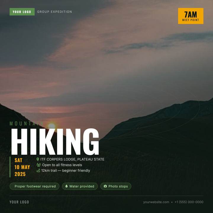
Built on a deep forest-green canvas, this template layers a full-bleed trail photo under a directional scrim and subtle topographic contour overlay for rugged depth. A monumental 120px headline commands attention instantly, while the amber time badge and green-accented details row keep logistics clear. Ideal for outdoor clubs, trail runs, and guided summit meetups promoting on social squares.
What our users say
Join thousands of satisfied users who trust AIFlyer for their design needs
I actually checked this out because I was curious. I randomly thought something together and aiflyer.ai did a pretty good job. I did a simple prompt for a Birthday Brunch Invitation for April 4th @12:30 I was impressed the text was accurate. DALLE still has trouble sometimes. So great job!
Aovythegreat
Event Planner
As a small business owner, I was skeptical about AI design tools, but AIFlyer exceeded my expectations. The designs are beautiful and the process is incredibly intuitive.
Michael
Small Business Owner in Austin, TX
AIFlyer.ai has been a game-changer for our marketing team. We've been able to create beautiful flyers and social media posts in no time.
Fun_Cobbler1939
Social Media Manager
Hi, I just subscribed for AIFlyer and was really impressed. Game-changer for our marketing team! We need to make a lot of flyers for our social media campaigns and this has been so helpful.
David
Marketing Manager
No credit card needed
More Templates to Explore
🧘 Reformer Pilates Flyer
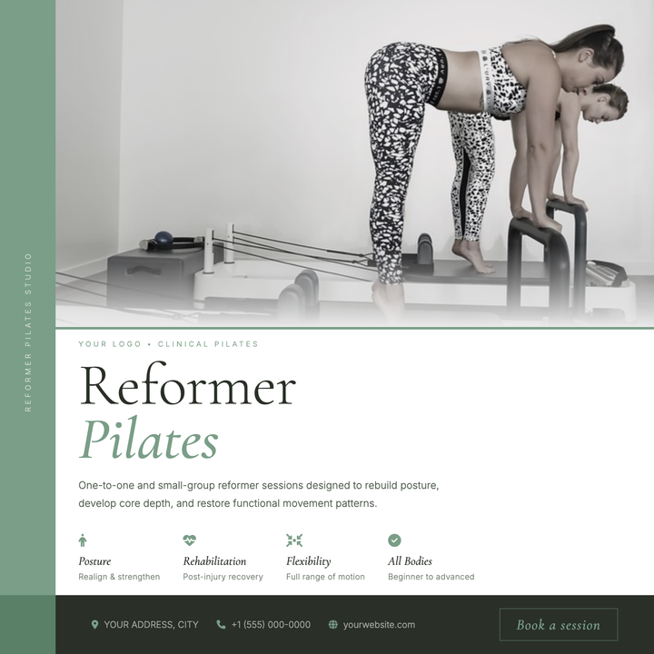
A split-canvas layout pairs a full-bleed photo panel with a sage-green structural spine and a Cormorant Garamond headline at 72px — giving boutique and rehabilitation-focused studios a calm, premium aesthetic. The muted #7a9e87 palette runs through accent lines, benefit icons, and footer callouts for cohesive visual continuity. Built for studio-opening announcements, term-intake promotions, or new session launches targeting health-conscious clients.
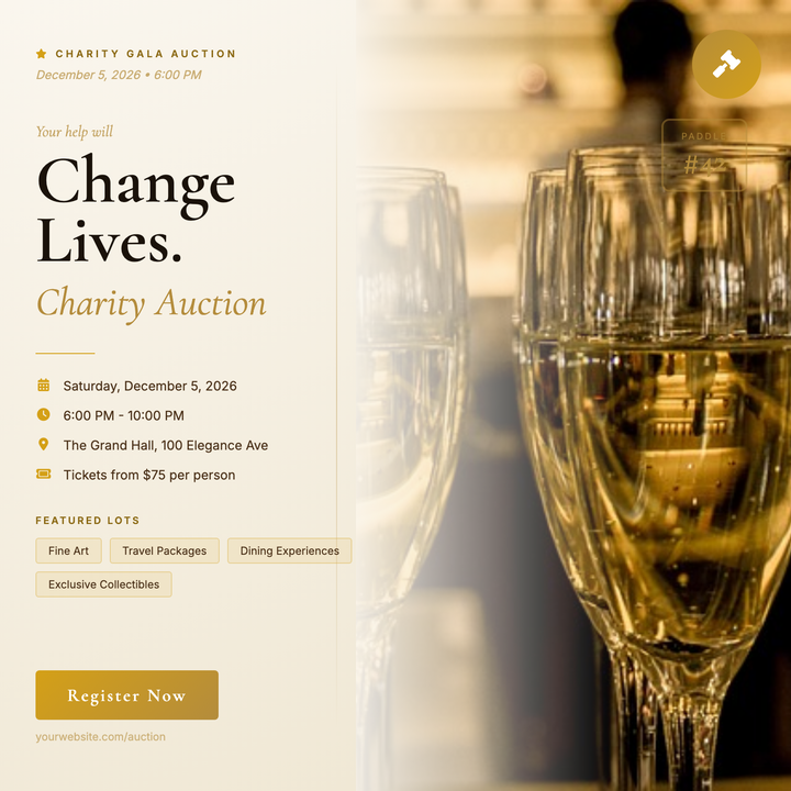
🔨 Charity Auction Flyer
A split-column layout pairs a warm parchment left panel with a full-bleed lifestyle photo, unified by a seamless gold scrim. Serif display headlines, a circular gold medallion badge, and a paddle-number card reinforce the ceremonial auction aesthetic. Built for nonprofit galas, benefit dinners, and museum auction nights where donor trust is the first impression.
🎵 Album Release Party Flyer
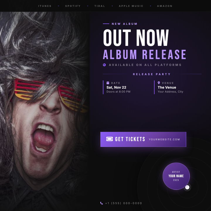
A moody, cinema-dark 800×800 social tile built for album drops, vinyl releases, and listening sessions. A full-bleed photo column fades into near-black (#0D0D0D), anchored by a massive 88px Bebas Neue headline and a violet two-tier typographic stack. Streaming bar, event details grid, and a sharp gradient CTA button give artists and venue promoters every callout they need in one punchy layout.
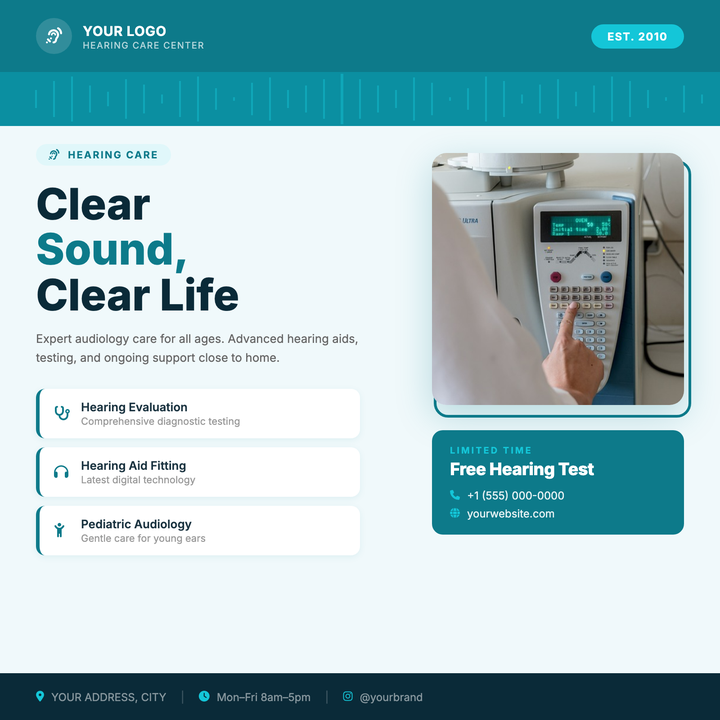
🦻 Audiology Clinic Flyer
Built for hearing health clinics and audiologist practices, this square 800×800 template pairs a bold right-column photo block with a teal clinical palette to build instant trust. Service cards with left-border accents organize key offerings, while a high-contrast bottom strip keeps your phone number and contact details front and center. Designed for Instagram, Facebook, and email hero placements where one clear call-to-action — book a free hearing test — must land at a glance.
🏢 Corporate Services Flyer
Corporate business templates featuring workplace visuals and infographics to promote B2B solutions and professional services. These sleek designs highlight virtual office packages, administrative support tiers, and technology integrations with free consultation offers and scalable pricing for growing companies.
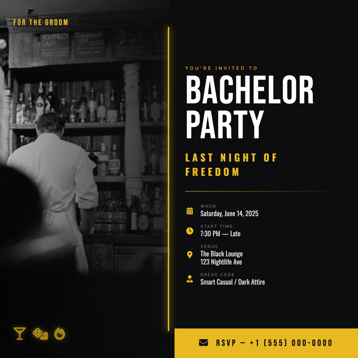
🥃 Bachelor Party Flyer
A split-panel Vegas-noir layout with a full-bleed photo column on the left and a near-black right panel anchored by an 88px Bebas Neue headline. A slim amber-gold neon bar seams the two halves, while the #e8b923 accent carries through icons, labels, and a bold CTA bar. Built for bachelor parties, VIP nights, and upscale after-dark events that need an Instagram-ready square.

🚑 EMT Training Flyer
Professional medical templates featuring ambulance interiors and certification badges to promote emergency responder courses. These authoritative designs highlight hands-on training hours, job placement rates, and financial aid options with open house dates for prospective students.

📚 Book Club Flyer
Literary discussion templates featuring novel covers and meeting prompts to promote reading groups and author events. These intellectual designs highlight monthly selections, wine-and-cheese pairings, and guest facilitator spotlights with bookstore partnership discounts.

💻 Webinar Flyer
Professional digital templates featuring screen mockups and speaker headshots to promote online workshops and virtual trainings. These tech-savvy designs highlight learning objectives, software requirements, and CPE credits with registration deadlines and replay access details for remote attendees.
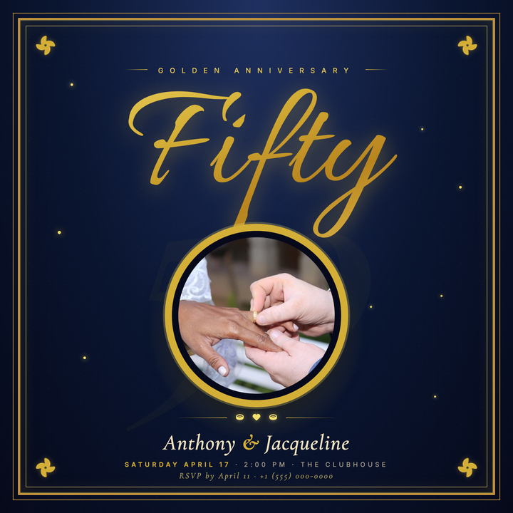
💍 50th Anniversary Flyer
Elegant navy-and-gold template built for Golden Wedding Anniversary invitations, featuring an Allura script "Fifty" headline with a multi-stop gold gradient, a ghost watermark numeral in Cormorant Garamond Italic, and an ornate triple-frame portrait medallion. Flanking gradient dividers, spaced-cap event details, and an anchored RSVP line complete the formal composition. Ideal for milestone anniversaries, upscale galas, and half-century institutional celebrations.
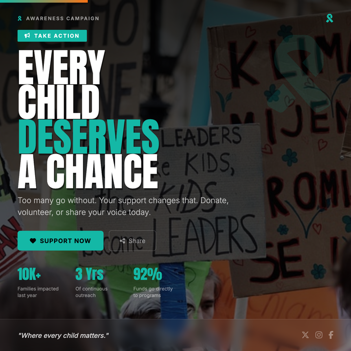
📣 Awareness Campaign Flyer
A cinematic dark-canvas layout built for non-profits, advocacy groups, and fundraising drives. The bold 90px Anton stacked headline commands immediate attention, while a warm-teal accent (#14b8a6) highlights key callouts, CTAs, and stat values against a grayscale photo with a deep gradient scrim. A credibility stats bar and donate/volunteer action row give supporters everything they need to act at a glance.
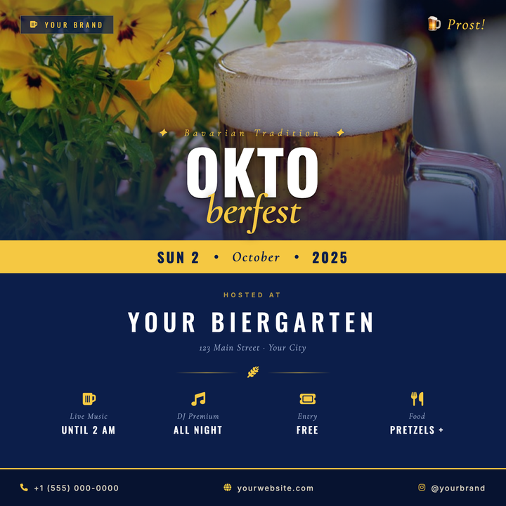
🍺 Oktoberfest Event Flyer
A navy-and-gold split logotype layout built for Oktoberfest celebrations, biergarten openings, and fall beer festivals. The oversized Oswald "OKTO" headline and italic Cormorant Garamond "FEST" drop create a bold masthead over a darkened photo scrim, while a warm gold date strip divides the photo zone from the venue details below. Ideal for craft breweries and hospitality venues promoting festive seasonal events.
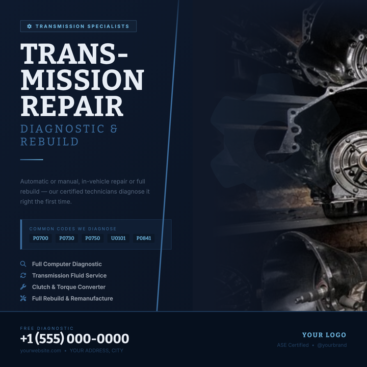
⚙️ Transmission Repair Flyer
Built on a deep navy canvas with gear-ring motifs and a split photo-strip layout, this template projects engineered precision for transmission shops and drivetrain specialists. A serif/sans-serif type pairing, steel-blue OBD-code callout box, and layered dark surfaces communicate diagnostic credibility at a glance. Ideal for converting skeptical vehicle owners into booked service appointments.
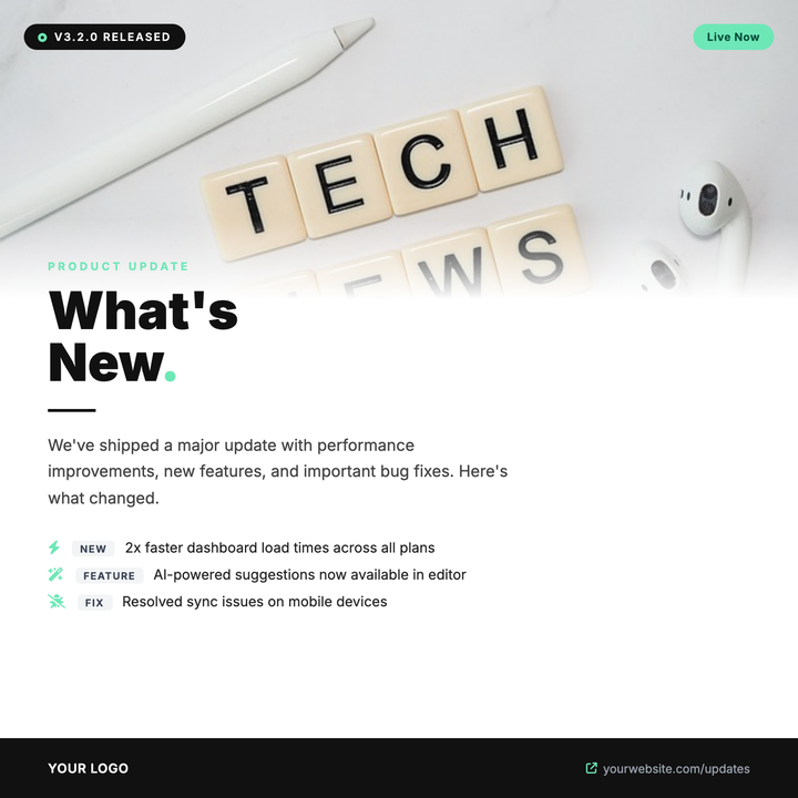
🚀 Product Update Flyer
Built for SaaS and software teams announcing version launches, feature drops, or patch notes. A full-bleed photo strip fades into a white canvas via a soft gradient, anchoring a bold 52px headline with mint-green accent highlights and a structured changelog list below. Dark pill badges call out version numbers and status at a glance, while the high-contrast dark-and-mint palette signals technical credibility.
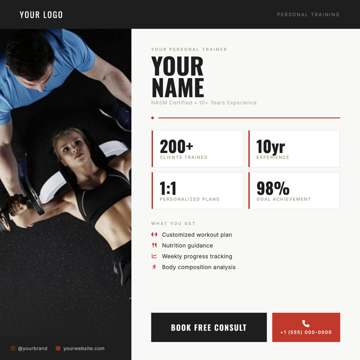
💪 Personal Trainer Flyer
A credential-forward fitness flyer built around a bold portrait photo panel and Oswald display headlines. Red-accented stat cards highlight key metrics like years of experience or clients trained, while icon-led service rows and a strong CTA block drive action. Ideal for independent trainers and boutique studios promoting on Instagram, gym lobbies, or websites.
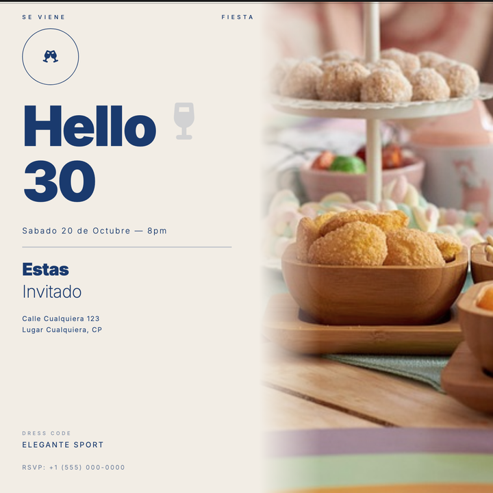
🎂 30th Birthday Invitation
A split-panel editorial design with a warm ecru background and full-bleed photo half, feathered seamlessly into the cream surface. Bold 90px weight-900 headline type commands the left column, anchored by art-deco double rules and spaced-caps labels. Built for milestone cocktail parties, lounge dinners, and rooftop celebrations with a sophisticated, understated mood.
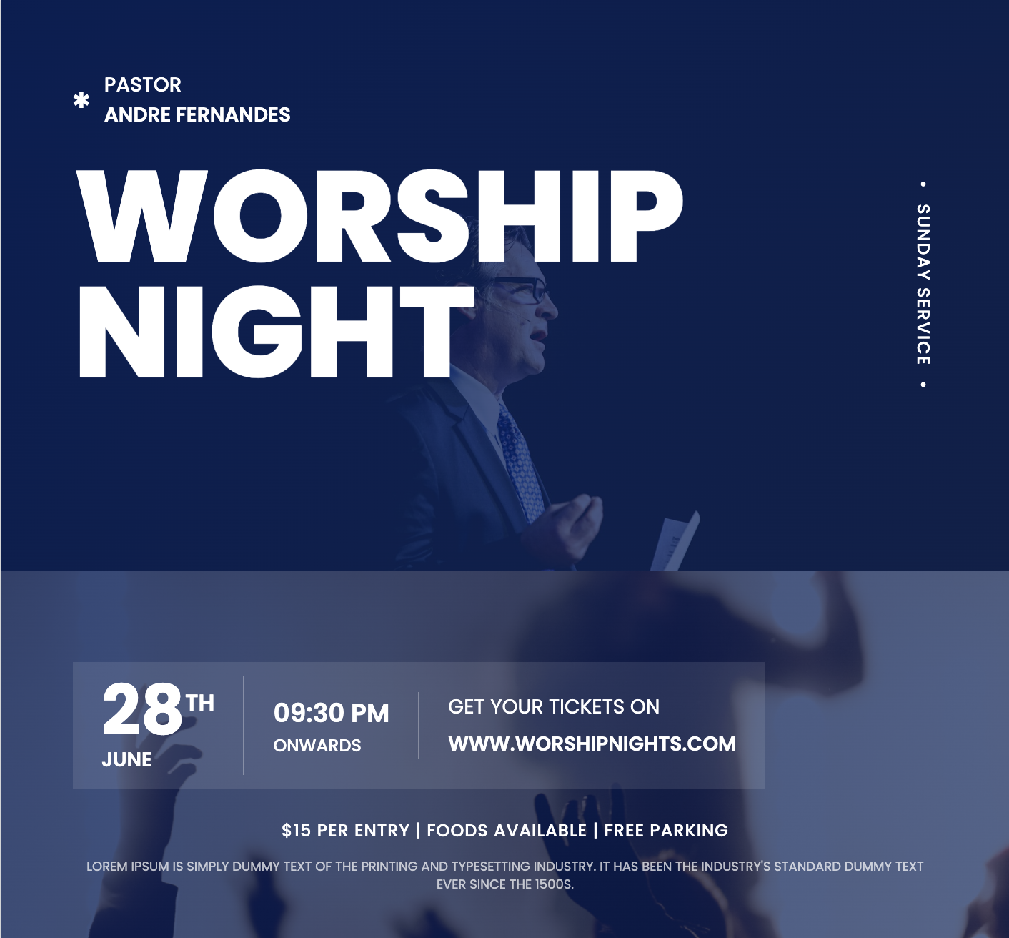
⛪ Church Event Flyer
Uplifting spiritual templates featuring stained glass motifs and scripture quotes to promote worship services and faith gatherings. These reverent designs highlight sermon topics, choir performances, and potluck details with childcare availability and livestream access information for congregants.
🎄 Christmas Party Flyer
Festive holiday templates featuring ornament borders and gift pile visuals to promote seasonal celebrations and winter gatherings. These cheerful designs highlight ugly sweater contests, secret Santa rules, and catering menus with RSVP deadlines and charity donation options for office parties.

🔧 Plumbing Service Flyer
Bold Anton display type and a high-contrast sky-cyan CTA bar keep your phone number front and center. An industrial pipe-column sidebar, deep navy-to-midnight gradient, and a bottom-anchored photo frame give this square flyer a rugged, trustworthy feel built for emergency callouts and local brand awareness. Ideal for plumbers, HVAC techs, and trade contractors who need to drive direct response fast.
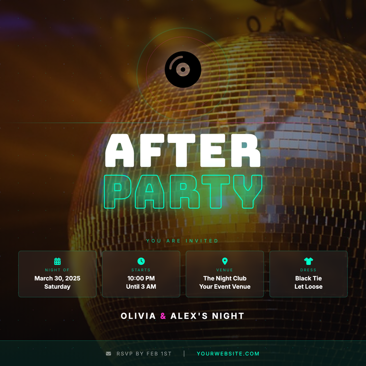
🪩 Wedding After-Party Flyer
A dark, club-ready flyer built on a near-black background with a full-bleed disco photo and neon scrim. Stacked 100 px Bungee display type contrasts solid white with a cyan-outlined "PARTY" word, while frosted info chips and a disco-ball icon keep event details sharp. Built for couples throwing a high-energy late-night celebration after the main reception.
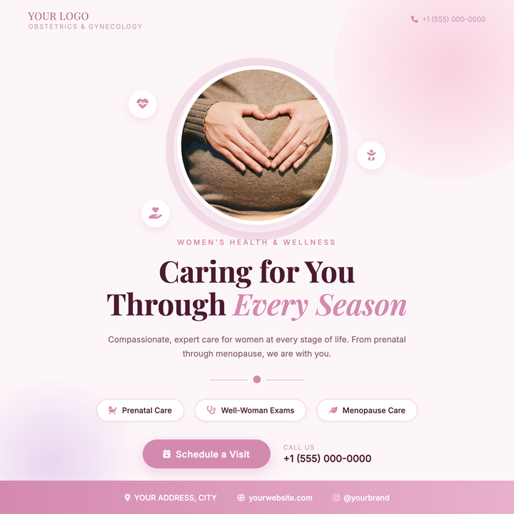
🌸 OB-GYN Practice Flyer
A warm rose-toned flyer built around a circular provider headshot with a soft halo ring, floating icon bubbles, and Playfair Display headlines. The blush-to-lavender blob gradients and medium rose accent (#d48aaf) create a reassuring, modern-elegant tone. Ideal for OB-GYN practices, midwifery centers, and women's health clinics promoting new providers or booking appointments.

✈️ Travel Agency Flyer
Stunning wanderlust templates showcasing destination photography and package deals to promote vacation specials and tour operators. These eye-catching designs highlight flight inclusions, hotel amenities, and cultural experiences with map visuals and limited-time booking discounts for tropical getaways and adventure tours.
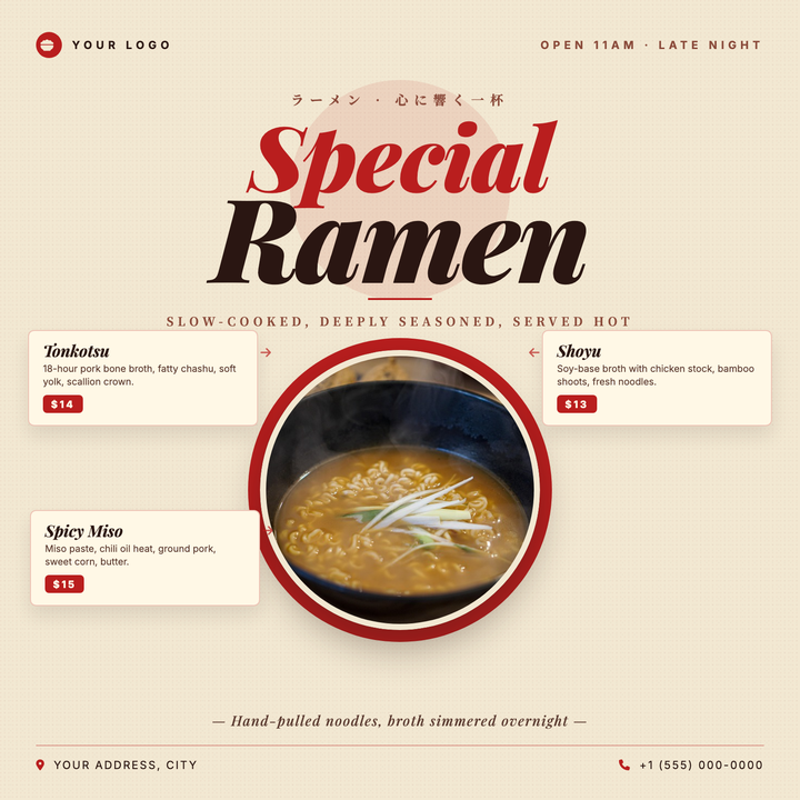
🍜 Ramen Shop Flyer
A warm cream-and-crimson layout built for Japanese ramen shops, izakayas, and noodle pop-ups. Playfair Display italic headlines (up to 116px) pair with Noto Serif JP accents for a traditional-yet-premium feel, while a medallion-style circular bowl hero anchors three side-by-side menu item cards—ideal for seasonal specials or new menu launches.
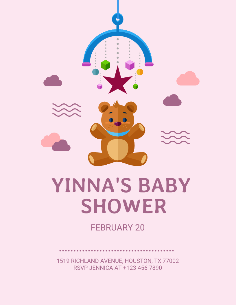
👶 Baby Shower Flyer
Adorable baby flyer templates featuring nursery themes, gift registry info, and playful illustrations for gender reveals and showers. These heartwarming designs help hosts coordinate events by including RSVP deadlines, venue directions, and themed activity details like diaper raffles or onesie decorating stations.
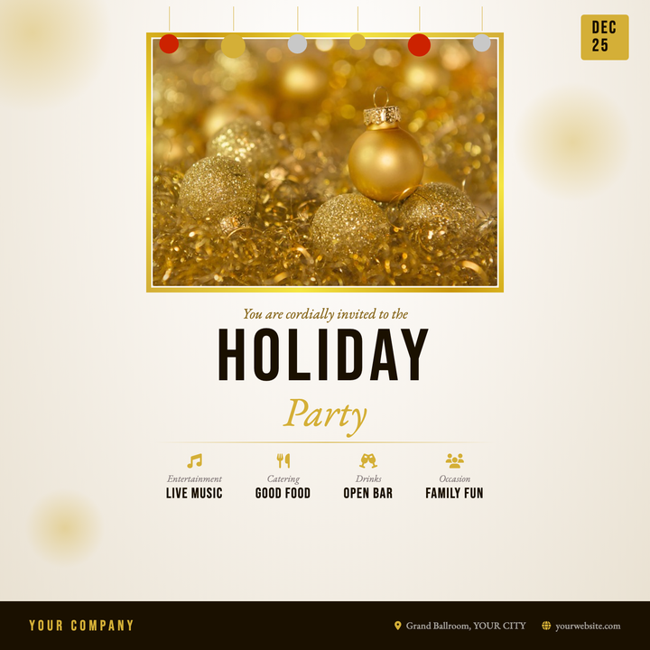
🎉 Office Holiday Party Flyer
A champagne radial background, metallic gold photo frame, and bold Bebas Neue headline give this 800×800 invite an upscale festive tone. Hanging ornaments along the top, an at-a-glance date chip, and a four-column details row keep all event info organized. Built for corporate holiday parties, year-end galas, and staff celebrations.
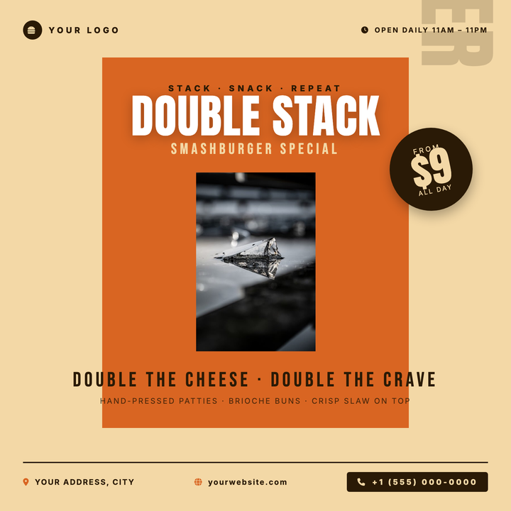
🍔 Burger Joint Flyer
Bold burnt-orange panel and oversized burger photography create instant appetite appeal. Anton headlines stacked against cream and white drive a punchy hierarchy, while a rotated price-burst badge locks in the CTA. Built for burger restaurants, fast-casual spots, and limited-time smash-stack promos.
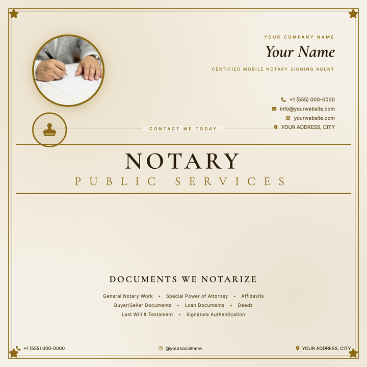
📜 Notary Service Flyer
A parchment-cream flyer built for mobile notaries and certified signing agents who want to lead with personal credibility. A circular portrait, gold-bordered credential block, and 52 px Cormorant Garamond headline anchor the formal document aesthetic, while nested gold rules and corner star ornaments reinforce trustworthiness. Ideal for Instagram, Facebook, or print promotion of solo legal-document practices.
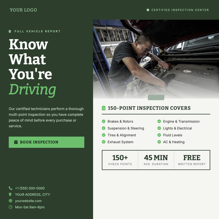
🔧 Auto Inspection Flyer
A split-layout flyer built for automotive inspection and certified mechanic services. The deep forest-green left column anchors a bold serif headline and CTA button, while the off-white right panel pairs a full-bleed car photo with a clipboard-style checklist grid and stats row. Converts browsing interest into bookings fast.
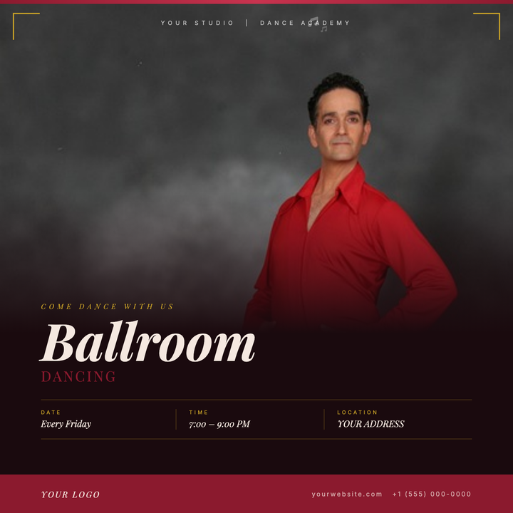
💃 Ballroom Dance Flyer
A photograph-first design for upscale ballroom events, built on a deep burgundy canvas with a full-bleed photo panel that dissolves into the dark lower zone via a seamless gradient scrim. Gold L-bracket corner ornaments and a crimson top stripe frame the composition with formal elegance, while Playfair Display italic headlines and a crimson-and-gold hierarchy guide the eye from mood to logistics. Ideal for studio socials, competition galas, and evening dance series.
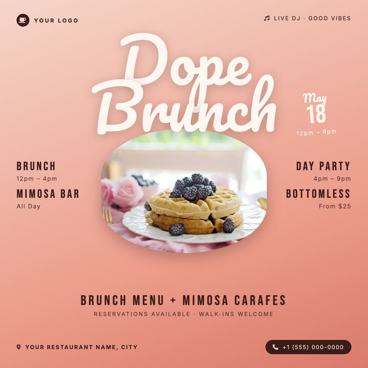
🍳 Brunch Event Flyer
A warm blush-to-terracotta diagonal gradient sets the tone for this lively brunch flyer, anchored by a bold 132px Pacifico script title and an oval photo frame for food or venue shots. A rotated date block at top-right adds playful energy. Built for restaurants, rooftop venues, and Sunday social events promoting bottomless mimosas or day-party brunches.