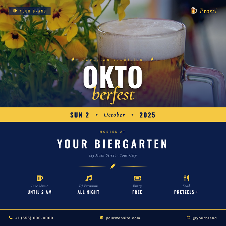
🍺 Oktoberfest Event Flyer
A navy-and-gold split logotype layout built for Oktoberfest celebrations, biergarten openings, and fall beer festivals. The oversized Oswald "OKTO" headline and italic Cormorant Garamond "FEST" drop create a bold masthead over a darkened photo scrim, while a warm gold date strip divides the photo zone from the venue details below. Ideal for craft breweries and hospitality venues promoting festive seasonal events.
What our users say
Join thousands of satisfied users who trust AIFlyer for their design needs
I actually checked this out because I was curious. I randomly thought something together and aiflyer.ai did a pretty good job. I did a simple prompt for a Birthday Brunch Invitation for April 4th @12:30 I was impressed the text was accurate. DALLE still has trouble sometimes. So great job!
Aovythegreat
Event Planner
As a small business owner, I was skeptical about AI design tools, but AIFlyer exceeded my expectations. The designs are beautiful and the process is incredibly intuitive.
Michael
Small Business Owner in Austin, TX
AIFlyer.ai has been a game-changer for our marketing team. We've been able to create beautiful flyers and social media posts in no time.
Fun_Cobbler1939
Social Media Manager
Hi, I just subscribed for AIFlyer and was really impressed. Game-changer for our marketing team! We need to make a lot of flyers for our social media campaigns and this has been so helpful.
David
Marketing Manager
No credit card needed
More Templates to Explore
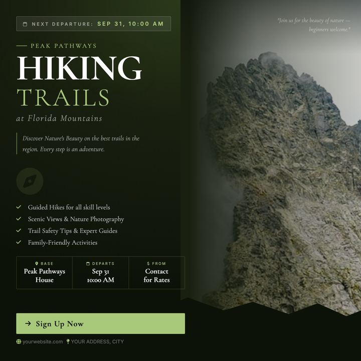
🏔️ Outdoor Adventure Flyer
A moody, editorial layout built for guided hikes, trail runs, and eco-retreats. A full-bleed landscape photo anchors the right panel while a deep forest-green column on the left stacks trip details, departure dates, and a sage-lime CTA button. Cormorant Garamond serif headlines and a dark #1a2010 palette give boutique operators an artisanal, upscale-rustic feel.
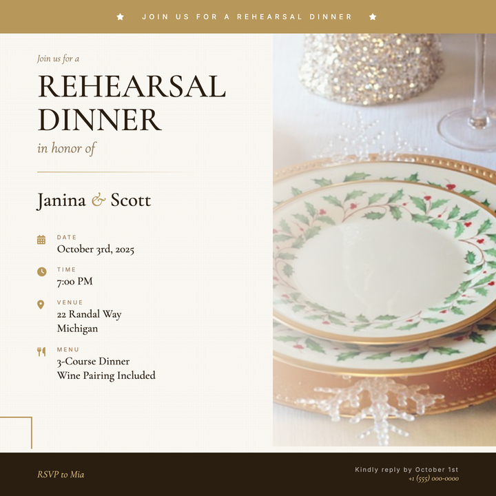
🍽️ Rehearsal Dinner Flyer
A warm, elegant template built for intimate pre-wedding dinners, with a linen-textured cream canvas, dual-gold accent bands framing the top and bottom, and a fading tableware photograph on the right. Cormorant Garamond typography stacks an eyebrow line, 54 px display title, and couple names over a gradient warm-rule divider. Ideal for rehearsal dinners, engagement suppers, and anniversary dinners where a refined, romantic mood is essential.
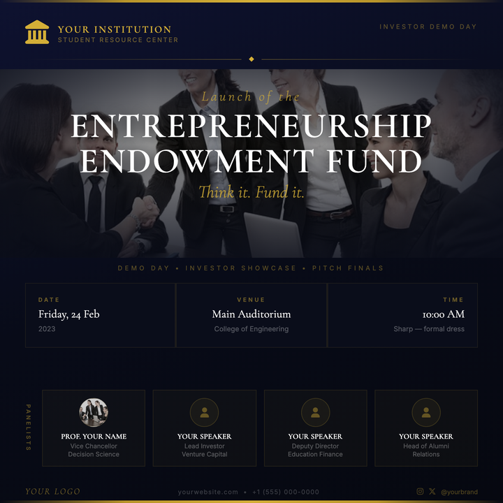
🏛️ Investor Demo Day Flyer
A ceremonial deep-navy canvas anchored by antique gold horizontal rules and Cormorant Garamond display typography gives this template an almost heraldic authority. A full-bleed photo band with a four-sided gradient scrim frames the event title, while a three-column info grid keeps logistics legible at a glance. Built for university demo days, alumni investor showcases, and venture-pitch finals where the design must feel institutional, not generic.
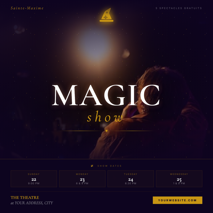
🎩 Magic Show Flyer
A cinematic dark-mystical flyer built on a deep violet-black canvas with a gold starfield overlay and full-bleed atmospheric photo scrim. The 120px Cormorant Garamond serif headline and italic gold "show" lockup command center stage, while a hat icon medallion and line-diamond-line ornament add theatrical polish. Designed for magicians, illusionists, and cabaret headliners running multi-night engagements.
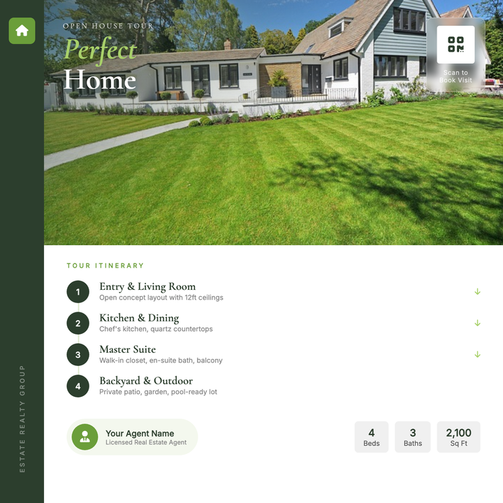
🏡 House Tour Flyer
A polished editorial layout built for open houses and private property showings. A full-width photo hero with a diagonal forest-green scrim draws the eye instantly, while Cormorant Garamond display type anchors the property title and numbered tour-stop itinerary below. The deep green sidebar, frosted-glass QR badge, and lime accent chips give agents a premium, print-ready look for Instagram posts or one-page handouts.
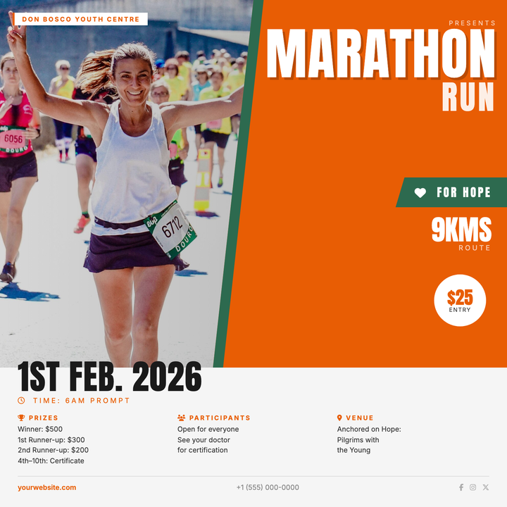
🏃 Marathon Run Flyer
Built for community and charity runs, this template pairs a diagonal-clipped runner photograph with a bold orange hero block and a razor-thin forest-green seam for a high-energy split-panel effect. Anton display type stacks the event name at 88px for instant readability, while a cause-driven ribbon, circular fee badge, and three-column info grid handle all race logistics below. Ideal for daylight-event announcements where distance, entry fee, and start time need to hit fast.
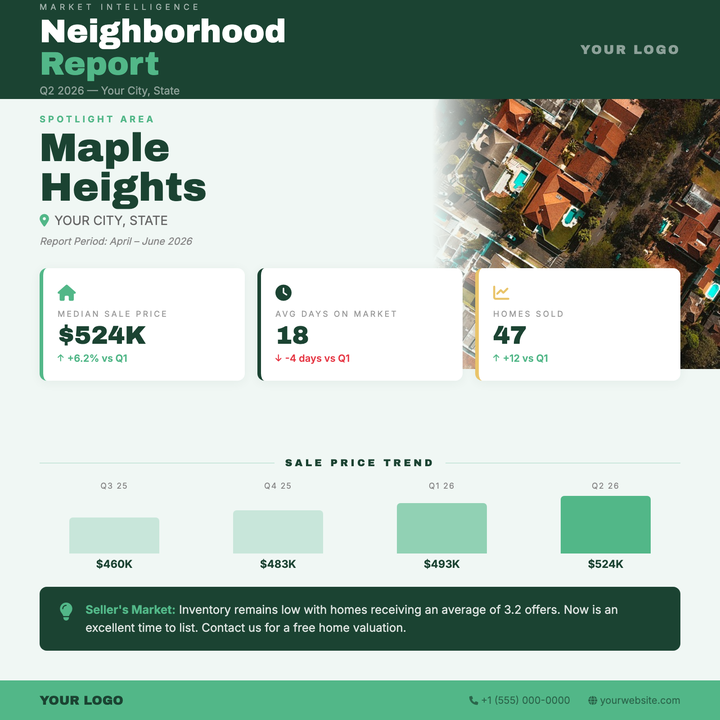
📊 Neighborhood Market Report
A structured quarterly snapshot for real estate agents and brokerages, built around three KPI cards (median price, days on market, sales volume) and a four-bar quarterly chart. The dark forest green header and sage accent palette project authority, while a full-width narrative insight panel closes the story. Swap the neighborhood name, data, and quarter each cycle — the layout holds itself together.
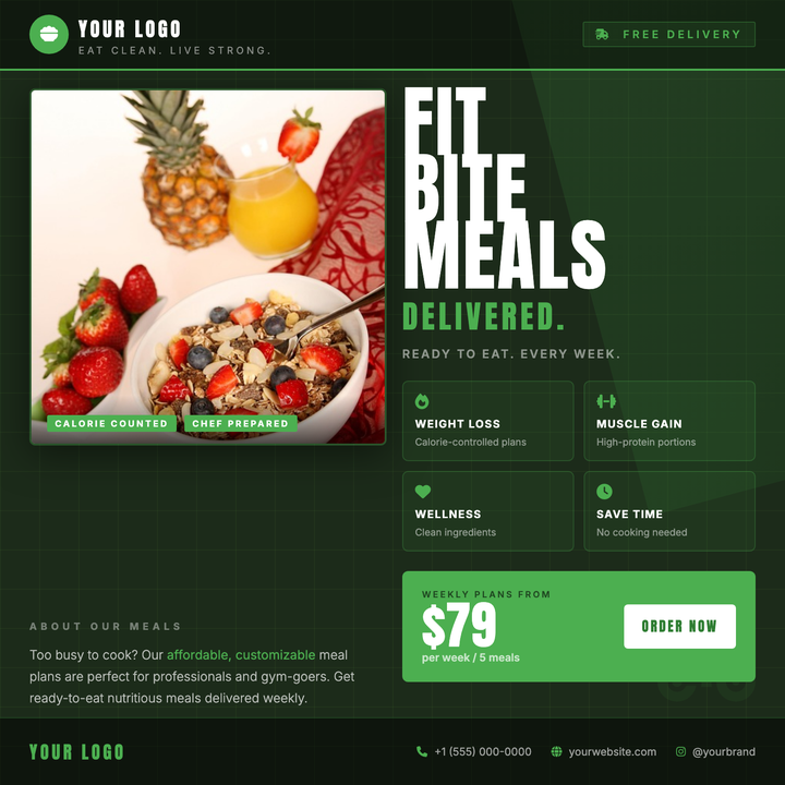
🥗 Meal Prep Flyer
A dark forest-green canvas with a bold Anton headline, 2×2 benefit grid, and a prominent price-CTA bar drives instant attention for meal prep and nutrition delivery brands. A square food photo card with gradient scrim overlay anchors the left column, while accent green (#4CAF50) highlights icons, tags, and callouts throughout. Built for fitness audiences and health-conscious professionals who need one clear subscription offer and a visible price point.
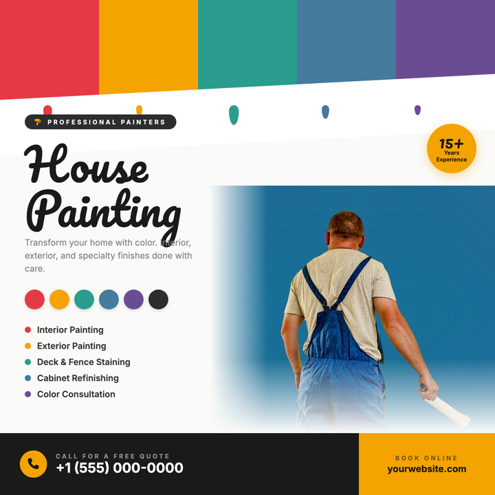
🖌️ House Painting Flyer
A craft-forward flyer built around a bold swatch bar, dripping paint accents, and color chip callouts that immediately signal painting expertise. The split layout pairs a right-side photo with left-aligned headline, services list, and amber CTA strip — making phone and web contacts impossible to miss. Ideal for residential or commercial painters running seasonal promos, neighborhood drops, or social media ads.
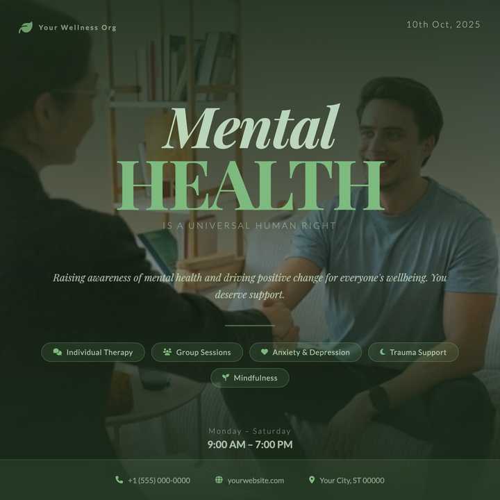
🧠 Mental Health Therapy Flyer
A calm, dignified flyer built on a deep forest-green gradient canvas with a centered portrait photo and dark scrim overlay. The two-line Playfair Display headline stack — massive italic "Mental" over bold sage-tinted "Health" — anchors the design, while small-caps Lato taglines and horizontal service pills add structure. Ideal for therapy launches, counseling clinic open houses, and mental health awareness campaigns.
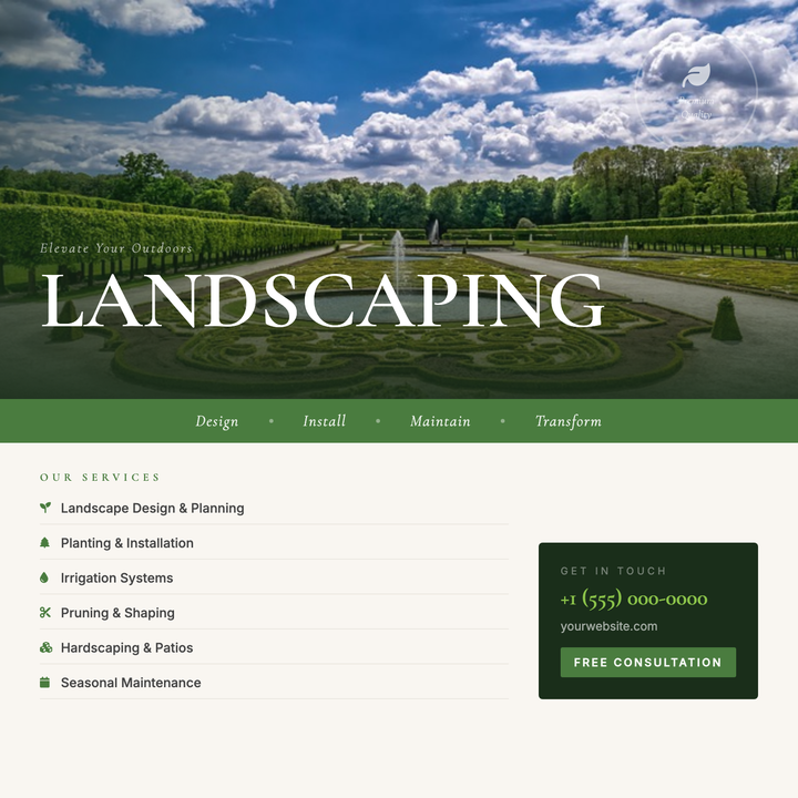
🌿 Landscaping Service Flyer
A photo-forward layout with an 82px Cormorant Garamond headline riding the seam between a full-bleed environmental image and a warm cream info zone. A moss-green tagline band and lime-accented italic draw the eye to your key offer, while a structured services column and contact card keep details crisp. Built for landscaping, garden design, and hardscape contractors running seasonal promos or lead-gen campaigns.
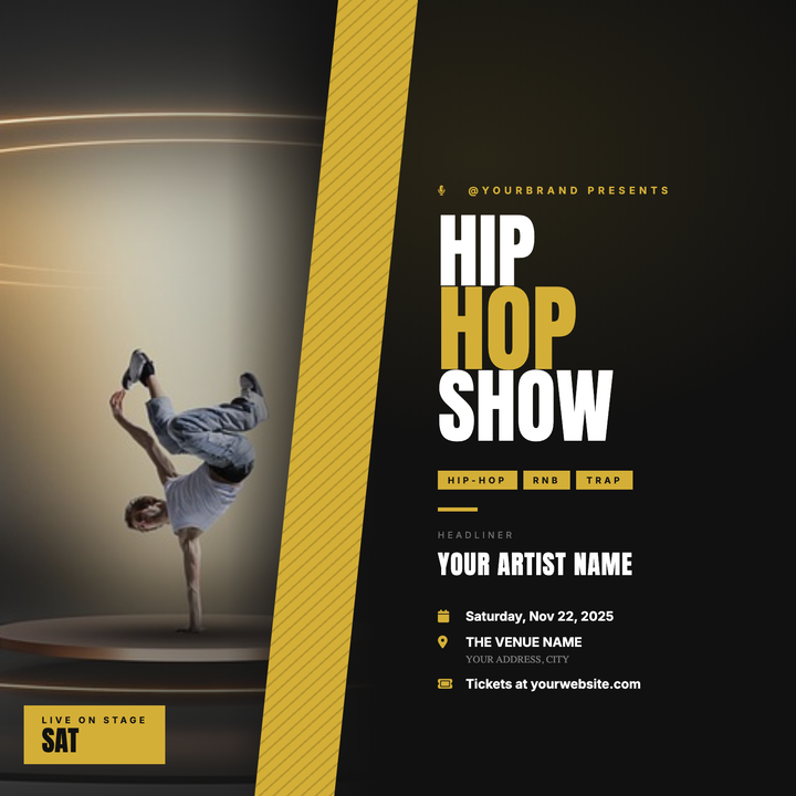
🎤 Hip-Hop Show Flyer
A split-panel layout pairs a full-height artist portrait with bold Anton headlines, separated by a gold diagonal slash that drives the eye across the design. Dark #111 backgrounds and antique-gold accents deliver a premium nightlife aesthetic built for rap showcases, RnB nights, and DJ residencies. Artist name, genre tag, and event info stack cleanly on the right panel for instant readability at a distance.
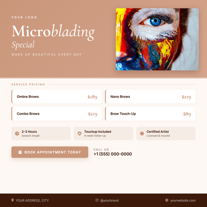
✨ Microblading Studio Flyer
A rose-gold diagonal-gradient hero paired with a Cormorant Garamond serif headline gives this flyer an upscale, feminine edge suited to brow studios and permanent makeup artists. A prominent photo card showcases your work, while a structured pricing grid, icon-pill info strip, and rose-gold CTA button make services and booking details instantly scannable. Use it to promote appointment slots, limited-time pricing, or new-service launches.
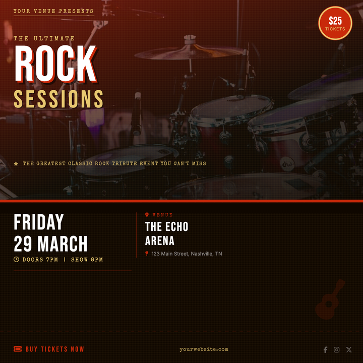
🎸 Tribute Band Flyer
Built for tribute band nights and classic-rock cover events, this template pairs a 110px Bebas Neue headline with a gold secondary word over a darkened concert photo. A ticket-stub serration divides the photo zone from the near-black info panel below, while a crimson-gold palette and aged paper texture deliver a gritty, vintage-ticket energy that cuts through on social feeds and digital signage.
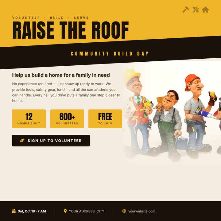
🔨 Habitat Build Day Flyer
Built for nonprofit construction events and community volunteer drives, this template uses a bold Anton headline at 72px, a diagonal dark slash cutting across an amber header block, and stat boxes that surface key event details at a glance. The warm cream canvas and construction-site color palette — amber yellow, near-black, and cream — read as urgent and mission-driven. Tool icon accents in the top corner reinforce the worksite energy without going corporate.
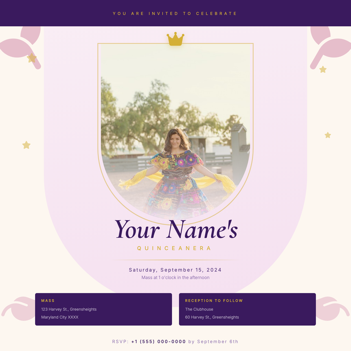
👑 Quinceañera Invitation
An arched portrait frame in soft blush rose gradients, trimmed with a 2px gold ring and topped with a crown icon, gives this invitation an heirloom, keepsake quality. Royal purple anchors the top band and ceremony details block, while Cormorant Garamond serif typography and gold rule accents carry the elegant hierarchy from name to RSVP. Built for quinceañeras, sweet sixteens, and formal debut parties where the design needs to feel as memorable as the occasion.
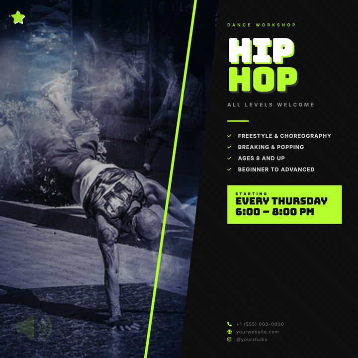
🕺 Hip-Hop Dance Flyer
A split-panel layout with a diagonal photo block and skewed neon-yellow accent bar delivers instant street-culture energy. Bold Bungee Inline headlines dominate the right panel alongside a date callout, bullet features, and contact details — all tied together by a sharp #b5ff2e thread. Built for dance crews, studio showcases, and urban battle nights that need to pop on social feeds or printed posters.
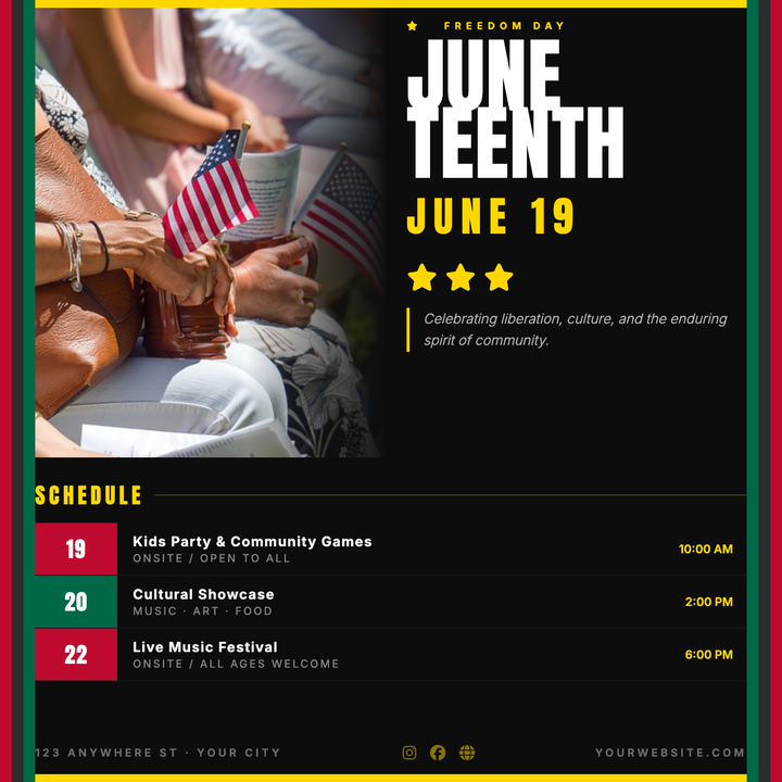
✊ Juneteenth Celebration Flyer
Bold Pan-African column framing in red, black, and green borders a near-black canvas, while gold bars and an Anton display headline anchor a ceremonial, headline-forward layout. A full-bleed photo zone bleeds into a structured schedule card with three time-slot listings — built for multi-day community lineups. Ideal for Juneteenth commemorations, Black heritage festivals, and civic freedom block parties.
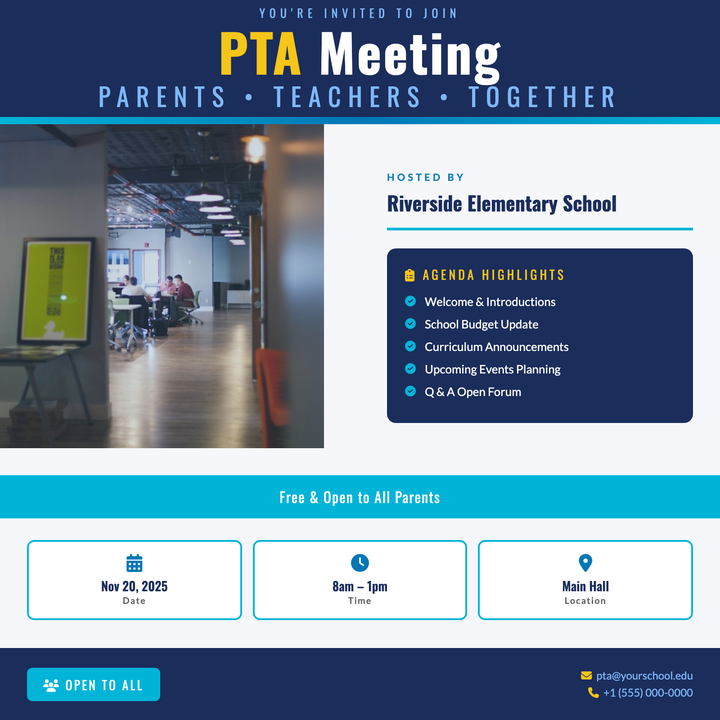
📋 PTA Meeting Flyer
A structured navy-and-teal layout built for school and civic gatherings, with a bold Oswald headline lockup, a dedicated agenda board, and three at-a-glance info cards for date, time, and location. A golden yellow accent highlights key callouts against the deep navy header band. Ideal for PTA meetings, parent info nights, and community forums that need to look organized and approachable.
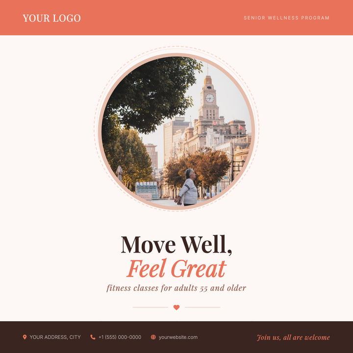
🧘 Senior Fitness Class Flyer
A warm coral-and-cream layout built for low-impact fitness and active-aging programs. A circular portrait photo framed by concentric decorative rings anchors the design, while Playfair Display headlines and benefit-icon rows communicate value at a glance. Ideal for senior centers, 55+ wellness studios, or healthcare systems promoting balance, mobility, and community wellness classes.
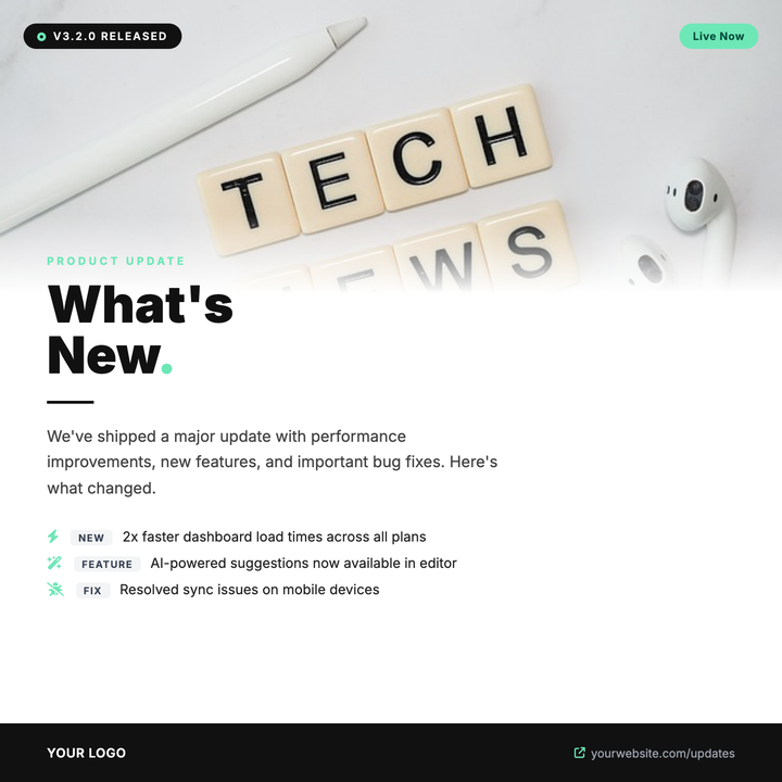
🚀 Product Update Flyer
Built for SaaS and software teams announcing version launches, feature drops, or patch notes. A full-bleed photo strip fades into a white canvas via a soft gradient, anchoring a bold 52px headline with mint-green accent highlights and a structured changelog list below. Dark pill badges call out version numbers and status at a glance, while the high-contrast dark-and-mint palette signals technical credibility.
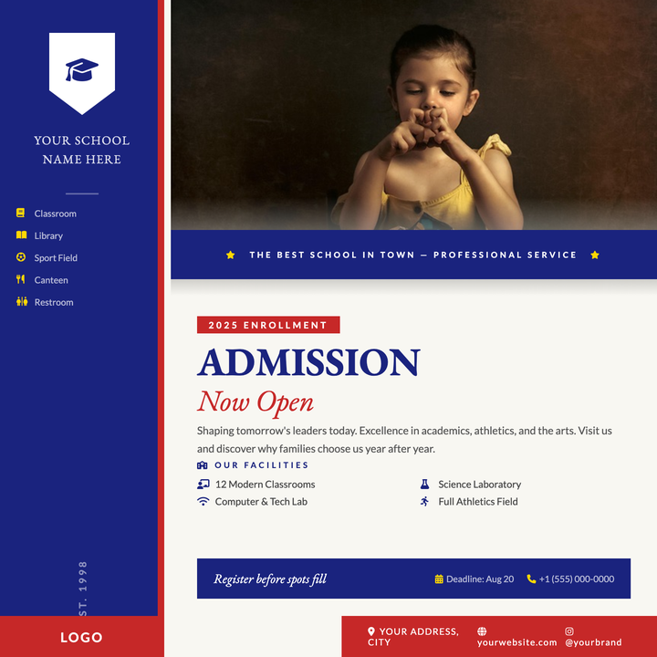
🏫 School Open House Flyer
A navy-and-crimson institutional layout built for schools promoting enrollment and open house events. A shield crest sidebar, bold serif admission headline, and photo-to-copy gradient flow guide families from aspiration to action. Facility icons and a deadline CTA block make key details impossible to miss.
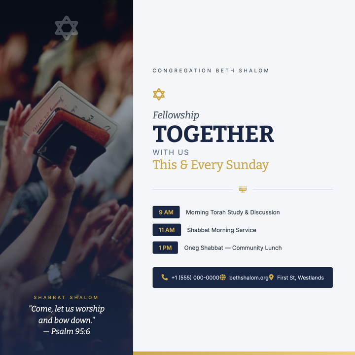
🕍 Synagogue Service Flyer
A two-column square layout pairing a full-bleed photo with a navy-and-gold typographic program panel. The left column anchors a congregational photo under a darkening navy scrim with a translucent Star of David watermark; the right column stacks the congregation name, Bitter-serif headline, schedule, and footer bar between framing gold gradient bars. Built for Shabbat announcements, High Holiday services, and Jewish cultural programming that calls for dignified warmth over festivity.
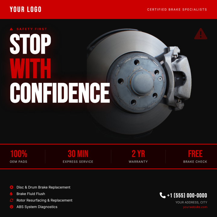
🚗 Brake Service Flyer
A high-contrast dark layout built for automotive brake and tire centers that need to project urgency and professionalism at a glance. Bold red headline accents, a dramatic photo panel with gradient blending, and a four-stat info strip deliver key service details fast. Ideal for seasonal inspections, limited-time offers, or express-service promotions.
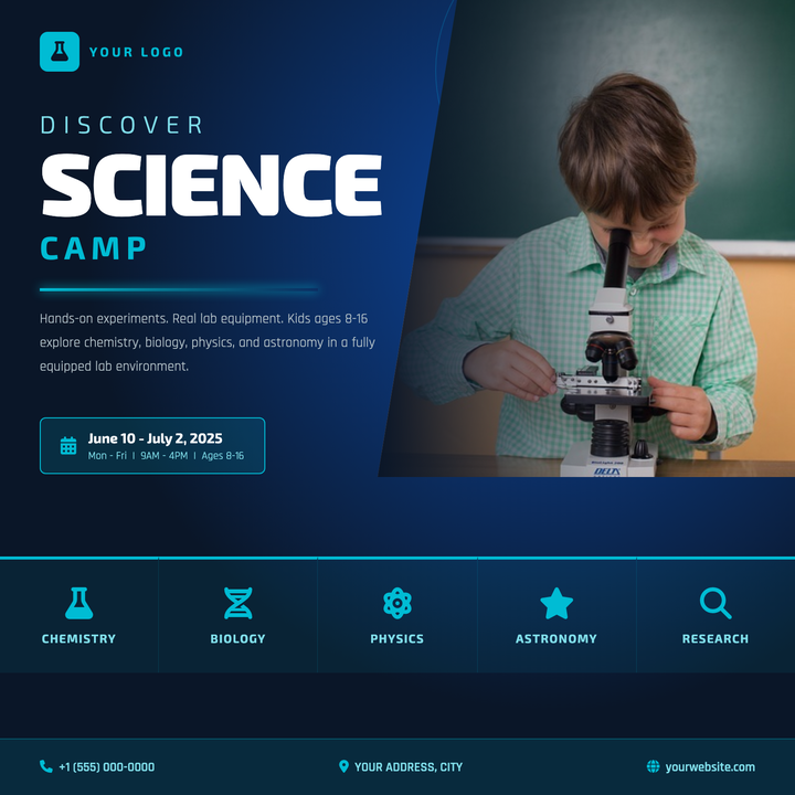
🔬 Science Camp Flyer
Built on a deep navy-to-black radial gradient, this template pairs an 88 px bold "Science" wordmark with a cyan glow-line divider and diagonal photo panel for a sharp, futuristic-educational look. Orbit ring decoratives and dot-node accents add depth without crowding the left-column content stack. Designed for STEM programs, summer camps, and youth lab workshops targeting parents on Instagram and Facebook.
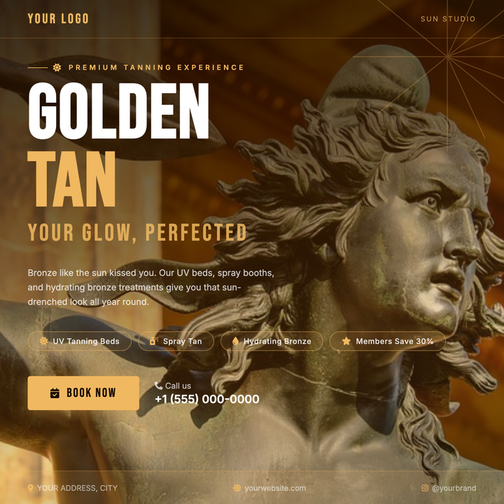
🌞 Tanning Salon Flyer
A warm, sun-drenched 800×800 design built for tanning salons and spray-tan studios. Oversized Bebas Neue headlines in deep espresso and amber-gold command attention, while a directional bronze scrim keeps text crisp over the full-bleed photo. Service pill tags, a bold CTA button, and a phone callout make it ready for Instagram posts, Facebook ads, or square digital signage.
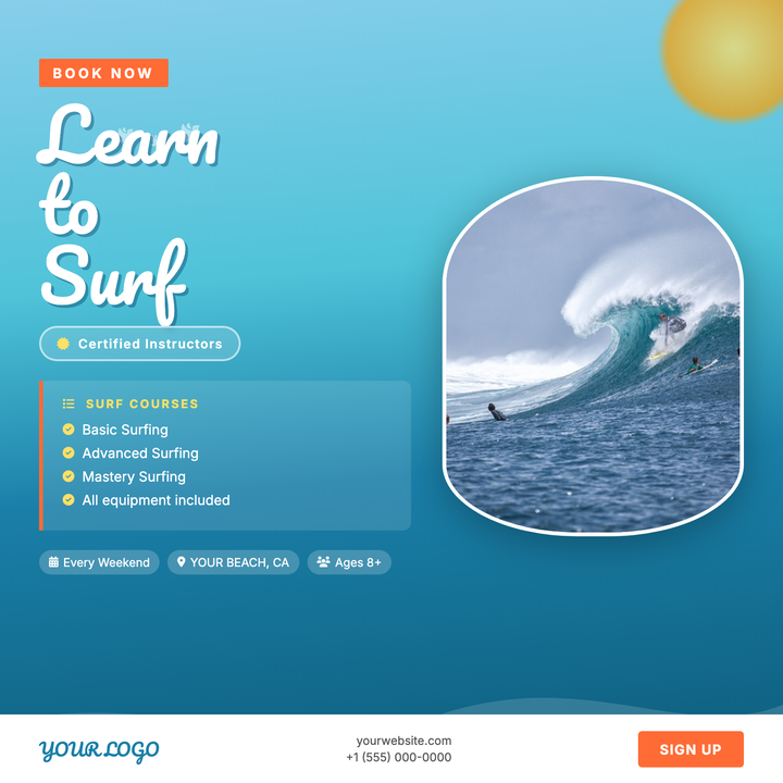
🏄 Surf Lesson Flyer
A sky-to-ocean gradient backdrop and Pacifico script headline set a sun-drenched coastal mood for surf schools and beachside programs. A coral-orange CTA button and course-list panel highlight key offerings, while an oval photo frame on the right draws the eye to action shots. Ideal for lesson series, paddleboard clinics, or waterfront summer camps.
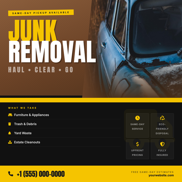
🚛 Junk Removal Flyer
Bold Anton headlines at 110px anchor a kraft-paper warm brown upper panel against a near-black base, with a parallelogram photo cutout blending seamlessly into the background. A #f5c400 yellow stripe divides the layout, drawing the eye to same-day service callouts, icon-tagged service lists, and a high-contrast CTA footer. Built for local hauling and cleanout companies that need to project speed and rugged reliability across social ads, doorhangers, and mailers.
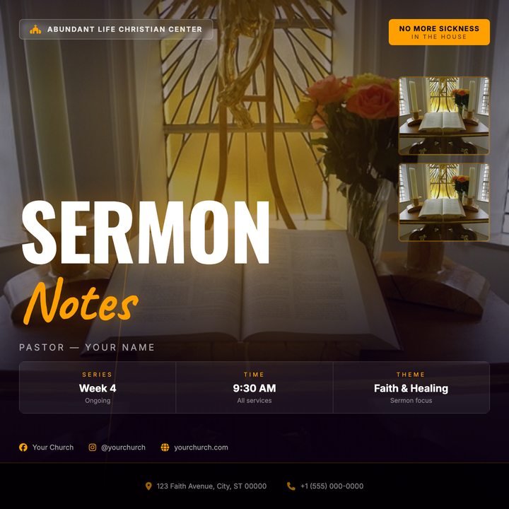
⛪ Sermon Series Flyer
A cinematic, stage-lit flyer built on a deep purple-to-black gradient with a full-bleed portrait photo and amber-gold radial spotlight glow. Oversized Oswald typography anchors the message while Caveat script adds a handwritten accent, and a frosted-glass church badge pairs with a bold amber series tag for key callouts. Built for faith communities promoting sermon series, revival nights, healing services, or guest preacher events.
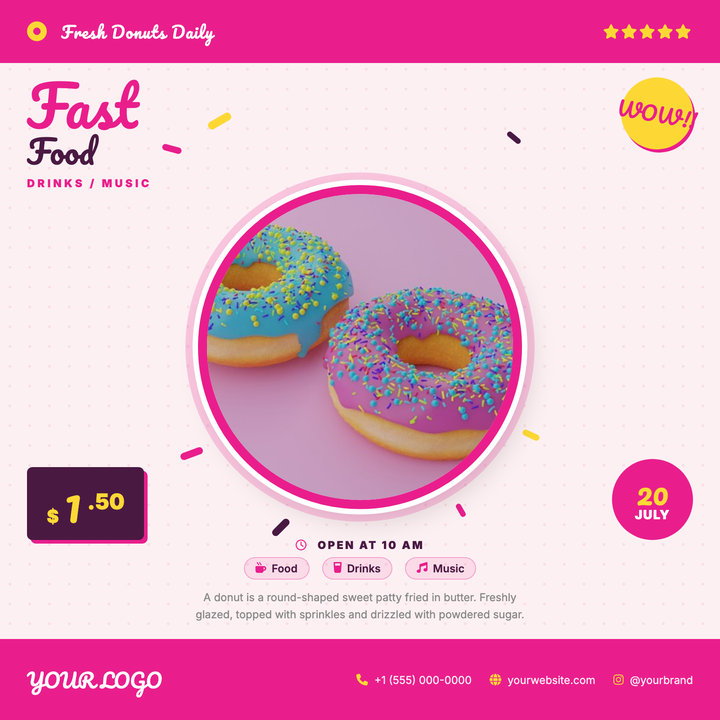
🍩 Donut Shop Flyer
A playful retro-style flyer built around a bold circular food photo framed in hot pink, scattered sprinkle accents, and a halftone dot background. Pacifico script headlines, a starburst callout, and a price badge make limited-time deals and grand openings pop. Ideal for donut shops, bakeries, or food trucks targeting a fun, family-friendly crowd.