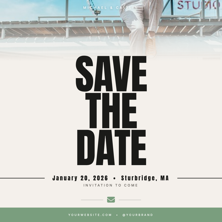
💌 Save the Date Card
A warm linen canvas anchors oversized Anton typography — three bold stacked lines of names and date — against a cropped couple photo that fades seamlessly into the background. A newspaper-stamp date bar, sage green envelope motif, and solid sage footer give this design a rustic-contemporary editorial feel. Built for weddings and intimate formal events where bold legibility does all the work.
What our users say
Join thousands of satisfied users who trust AIFlyer for their design needs
I actually checked this out because I was curious. I randomly thought something together and aiflyer.ai did a pretty good job. I did a simple prompt for a Birthday Brunch Invitation for April 4th @12:30 I was impressed the text was accurate. DALLE still has trouble sometimes. So great job!
Aovythegreat
Event Planner
As a small business owner, I was skeptical about AI design tools, but AIFlyer exceeded my expectations. The designs are beautiful and the process is incredibly intuitive.
Michael
Small Business Owner in Austin, TX
AIFlyer.ai has been a game-changer for our marketing team. We've been able to create beautiful flyers and social media posts in no time.
Fun_Cobbler1939
Social Media Manager
Hi, I just subscribed for AIFlyer and was really impressed. Game-changer for our marketing team! We need to make a lot of flyers for our social media campaigns and this has been so helpful.
David
Marketing Manager
No credit card needed
More Templates to Explore
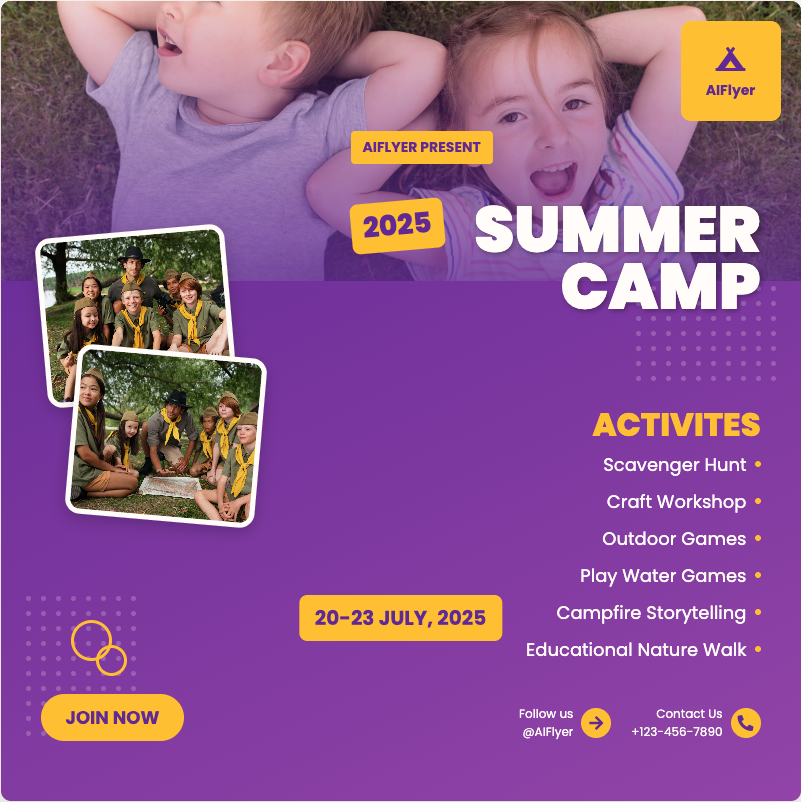
🏕️ Summer Camp Flyer
A bold, outdoor-coded square flyer built for youth and family camp promotions. The Bungee slab headline crashes over a full-bleed photo with a darkening scrim, flanked by handwritten Caveat script and wide-spaced Anton caps in golden yellow. A forest-green lower section houses an activity icon grid and date strip, giving programs a clear, energetic way to display registration details at a glance.

🎪 Circus Flyer
Dazzling big top templates featuring performer silhouettes and ticket stubs to promote touring shows and carnival events. These exciting designs highlight acrobat lineups, animal act disclaimers, and VIP meet-and-greet opportunities with family bundle pricing.
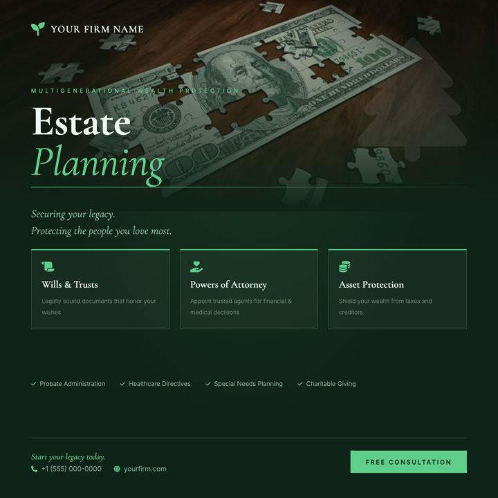
🌿 Estate Planning Flyer
A deep emerald canvas with a ghost tree watermark and serif display headline projects quiet authority for law firms and fiduciary practices. A photo-to-dark gradient scrim, gold-green accent rule, and three-column service grid clearly communicate trust, legacy, and long-term stewardship. Built for seminar promotions, planned-giving campaigns, and wealth management announcements.
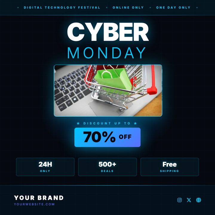
💻 Cyber Monday Sale Flyer
A deep near-black canvas with electric-cyan circuit grid lines and a radial blue glow sets a high-voltage digital mood. Bold Inter 900 headline type contrasts with a light-weight secondary line, while a gradient pill badge spotlights the discount and a three-column stats row seals the deal. Built for tech retailers, SaaS promos, and electronics drops that need urgency without sacrificing polish.
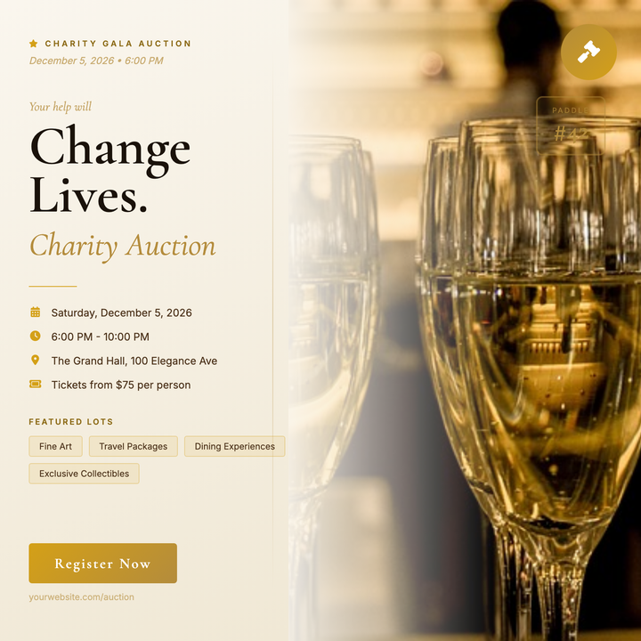
🔨 Charity Auction Flyer
A split-column layout pairs a warm parchment left panel with a full-bleed lifestyle photo, unified by a seamless gold scrim. Serif display headlines, a circular gold medallion badge, and a paddle-number card reinforce the ceremonial auction aesthetic. Built for nonprofit galas, benefit dinners, and museum auction nights where donor trust is the first impression.
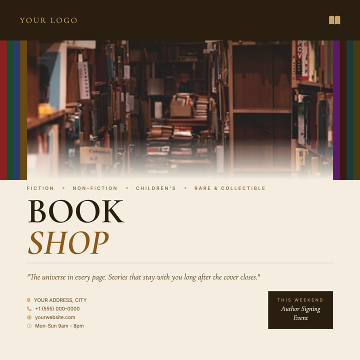
📚 Bookstore Flyer
A warm, editorial-style flyer built on a parchment `#f5ede0` ground with Cormorant Garamond serif typography and a rich espresso-and-gold palette. Decorative book-spine columns frame a full-width atmospheric photo, while layered gradient scrims blend the image seamlessly into the copy zone below. Ideal for independent bookstores, author signings, literary events, and book fairs where heritage craft and curation matter more than hard-sell promotions.
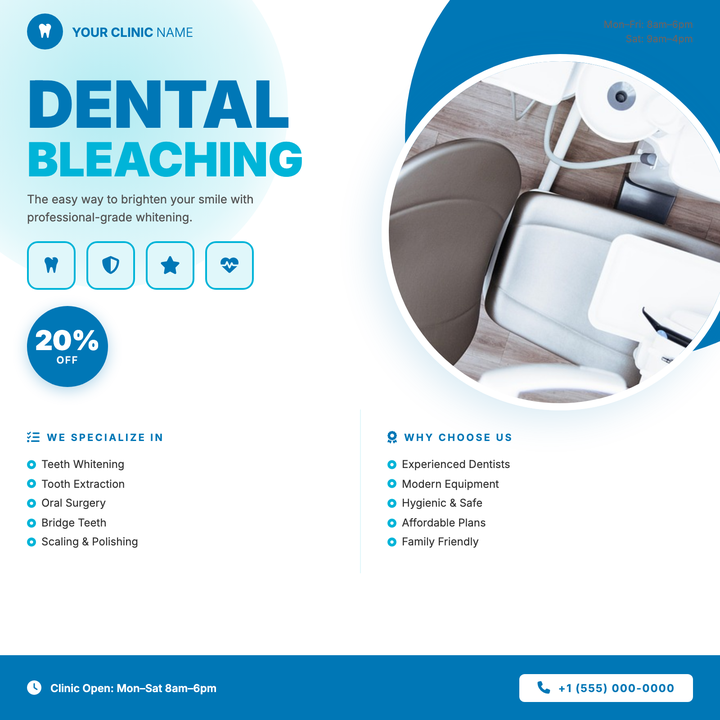
🦷 Dental Office Flyer
A clean, clinical-friendly layout built around a bold cyan-and-blue headline, circular patient portrait, and a prominent discount badge — ideal for whitening promos or treatment offers. Four icon tiles bridge the headline to a scannable two-column service list, while the deep `#0077b6` footer anchors the call-to-action. Suits family dental practices and upscale cosmetic smile-design campaigns alike.
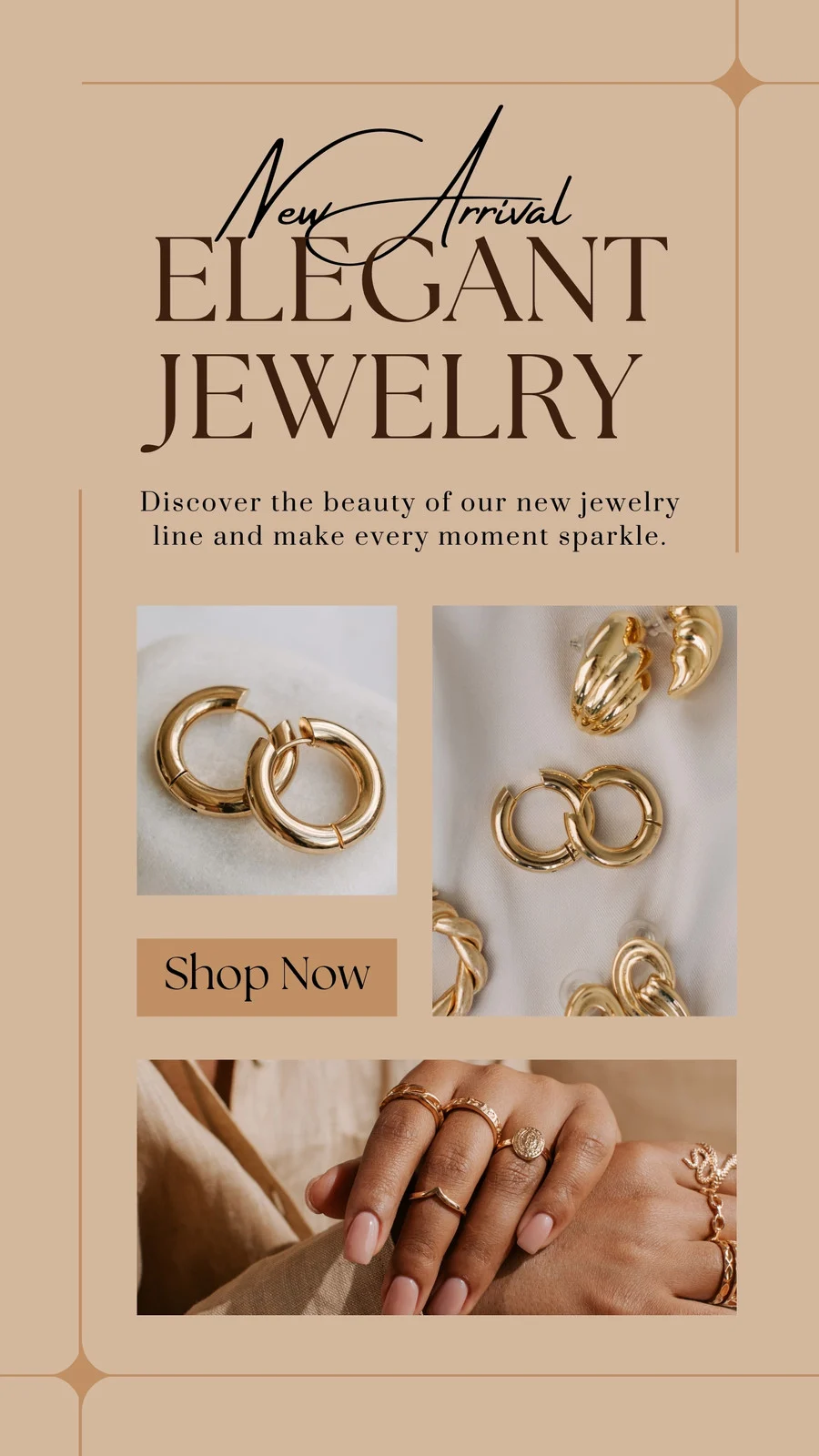
📿 Jewelry Store Flyer
Handcrafted accessory templates featuring material close-ups and finished piece shots to promote Jewery store product sales. These detailed designs highlight bead selection options, technique difficulty levels, and sales promotion with package deals.
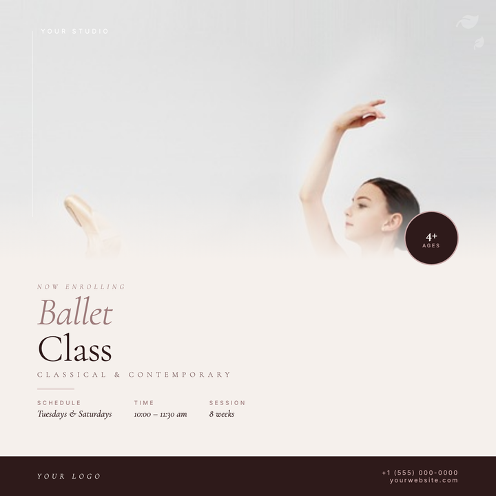
🩰 Ballet Class Flyer
A square, Instagram-ready flyer built for boutique dance studios running enrollment campaigns. A full-bleed dancer photo fades painterly into a warm cream field via a soft scrim, with a bold 62px headline anchored in espresso, a dusty-rose divider, and a clean three-column details row for class info. Ideal for ballet, barre, or contemporary studios that lead with artistry over price.
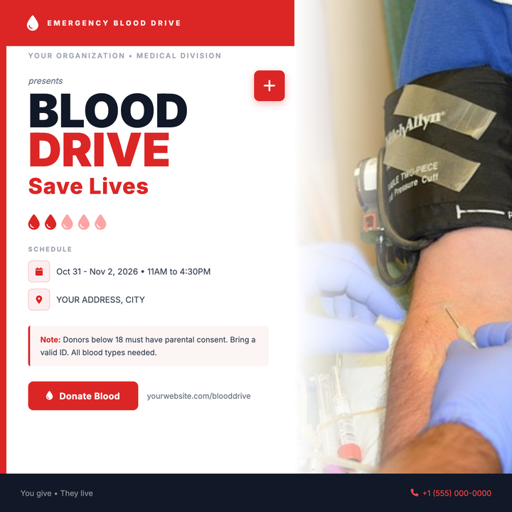
🩸 Blood Drive Flyer
A bold, clinically urgent layout built for blood drives and donor recruitment campaigns. Deep red headers, heavyweight 72px Inter headlines, and a structured schedule block project institutional credibility, while a full-bleed photo panel and vivid #dc2626 CTA button drive immediate action. Ideal for hospital systems, Red Cross chapters, or corporate wellness teams promoting donation events.
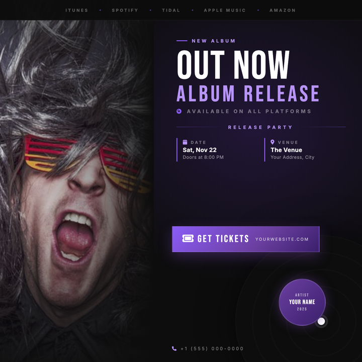
🎵 Album Release Party Flyer
A moody, cinema-dark 800×800 social tile built for album drops, vinyl releases, and listening sessions. A full-bleed photo column fades into near-black (#0D0D0D), anchored by a massive 88px Bebas Neue headline and a violet two-tier typographic stack. Streaming bar, event details grid, and a sharp gradient CTA button give artists and venue promoters every callout they need in one punchy layout.
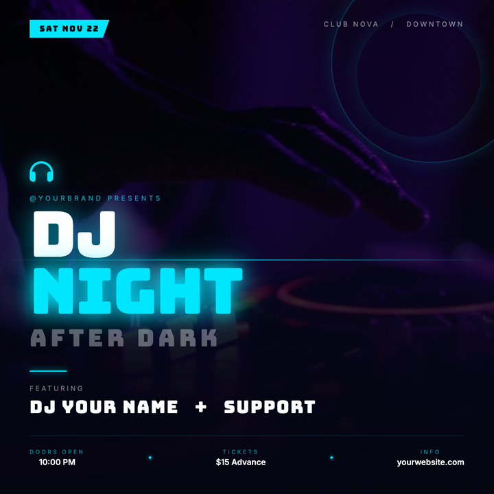
🎧 DJ Night Flyer
Built on a deep navy-black canvas with a vivid cyan accent, this template layers a full-bleed photo under a dark gradient scrim, keeping bold Bungee headlines and DJ details crisp and legible. Neon halo rings, a cyan scan-line divider, and glowing text shadows give the layout a premium-underground club feel. Ideal for DJ residencies, electronic music showcases, and late-night events targeting an 18–35 crowd.
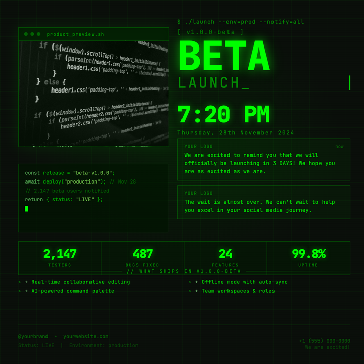
🖥️ Beta Launch Flyer
A CRT terminal-style announcement flyer built on a near-black base with pure #00ff00 green accents, scanline overlays, and a faux OS window holding a luminosity-blended product image. The 88px bold headline, monospace CLI eyebrow, live code snippet panel, and blinking cursor signal credibility to technical audiences. Built for beta program launches, developer release posts, and gaming alpha announcements.
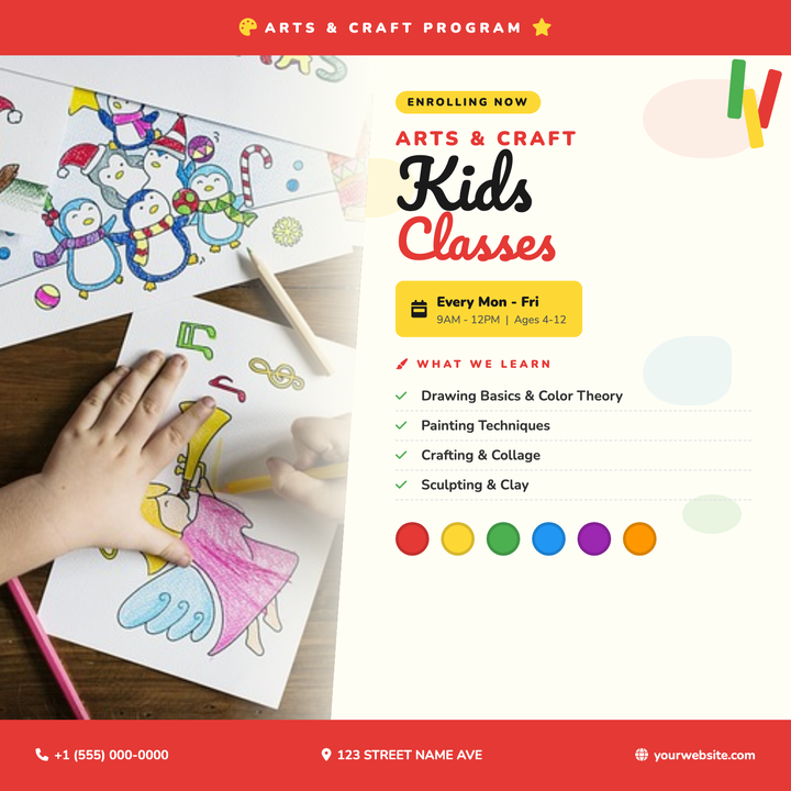
🎨 Kids Art Class Flyer
Bold Pacifico display headlines and a vivid red-and-yellow palette give this flyer an energetic, playful feel built for parents scanning fast. A diagonal photo panel on the left bleeds into an editorial stack featuring a bright yellow schedule badge, a learn-list, and a clear contact footer. Ideal for after-school art programs, summer camps, and community center kids' workshops.
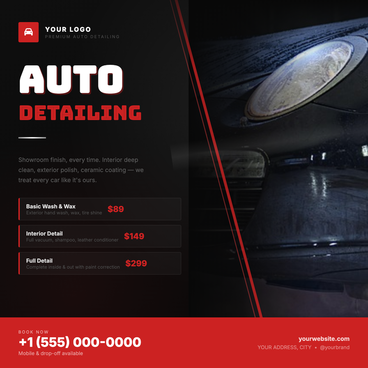
🚗 Auto Detailing Flyer
A dark chrome aesthetic with a bold red accent slash and right-anchored car photo makes this flyer ideal for detailing shops and mobile detailers. Tiered package cards with frosted borders and crimson price callouts let you showcase three service levels at a glance. Built for social media drops, digital ads, or print handouts promoting seasonal specials or grand openings.
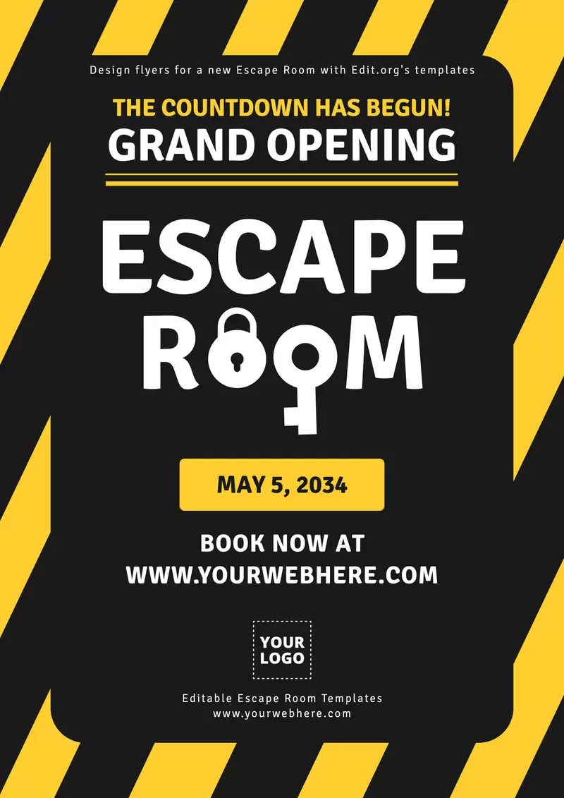
🧩 Escape Room Flyer
Puzzle adventure templates featuring locked chests and timer graphics to promote immersive game experiences. These intriguing designs highlight difficulty levels, group size recommendations, and corporate team-building packages with leaderboard challenges and photo op rewards.
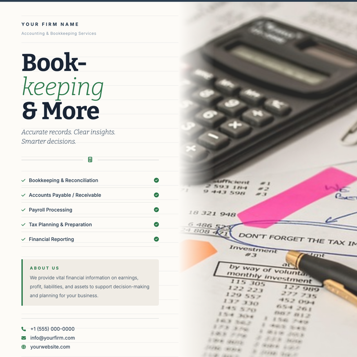
🧾 Bookkeeping Services Flyer
A split-layout flyer with a warm cream-and-navy palette, ledger-line background, and Bitter serif headlines — built for bookkeeping, accounting, and tax prep firms. The italic green accent in the headline, structured service rows, and restrained typography project credibility and order. Ideal for free-consultation campaigns targeting small business owners.
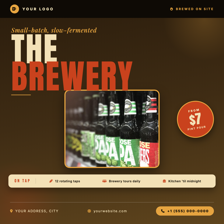
🍺 Brewery Event Flyer
Built on a deep forest-green radial gradient with stadium-scale Bebas Neue typography, this template puts a bold 2-for-1 callout and performer credit front and center. A glowing centered product photo panel anchors the layout, while warm cream text and atmospheric smoke overlays give it a premium nightlife edge. Ideal for taprooms, bar nights, and tap takeover promotions.
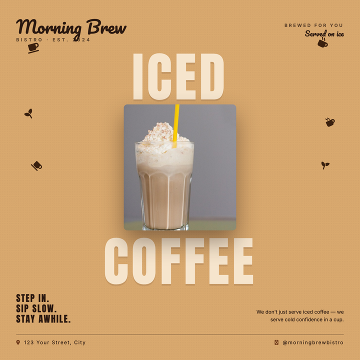
☕ Coffee Shop Flyer
A bold split-headline layout pairs oversized Anton type ("ICED" + "COFFEE") in pale cream against a warm caramel field, sandwiching a centered hero product photo for a deliberate top-to-bottom visual read. Pacifico script branding anchors the upper corners while scattered coffee bean icons add organic energy to the side margins. Built for cafés, cold-brew launches, and seasonal iced-beverage promos — equally at home as an Instagram square or in-store print poster.
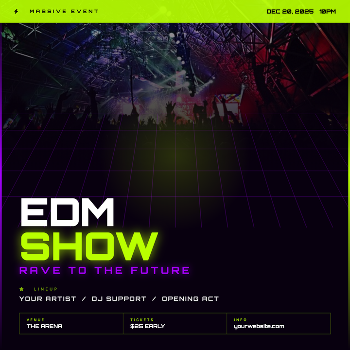
🎛️ EDM Show Flyer
Built for DJ nights, raves, and club promos, this template pairs Orbitron type with an acid-green-on-near-black palette that pops at 2 AM. A perspective laser grid, centered glow orb, and neon beam accents frame your lineup and event details in a futuristic LED-screen aesthetic. Top-band date callouts and a seamless photo-to-dark scrim keep the layout clean and high-energy.
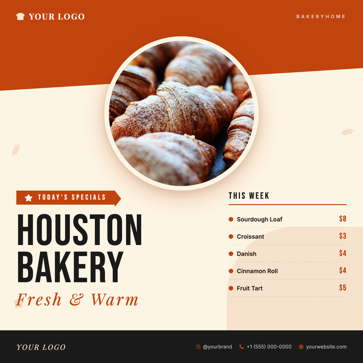
🥐 Bakery Specials Flyer
A warm rust-on-cream layout built for neighbourhood bakeries and artisan food stalls to showcase rotating daily or weekly specials. A circular hero photo straddles the diagonal terracotta header and cream canvas, while Bebas Neue headlines and Playfair Display italics anchor the left column and a clean priced specials grid sits right. Ideal for Instagram posts, in-store menu boards, or seasonal launches.

📊 Data Science Flyer
Tech education templates featuring code snippets and analytics dashboards to promote coding bootcamps and AI workshops. These cutting-edge designs highlight Python/R curriculum, career support services, and alumni success stories with early enrollment discounts.
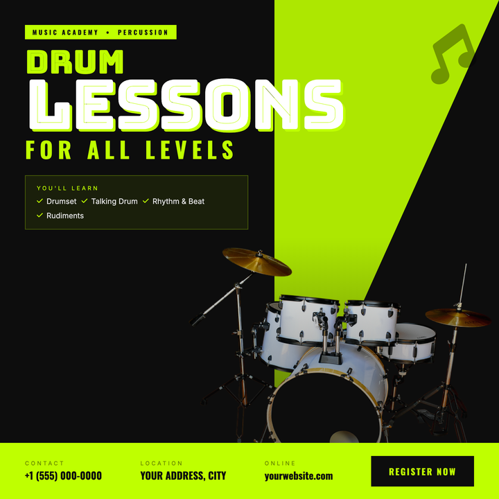
🥁 Drum Lesson Flyer
A high-energy two-tone layout built for drum instructors and music academies. Electric lime (#bfff00) slashes across a near-black canvas via a bold diagonal triangle, with Bungee Inline headlines up to 110 px commanding instant attention. A bleed drum photo, vignette fading, and a bottom event bar with contact, location, and sign-up callouts drive enrollment fast.
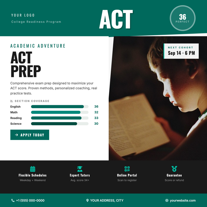
📝 ACT Prep Flyer
A data-forward layout built for test prep programs that need to show measurable results at a glance. Features a bold score dial, section-by-section teal bar chart, and a four-column feature grid — all anchored by sharp diagonal panel cuts and a deep teal-and-white palette. Ideal for tutoring centers, school counselors, and college-readiness cohorts targeting achievement-driven students and parents.
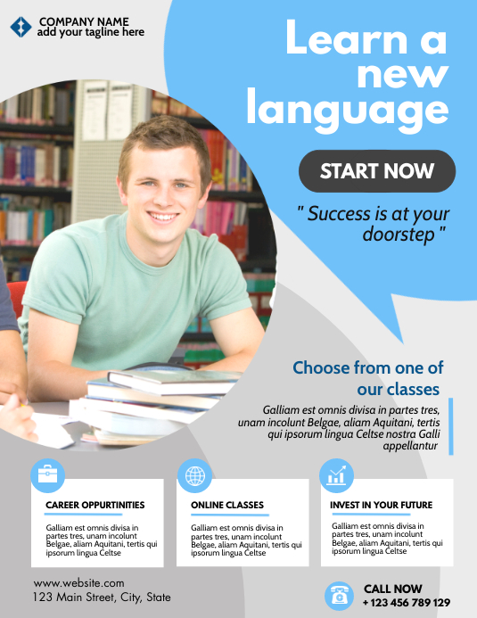
🌍 Language Class Flyer
Multilingual education templates featuring speech bubbles and cultural landmarks to promote language immersion programs. These global designs highlight beginner-friendly approaches, native speaker instructors, and conversation club schedules with free trial lesson offers.
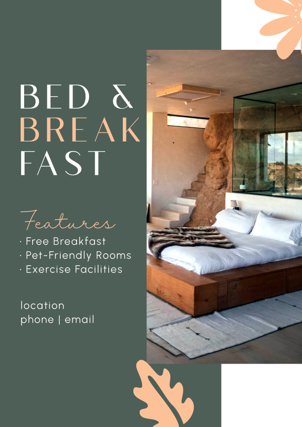
🛏️ Bed & Breakfast Flyer
Charming hospitality templates featuring room vignettes and local attraction maps to promote inns and guesthouses. These cozy designs highlight homemade breakfast menus, seasonal packages, and pet-friendly policies with walking distance to downtown badges.

📅 Community Calendar Flyer
Organized event templates featuring monthly grids and location pins to promote neighborhood activities and local happenings. These clear designs highlight festival dates, volunteer opportunities, and contact details with community-centric visuals that encourage civic participation and social connections.
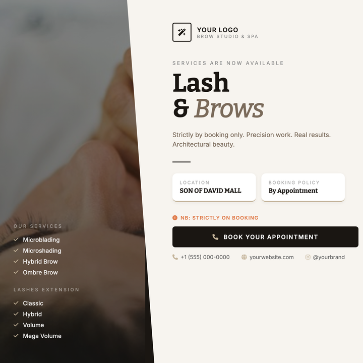
💆 Brow Studio Flyer
A moody split-panel layout built for appointment-driven beauty services — brow studios, lash bars, and boutique spas. A diagonal CSS slash divides a darkened editorial portrait from a warm off-white reading panel, while Bitter serif headlines and a dusty gold accent thread anchor the typographic hierarchy. Ideal for service menu rollouts, seasonal campaigns, and launch announcements where craft and precision matter.
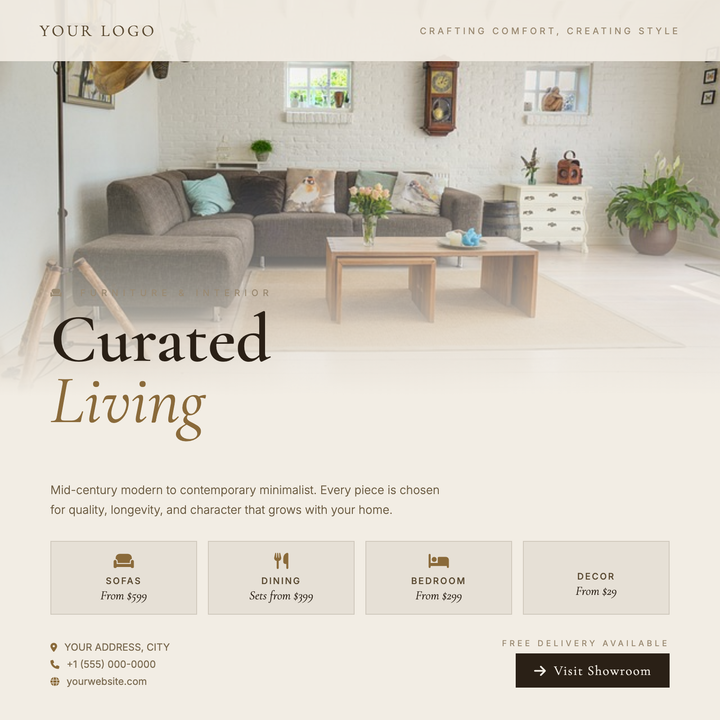
🛋️ Furniture Store Flyer
A warm, editorial layout built for boutique furniture showrooms and home goods brands. The full-bleed lifestyle photo dissolves into a cream content area via a gradient scrim, while Cormorant Garamond headlines at 76px and a muted warm-neutral palette signal craftsmanship. Use it for collection launches, showroom openings, or consultation promotions targeting style-conscious buyers.
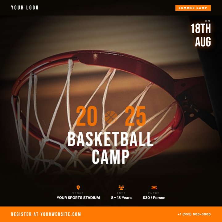
🏀 Basketball Camp Flyer
Built on a dark hardwood-texture canvas with a vivid orange accent, this template layers a full-bleed action photo behind a heavy vignette scrim for an athletic premium look. Bebas Neue headers, a three-column info strip, and a solid orange CTA bar keep dates, location, and contact details scannable at a glance. Ideal for youth camps, clinics, tryouts, and open gym sessions promoted on Instagram, Facebook, or printed gym flyers.