🌶️ Hot Sauce Flyer
Spicy food templates featuring pepper heat scales and product lineup shots to promote artisanal sauce brands and tasting events. These bold designs highlight Scoville ratings, ingredient sourcing, and limited batches with subscription club options and merch bundles.

What our users say
Join thousands of satisfied users who trust AIFlyer for their design needs
I actually checked this out because I was curious. I randomly thought something together and aiflyer.ai did a pretty good job. I did a simple prompt for a Birthday Brunch Invitation for April 4th @12:30 I was impressed the text was accurate. DALLE still has trouble sometimes. So great job!

Aovythegreat
Event Planner
As a small business owner, I was skeptical about AI design tools, but AIFlyer exceeded my expectations. The designs are beautiful and the process is incredibly intuitive.

Michael
Small Business Owner in Austin, TX
AIFlyer.ai has been a game-changer for our marketing team. We've been able to create beautiful flyers and social media posts in no time.

Fun_Cobbler1939
Social Media Manager
Hi, I just subscribed for AIFlyer and was really impressed. Game-changer for our marketing team! We need to make a lot of flyers for our social media campaigns and this has been so helpful.

David
Marketing Manager
No credit card needed
Frequently Asked Questions
More Templates to Explore
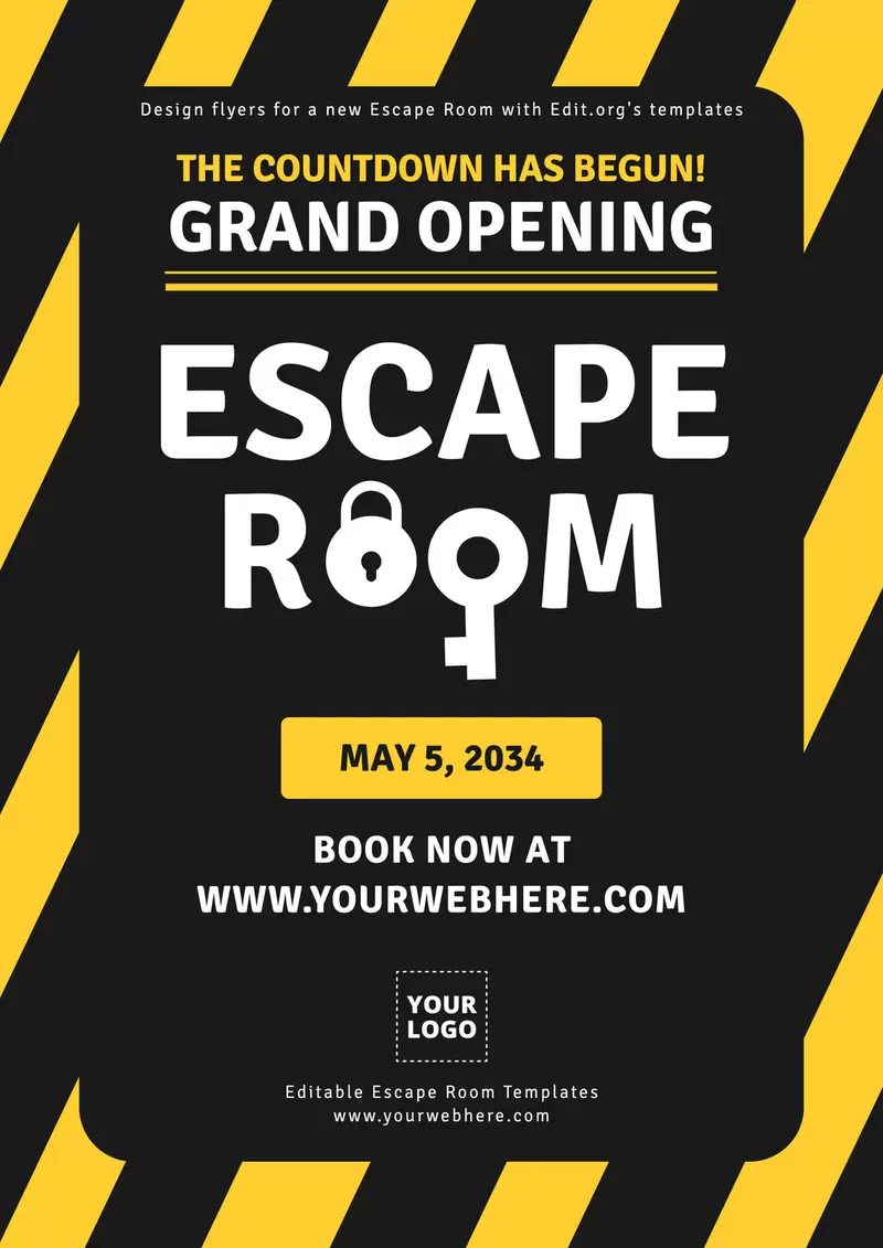
🧩 Escape Room Flyer
Puzzle adventure templates featuring locked chests and timer graphics to promote immersive game experiences. These intriguing designs highlight difficulty levels, group size recommendations, and corporate team-building packages with leaderboard challenges and photo op rewards.

🛶 Kayak Rental Flyer
Outdoor adventure templates featuring waterway maps and safety gear to promote paddle sports and eco-tours. These nature-focused designs highlight sunset tour specials, wildlife spotting guides, and waterproof phone case rentals with group discount tiers.
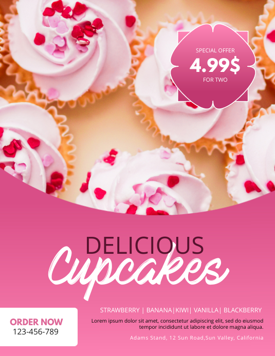
🧁 Cupcake Decorating Flyer
Sweet baking templates featuring frosting techniques and sprinkle close-ups to promote culinary workshops and bakery events. These delicious designs highlight themed class series, take-home boxes, and allergy-friendly options with birthday party package add-ons.
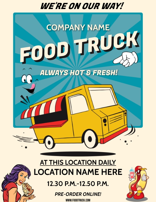
🚛 Food Truck Flyer
Mobile cuisine templates featuring menu boards and location schedules to promote gourmet trucks and pod events. These mouthwatering designs highlight signature items, vegan/gluten-free options, and live-tracker QR codes with loyalty punch card programs.

📊 Data Science Flyer
Tech education templates featuring code snippets and analytics dashboards to promote coding bootcamps and AI workshops. These cutting-edge designs highlight Python/R curriculum, career support services, and alumni success stories with early enrollment discounts.
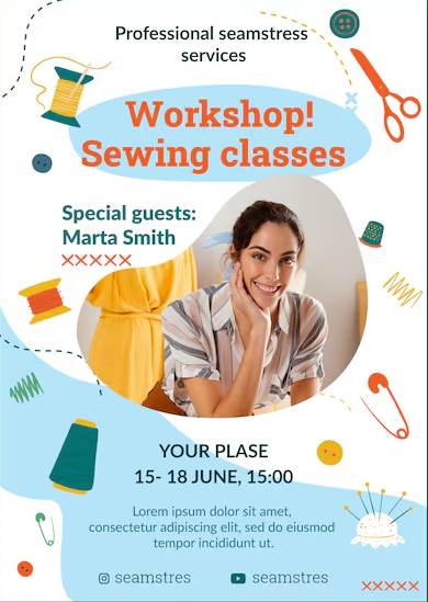
🧵 Sewing Class Flyer
Handmade craft templates featuring fabric stacks and machine close-ups to promote stitching workshops and alteration services. These detailed designs highlight project difficulty levels, supply lists, and take-home pattern inclusions with multi-class package deals.

🪴 Plant Nursery Flyer
Botanical garden templates featuring seasonal blooms and care instructions to promote garden centers and workshops. These lush designs highlight beginner-friendly houseplants, potting station amenities, and loyalty program perks with free repotting demo schedules.
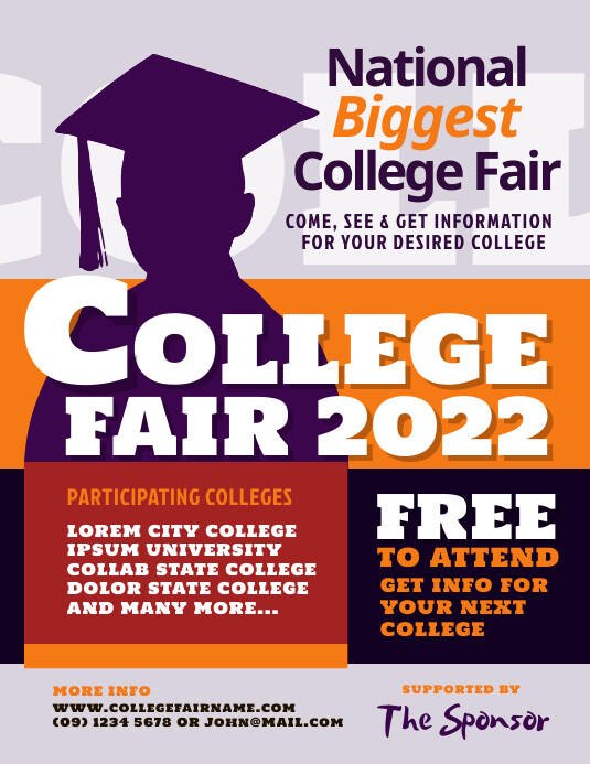
🎓 College Fair Flyer
Academic recruitment templates featuring campus skyline and mascot graphics to promote higher education events. These informative designs highlight participating universities, financial aid seminars, and alumni panels with registration requirements and parking instructions.
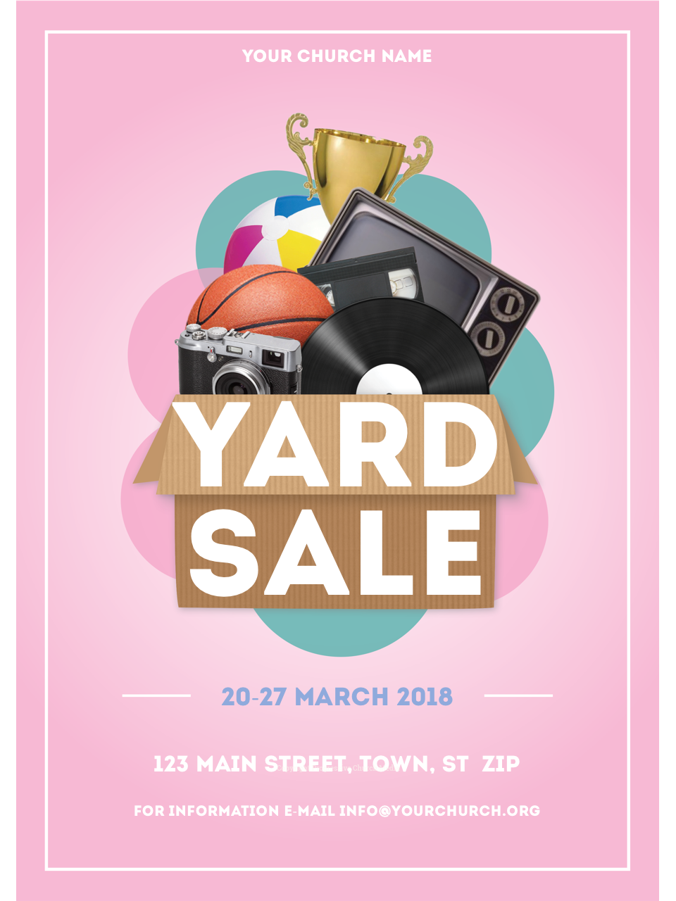
🛍️ Yard Sale Flyer
Exclusive shopping templates featuring clothing racks and percentage-off badges to promote designer clearance events. These urgent designs highlight VIP early access, fitting room policies, and payment options with countdown timers to build scarcity.

🎯 Axe Throwing Flyer
Adventure sport templates featuring target close-ups and safety gear to promote urban lumberjack experiences. These action-packed designs highlight league play options, corporate event packages, and scorecard systems with happy hour specials and photo wall setups.

🧀 Cheese Tasting Flyer
Gourmet food templates featuring charcuterie boards and pairing guides to promote fromagerie events and classes. These sophisticated designs highlight regional selections, expert presenter credentials, and wine/spirit accompaniment options with take-home tasting notes.
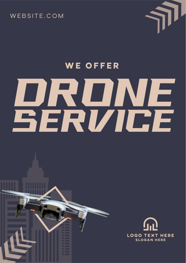
🚀 Drone Photography Flyer
Aerial media templates featuring landscape shots and equipment close-ups to promote drone pilot services. These elevated designs highlight real estate package options, FAA compliance badges, and turnaround times with sample footage QR codes.
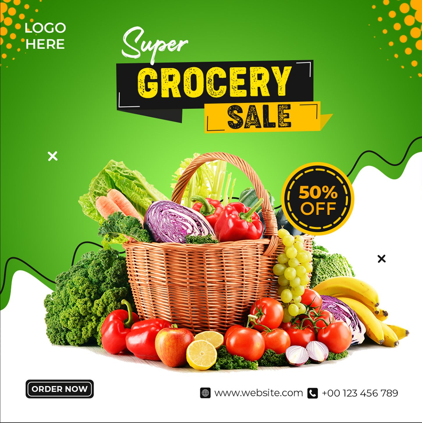
🛒 Grocery Sale Flyer
Appetizing supermarket templates featuring produce close-ups and price badges to promote weekly specials and food discounts. These mouthwatering designs highlight BOGO deals, loyalty card savings, and meal bundle ideas with store maps and peak hour reminders for shoppers.

🛍️ Retail Sale Flyer
High-converting retail flyer templates showcasing products with clean grids, discount badges, and limited-time offer countdown timers. These promotional designs help stores drive foot traffic and online sales by highlighting bestsellers, bundle deals, and loyalty program benefits with attention-grabbing visuals.
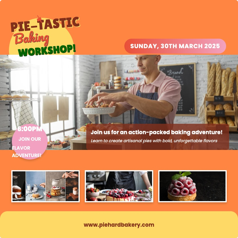
🍩 Bakery Promotion Flyer
Mouthwatering bakery templates featuring product close-ups, seasonal specials, and ingredient callouts for patisseries and dessert shops. These appetizing designs increase orders by highlighting limited-edition flavors, holiday bundles, and loyalty rewards programs with clear pricing and pickup/delivery options. Ideal for promoting custom cakes, gluten-free options, and barista-crafted beverages with tempting food photography.

🌱 Farmers Market Flyer
Rustic market templates featuring seasonal produce grids, vendor spotlights, and recipe ideas for local food events. These community-focused designs attract shoppers by highlighting organic certifications, live demonstrations, and SNAP payment options with farm-fresh photography and map layouts. Essential for promoting CSA subscriptions, harvest festivals, and artisanal craft fairs celebrating regional producers.
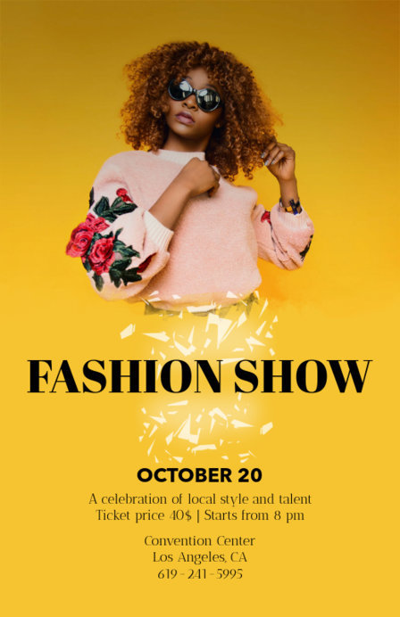
👗 Fashion Show Flyer
Chic runway templates featuring model silhouettes and fabric swatches to promote boutique openings and style events. These trendy designs highlight designer spotlights, ticket tiers, and VIP goody bags with hashtag prompts and social media contest details for fashion influencers.

🍳 Cooking Class Flyer
Appetizing culinary templates featuring ingredient close-ups and chef demonstrations to promote kitchen workshops and food education. These flavorful designs highlight cuisine specialties, dietary accommodations, and take-home recipes with wine pairing add-ons and private group rates.
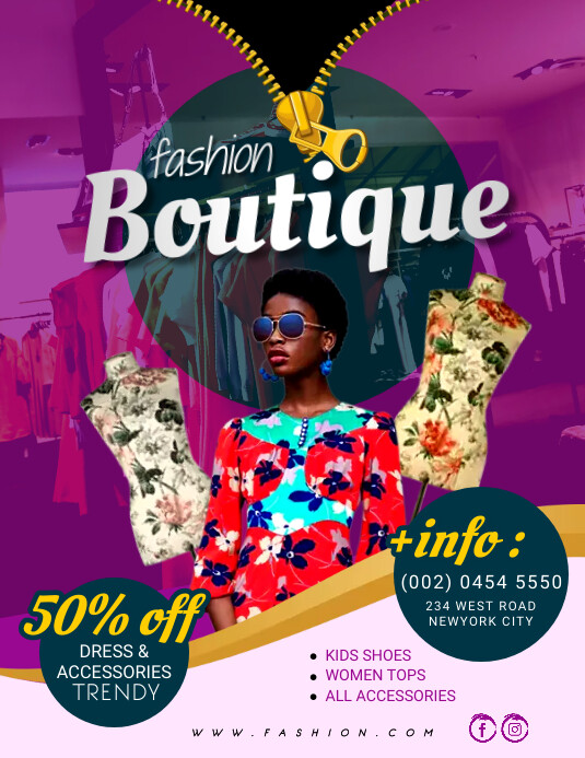
🛍️ Boutique Sale Flyer
Chic retail templates featuring mannequin displays and accessory close-ups to promote fashion sales and small business specials. These stylish designs highlight limited-edition arrivals, personal shopping options, and loyalty program perks with Instagram contest details for local shoppers.
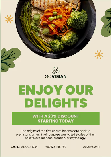
🌿 Vegan Cafe Flyer
Plant-based culinary templates featuring colorful bowl shots and ingredient callouts to promote vegan restaurants and juice bars. These fresh designs highlight seasonal menus, meal prep options, and sustainability practices with nutrition facts and allergen information.

🛒 Thrift Store Flyer
Vintage shopping templates featuring treasure hunt motifs and price tag badges to promote secondhand boutiques and charity shops. These eco-friendly designs highlight weekly color tag specials, donation guidelines, and volunteer opportunities with community impact stats.
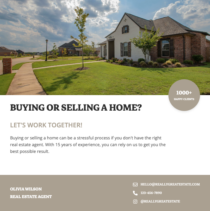
🏠 Real Estate Flyer
Professionally designed real estate flyer templates that showcase properties with high-resolution photos, virtual tour QR codes, and compelling property details. Perfect for real estate agents looking to attract buyers with visually stunning listings that highlight square footage, amenities, and neighborhood highlights for maximum engagement.
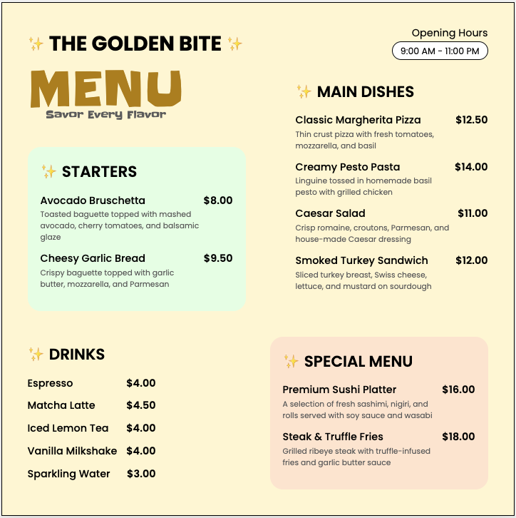
🍴 Restaurant Menu Design
Appetizing restaurant flyer templates featuring food photography that highlights your signature dishes, specials, and happy hour deals. These customizable menu designs help restaurants increase orders with clear pricing, dietary labels, and scannable QR codes linking to online ordering systems or reservation platforms.
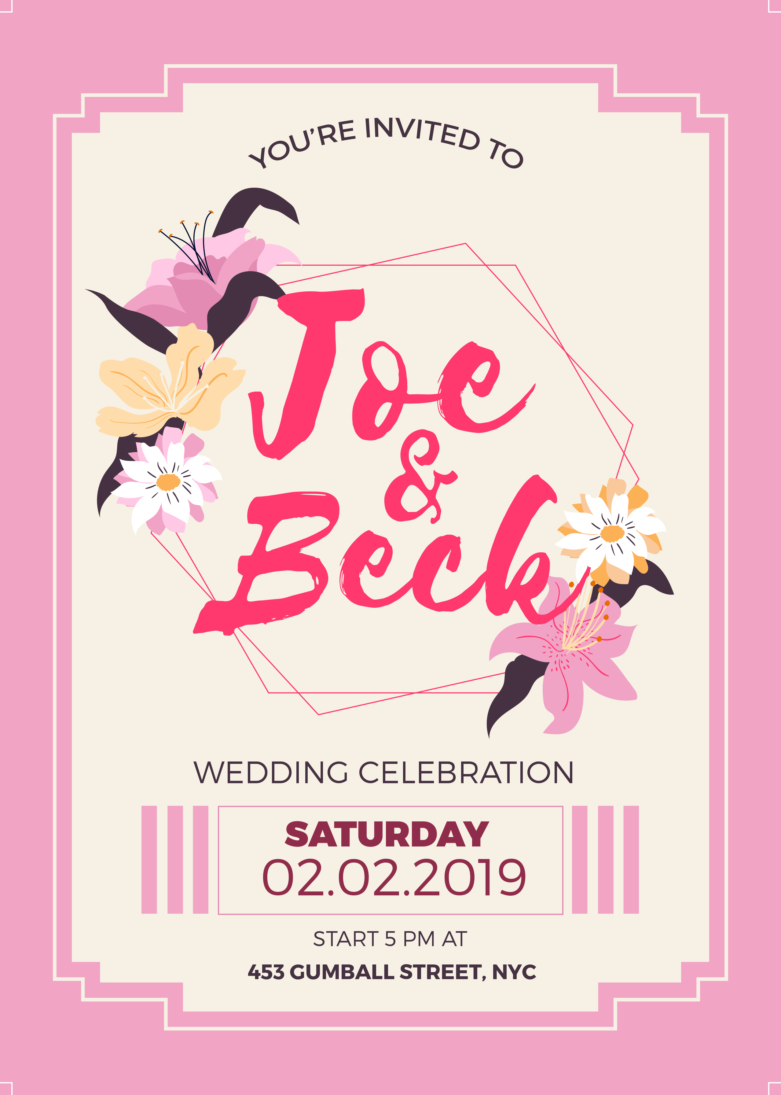
💍 Wedding Invitation
Elegant wedding flyer templates featuring romantic typography, floral motifs, and premium paper textures for save-the-dates, invitations, and RSVP cards. These designs help couples communicate wedding details like venue maps, dress codes, and registry information while setting the tone for their special day.

🎓 Graduation Flyer
Celebratory graduation flyer templates featuring academic motifs like diplomas, caps, and school colors for announcements, party invites, and ceremony programs. These designs help schools and families highlight graduate achievements, event schedules, and memorable quotes while incorporating photo collages of school memories.
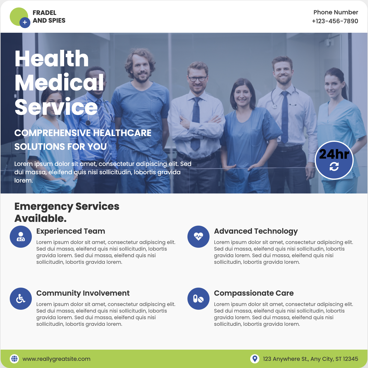
🏥 Medical Practice Flyer
Trust-building medical flyer templates featuring clean layouts, doctor profiles, and service icons for clinics, dentists, and specialists. These HIPAA-compliant designs help healthcare providers explain treatment options, showcase patient testimonials, and promote wellness events with professional yet approachable aesthetics.

🎭 Theater Event Flyer
Dramatic theater flyer templates featuring play titles in bold typography, cast headshots, and moody lighting effects for performances. These artistic designs help venues sell tickets by highlighting show dates, venue maps, and critic reviews while capturing the essence of dramatic productions.

🚗 Auto Repair Flyer
Professional auto repair flyer templates featuring service checklists, coupon cutouts, and vehicle diagrams for mechanics and detailers. These designs help shops promote oil change specials, brake inspections, and seasonal maintenance packages with easy-to-scan service menus and warranty information.
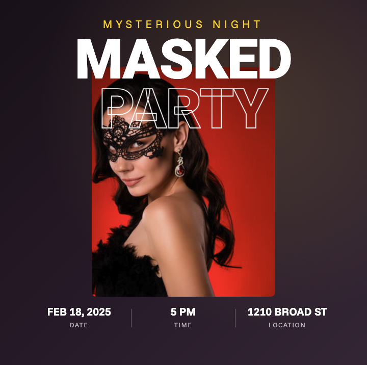
🎂 Birthday Party Flyer
Vibrant birthday flyer templates featuring age-appropriate themes from cartoon characters for kids to elegant motifs for adults. These customizable designs help hosts communicate party details like RSVP deadlines, gift registries, and dress codes while incorporating fun photo booths and activity schedules.
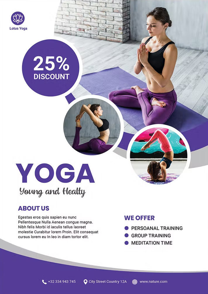
🌿 Yoga Class Flyer
Serene yoga flyer templates featuring peaceful nature backdrops, pose sequences, and mindfulness quotes for studios and instructors. These calming designs help promote class schedules, workshop series, and retreat packages while highlighting benefits like stress reduction and improved flexibility.