❄️ Snow Removal Flyer
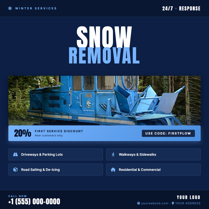
Bold Anton condensed headlines in deep-navy and icy periwinkle blue set an urgent, cold-weather tone for plow and de-icing promotions. A translucent header band flags service category and 24/7 availability at a glance, while a gradient discount band highlights first-time promo codes. Built for local contractors and property maintenance crews running winter storm campaigns.
What our users say
Join thousands of satisfied users who trust AIFlyer for their design needs
I actually checked this out because I was curious. I randomly thought something together and aiflyer.ai did a pretty good job. I did a simple prompt for a Birthday Brunch Invitation for April 4th @12:30 I was impressed the text was accurate. DALLE still has trouble sometimes. So great job!
Aovythegreat
Event Planner
As a small business owner, I was skeptical about AI design tools, but AIFlyer exceeded my expectations. The designs are beautiful and the process is incredibly intuitive.
Michael
Small Business Owner in Austin, TX
AIFlyer.ai has been a game-changer for our marketing team. We've been able to create beautiful flyers and social media posts in no time.
Fun_Cobbler1939
Social Media Manager
Hi, I just subscribed for AIFlyer and was really impressed. Game-changer for our marketing team! We need to make a lot of flyers for our social media campaigns and this has been so helpful.
David
Marketing Manager
No credit card needed
More Templates to Explore
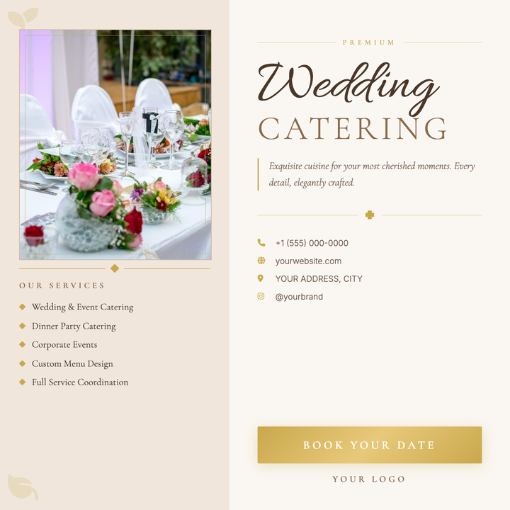
🍽️ Wedding Catering Flyer
A split-panel layout in soft blush and warm ivory, anchored by a gold-framed photo rect and Allura script headline paired with Cormorant Garamond small-caps. Antique gold accents — diamond dividers, ribbon flourishes, and icon callouts — carry an air of ceremony throughout. Built for boutique caterers and private chefs promoting upscale wedding packages or tasting menus.
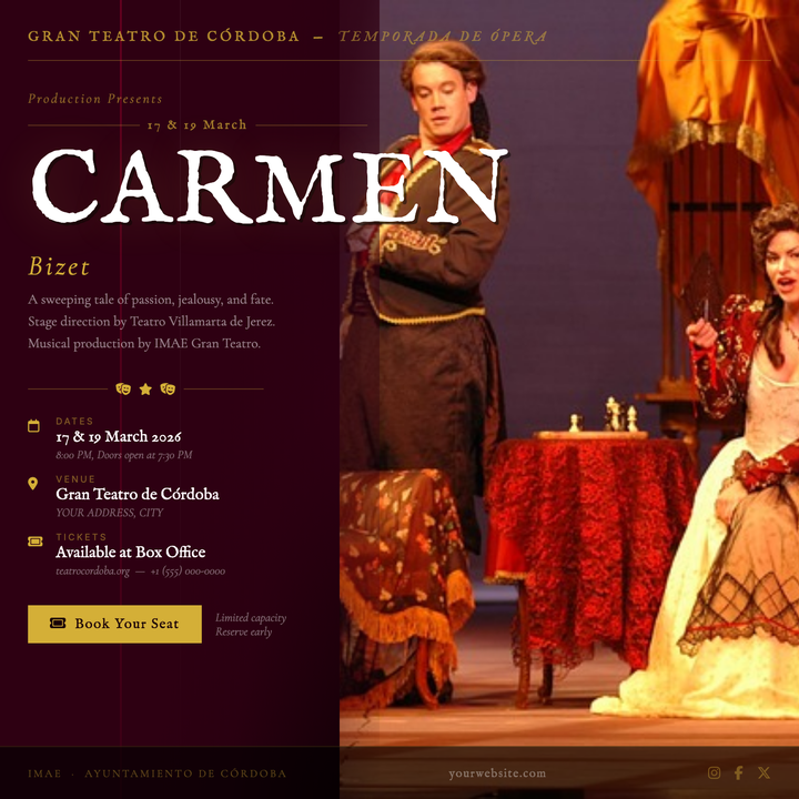
🎭 Opera Performance Flyer
A dramatic stage-curtain layout in deep burgundy and antique gold, built for classical and luxury performing-arts events. The oversized IM Fell English title dominates at 102px, flanked by a ceremonial date strip with gold hairlines and Cormorant Garamond italic composer credits. Ideal for opera, ballet, or symphony galas where prestige and occasion must read instantly.
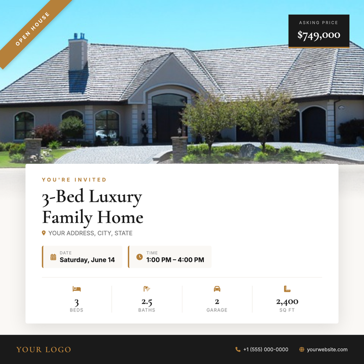
🏡 Open House Flyer
A full-bleed hero photo anchors this square listing flyer, with a warm off-white info card overlapping the image to tie photo and property details together. A diagonal gold ribbon and dark price badge float in the upper corners, while Cormorant Garamond headline type, address row, date chips, and a four-column stats bar give buyers everything at a glance. Built for agents marketing move-up, suburban luxury, or high-end rental properties on Instagram and email.
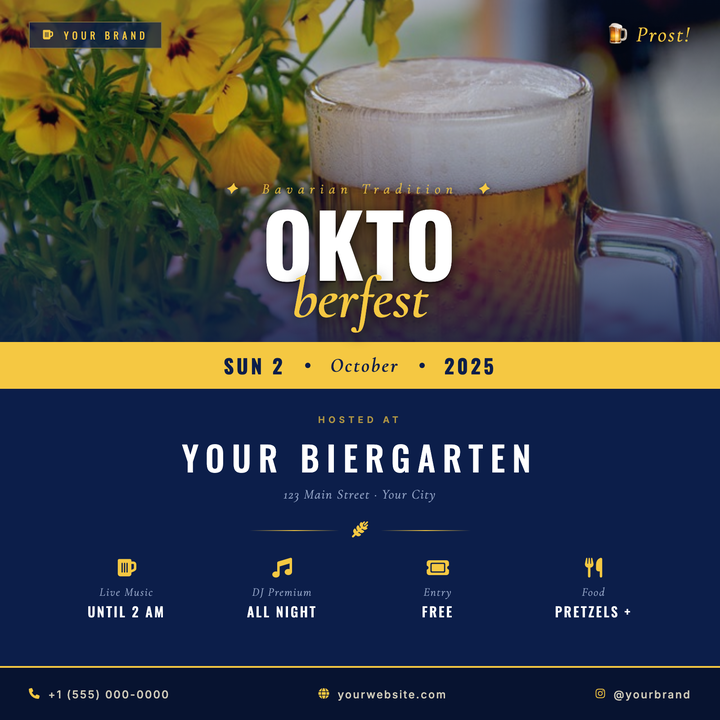
🍺 Oktoberfest Event Flyer
A navy-and-gold split logotype layout built for Oktoberfest celebrations, biergarten openings, and fall beer festivals. The oversized Oswald "OKTO" headline and italic Cormorant Garamond "FEST" drop create a bold masthead over a darkened photo scrim, while a warm gold date strip divides the photo zone from the venue details below. Ideal for craft breweries and hospitality venues promoting festive seasonal events.
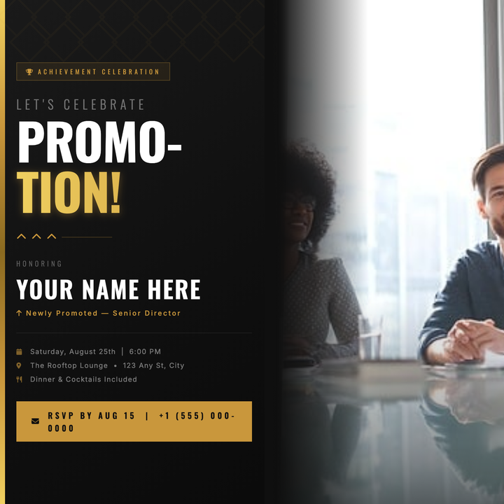
🎉 Promotion Party Flyer
A dark charcoal canvas with a corporate-gold left bar and bold Oswald display type makes this flyer instantly professional and premium. A split two-line headline dominates the layout, with the honoree's name, new title, and event details layered below in warm gold and white. Built for LinkedIn announcements, Instagram posts, or digital invitations celebrating a promotion, executive appointment, or awards-night milestone.
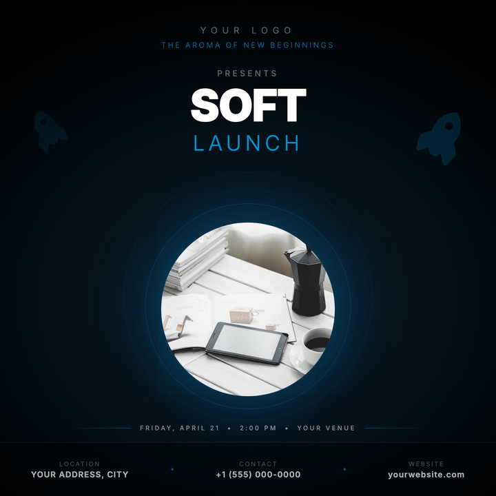
🚀 Product Launch Flyer
A keynote-stage dark canvas with a deep-teal radial spotlight and neon-blue accent hierarchy built for high-impact product reveals. A bold 900-weight headline dominates the upper canvas, while a circular hero image floats center-stage over luminous concentric glow rings. Ideal for tech drops, smart wearables, fragrance, or beauty launches where mood and precision drive the reveal.
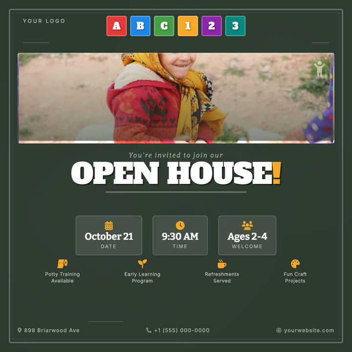
🎒 Preschool Open House Flyer
A chalkboard-green flyer with hand-drawn chalk border frames and a rainbow row of ABC/number blocks as the playful header motif. Alfa Slab One display type anchors the headline, while amber-yellow accents highlight key date cards and feature icons. Built for preschool open houses, kindergarten registration days, and daycare orientations where parents need warmth and clarity at a glance.
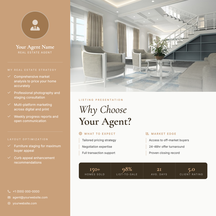
🏡 Listing Presentation Flyer
A polished agent one-sheet built for seller consultations, featuring a warm tan identity sidebar with a circular agent photo, bold serif headline, and a dark espresso stats strip. The hero property photo dominates the right column with a soft gradient scrim easing into structured strategy columns below. Ideal for residential agents and boutique brokerages who want authority and approachability in one glance.
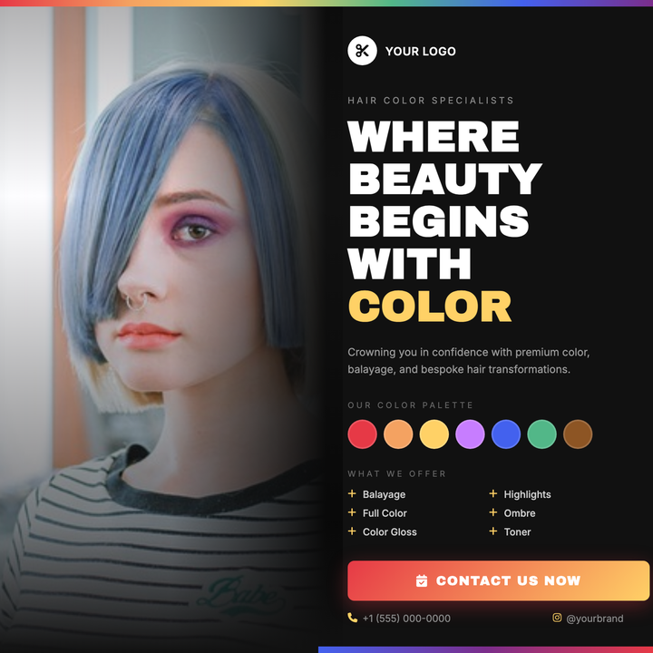
💇 Hair Color Salon Flyer
A dark-studio layout with a full-bleed portrait photo that fades seamlessly into a deep #111 right panel. Bold gold-yellow headlines and a six-stop rainbow swatch strip give chromatic flair, while a descending grey type hierarchy (white → #999 → #666) keeps services and contact details easy to scan. Built for color salons, balayage studios, and stylist portfolio promos.
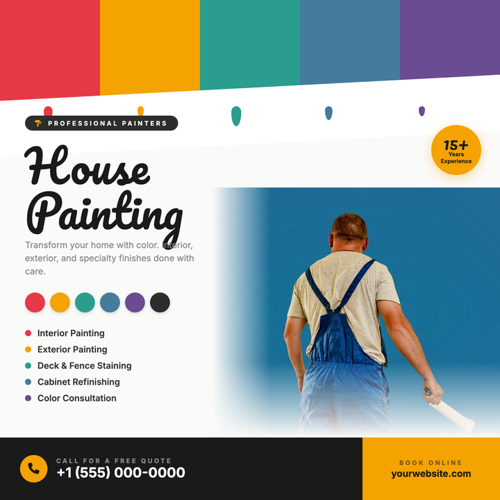
🖌️ House Painting Flyer
A craft-forward flyer built around a bold swatch bar, dripping paint accents, and color chip callouts that immediately signal painting expertise. The split layout pairs a right-side photo with left-aligned headline, services list, and amber CTA strip — making phone and web contacts impossible to miss. Ideal for residential or commercial painters running seasonal promos, neighborhood drops, or social media ads.
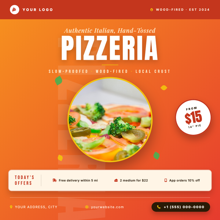
🍕 Pizzeria Flyer
A bold orange-to-red diagonal gradient canvas anchors Anton display type at 102px alongside Playfair Display italic accents and a gold rule divider. A circular photo hero dominates the center, flanked by green and gold leaf accents, while a cream promo strip and rotated price badge drive the offer home. Built for pizzerias and Italian fast-casual spots promoting weekly specials, grand openings, or delivery deals.
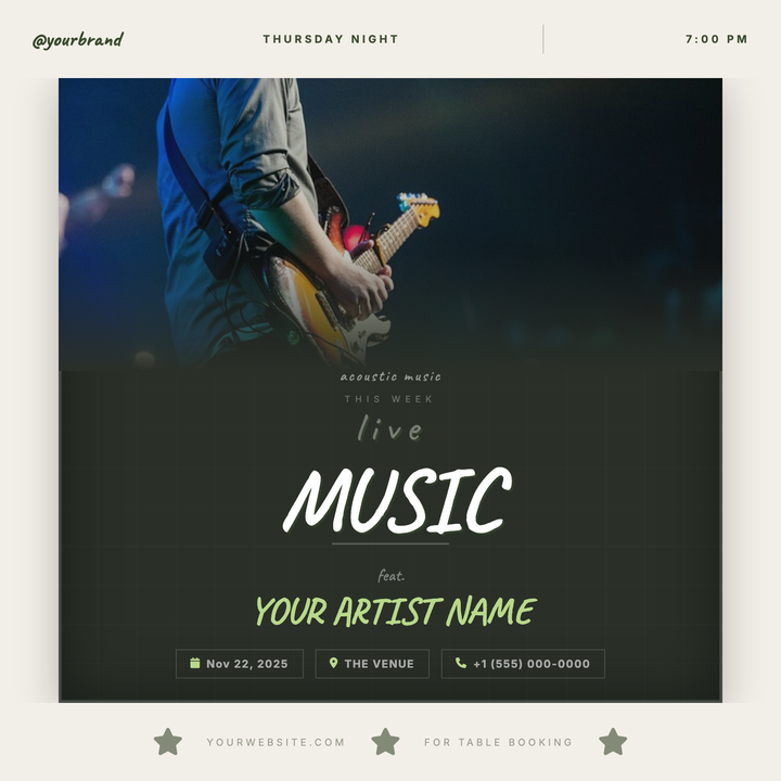
🎸 Live Music Flyer
A chalkboard-style flyer framed in warm cream bands, with a concert photo that dissolves into a deep forest-green panel via a smooth gradient fade. Caveat handwriting and a muted lime-green accent on artist names give it an intimate, neighborhood-gathering feel. Built for acoustic nights, jazz residencies, and open mic events at cafés or small venues.
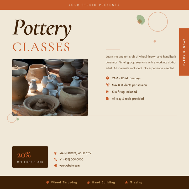
🏺 Pottery Class Flyer
A warm terracotta-and-parchment layout built for artisan studios and craft workshops. The oversized italic Cormorant Garamond headline pairs with spaced-caps type to anchor the upper-left, while a photo panel, icon-tagged class details, and a discount badge guide students from inspiration to sign-up. Organic circle and leaf accents add handmade texture without crowding the copy.
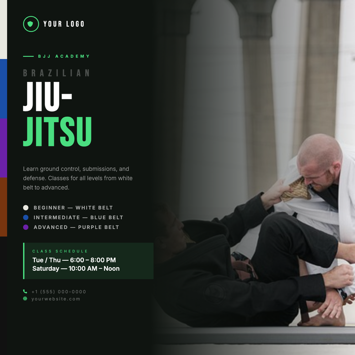
🥋 Jiu-Jitsu Class Flyer
A split-panel layout pairs bold Bebas Neue headlines on a near-black (#0f1410) left panel with a full-bleed martial arts photo on the right, blended seamlessly via a dark-to-transparent gradient scrim. Belt-rank color stripes — white, blue, purple, brown, and black — add authentic BJJ flavor without cluttering the composition. Built for academies and grappling clubs promoting new sessions, enrollment periods, or weekly class schedules.
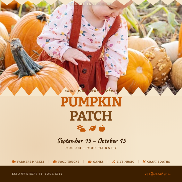
🎃 Pumpkin Patch Flyer
A warm kraft-paper canvas with a full-bleed photo panel, scalloped borders, and an earthy orange-and-brown palette sets a handcrafted harvest mood. Caveat handwriting accents pair with Bitter slab-serif headlines to guide visitors from invitation to key details — date, hours, and activities. Built for farms, pumpkin patches, and fall festivals needing a printed handout or social-media square.
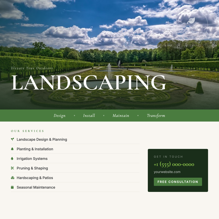
🌿 Landscaping Service Flyer
A photo-forward layout with an 82px Cormorant Garamond headline riding the seam between a full-bleed environmental image and a warm cream info zone. A moss-green tagline band and lime-accented italic draw the eye to your key offer, while a structured services column and contact card keep details crisp. Built for landscaping, garden design, and hardscape contractors running seasonal promos or lead-gen campaigns.
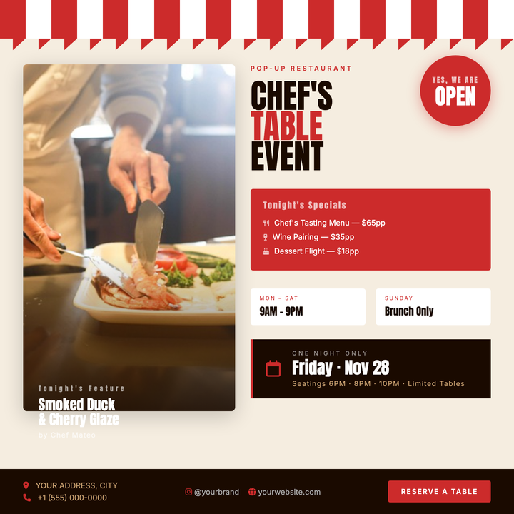
🍽️ Pop-Up Restaurant Flyer
Built around a candy-stripe awning motif and rich espresso-and-red palette, this template leads with a full-bleed food photo and gradient scrim that spotlights your featured dish and chef credit. A bold circular open badge competes for first glance while the right column stacks menu highlights, hours, and a date callout in tight vertical order. Ideal for pop-up dinners, supper clubs, or limited-run chef's table nights where selling a specific seat is the goal.
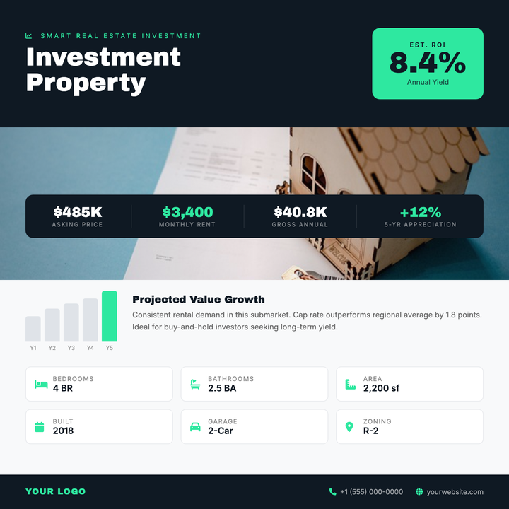
🏢 Investment Property Flyer
A data-forward layout built for financially motivated audiences, featuring a bold mint-green ROI callout box, full-bleed property photo with gradient scrim, and a floating stats bar bridging image to analytics. A light-surface data section houses a bar chart and six-tile property grid, while Archivo Black headings and charcoal-navy zones deliver an institutional-premium feel for brokers, investors, and crowdfunding listings.
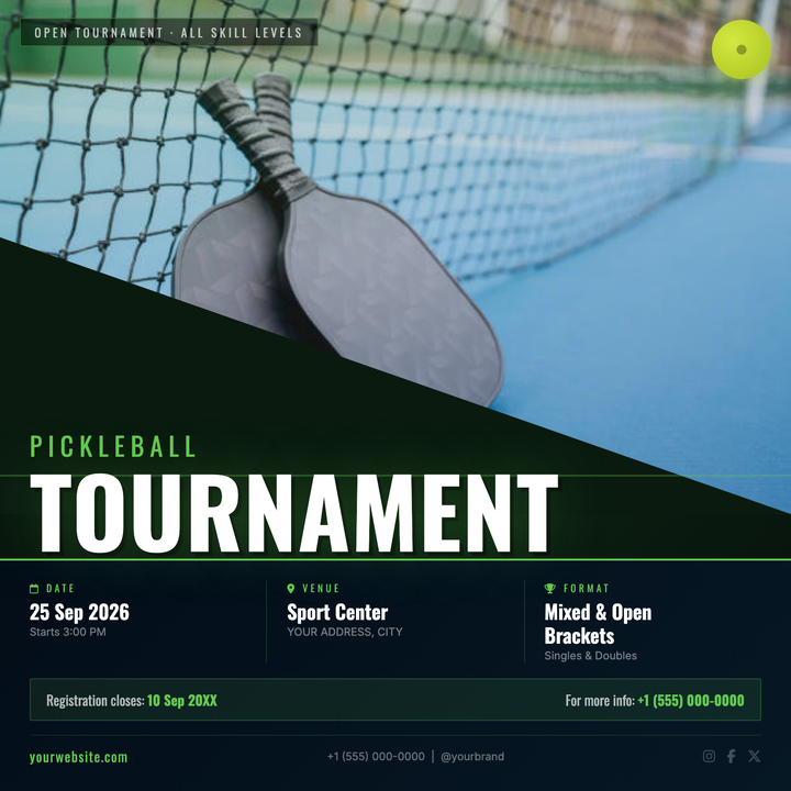
🏓 Pickleball Tournament Flyer
Built on a deep court-green base with a neon #64c850 accent, this template pairs a full-bleed action-photo hero with a structured bottom panel for all event logistics. Oversized Oswald condensed display type handles tournament name, date, and registration callouts, while a diagonal swoosh and court-line motif keep the energy high. Ideal for local clubs, parks-and-rec departments, and regional sponsors promoting anything from casual round-robins to multi-bracket open championships.
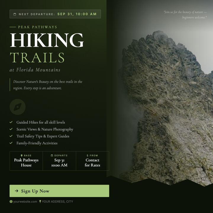
🏔️ Outdoor Adventure Flyer
A moody, editorial layout built for guided hikes, trail runs, and eco-retreats. A full-bleed landscape photo anchors the right panel while a deep forest-green column on the left stacks trip details, departure dates, and a sage-lime CTA button. Cormorant Garamond serif headlines and a dark #1a2010 palette give boutique operators an artisanal, upscale-rustic feel.
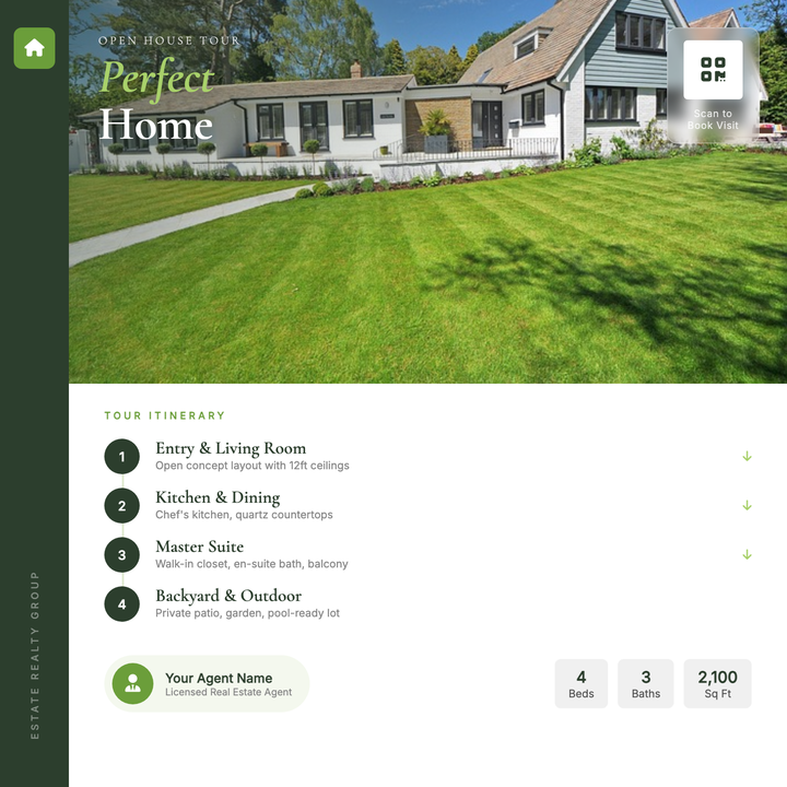
🏡 House Tour Flyer
A polished editorial layout built for open houses and private property showings. A full-width photo hero with a diagonal forest-green scrim draws the eye instantly, while Cormorant Garamond display type anchors the property title and numbered tour-stop itinerary below. The deep green sidebar, frosted-glass QR badge, and lime accent chips give agents a premium, print-ready look for Instagram posts or one-page handouts.
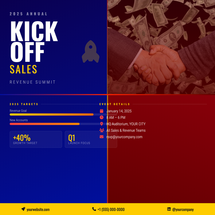
🚀 Sales Kickoff Flyer
A bold split-hemisphere layout with deep navy-blue and corporate crimson gradients that instantly signals ambition and momentum. Oversized hero typography dominates the left panel, while a photo block with a crimson-to-maroon scrim, gold-accented stat bars, and event logistics fill the remaining zones. Built for sales kickoffs, revenue summits, and leadership offsites that demand polished, high-energy internal communications.
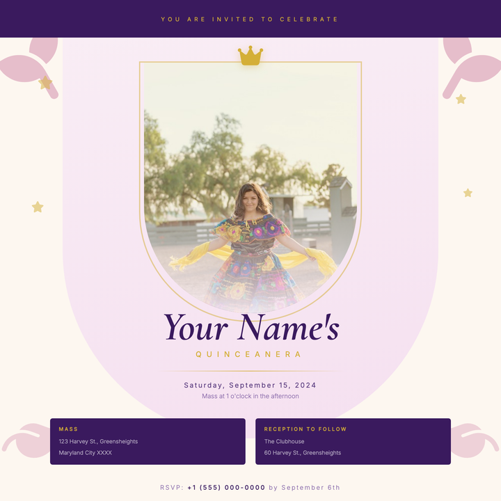
👑 Quinceañera Invitation
An arched portrait frame in soft blush rose gradients, trimmed with a 2px gold ring and topped with a crown icon, gives this invitation an heirloom, keepsake quality. Royal purple anchors the top band and ceremony details block, while Cormorant Garamond serif typography and gold rule accents carry the elegant hierarchy from name to RSVP. Built for quinceañeras, sweet sixteens, and formal debut parties where the design needs to feel as memorable as the occasion.
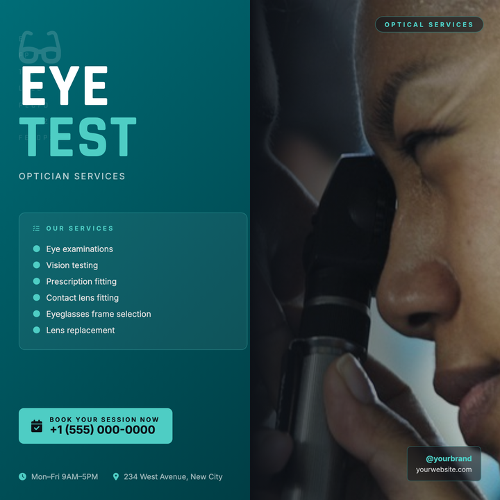
👁️ Optometry Practice Flyer
A bold two-column layout pairs a deep teal gradient panel with a full-height photo panel, blended seamlessly for a clinical-yet-approachable look. Teal-to-dark typography hierarchy highlights services, hours, and contact details, while the #4ecdc4 accent unifies CTAs and key callouts. Built for optometry practices, eyewear retailers, and vision screening events running appointment-drive or social campaigns.
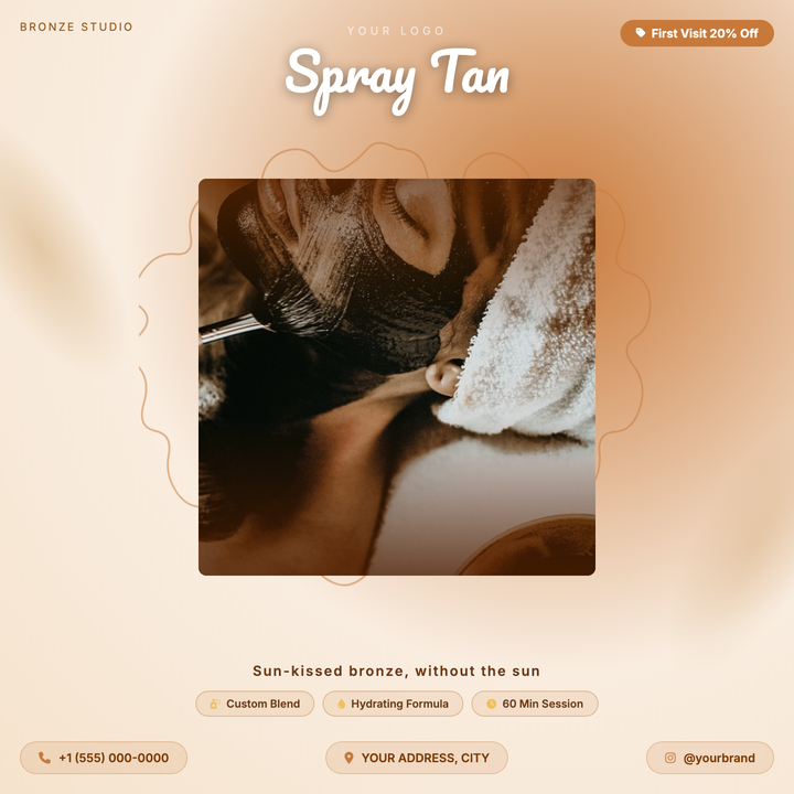
🌿 Spray Tan Flyer
A warm bronze-and-cream square flyer built for tanning salons and boutique beauty services. Features a Pacifico headline at 52px over a dark vignette scrim, a hand-drawn scallop medallion frame, and amber pill callouts for service highlights. Ideal for first-visit discounts, summer campaigns, or appointment-based promos where lifestyle photography takes center stage.
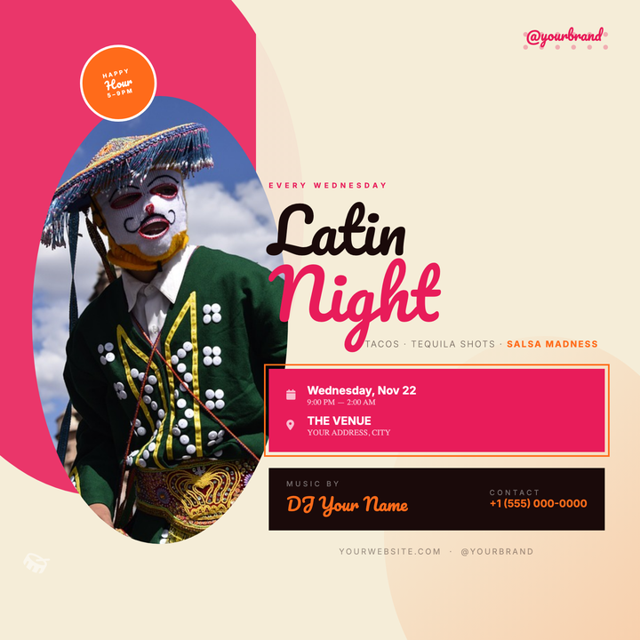
💃 Latin Night Flyer
Bold magenta and orange swooshes frame an elliptically clipped dancer portrait, giving this flyer instant warmth and movement. Pacifico script headlines, a cerise info card for date and venue, and a floating happy-hour badge keep the hierarchy sharp. Built for bars and clubs running recurring salsa, bachata, or tequila nights — no designer required.
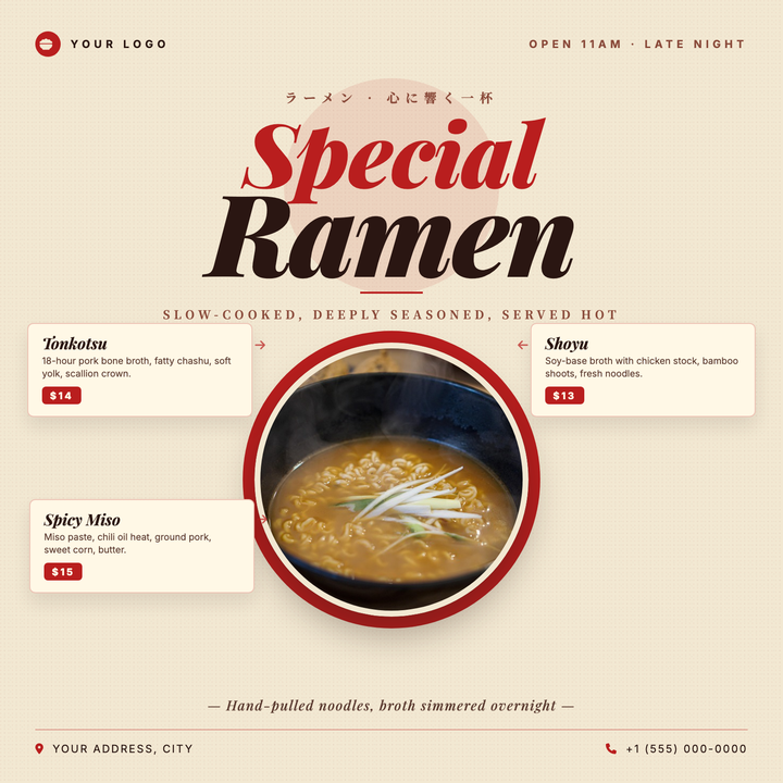
🍜 Ramen Shop Flyer
A warm cream-and-crimson layout built for Japanese ramen shops, izakayas, and noodle pop-ups. Playfair Display italic headlines (up to 116px) pair with Noto Serif JP accents for a traditional-yet-premium feel, while a medallion-style circular bowl hero anchors three side-by-side menu item cards—ideal for seasonal specials or new menu launches.
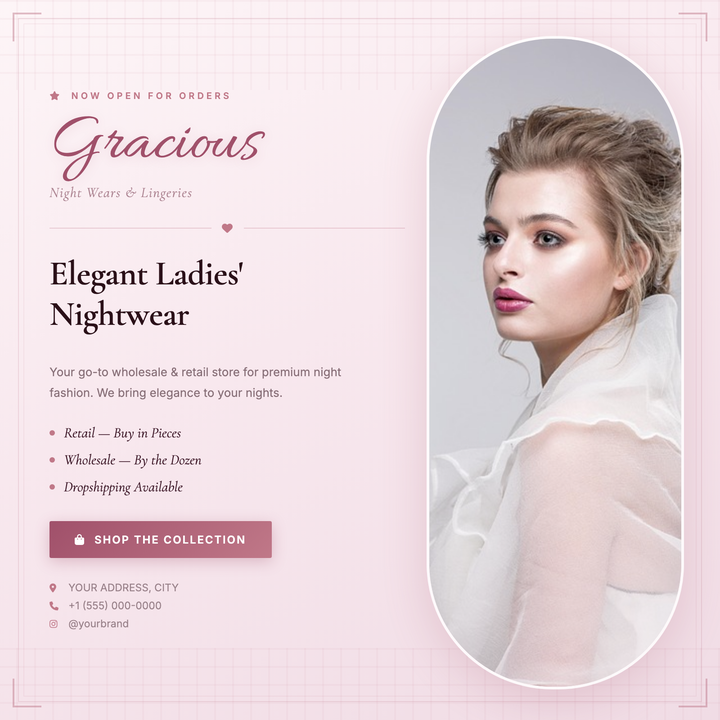
🩷 Lingerie Store Flyer
A boutique-luxury layout built on a dusty rose gradient with deep plum accents, pairing an Allura script logotype and Cormorant Garamond serif for an editorially refined feel. The vertical pill-shaped photo panel balances a structured content column that flows from brand identity through offers to a styled CTA. Ideal for store openings, seasonal collection launches, or bridal intimates promotions.
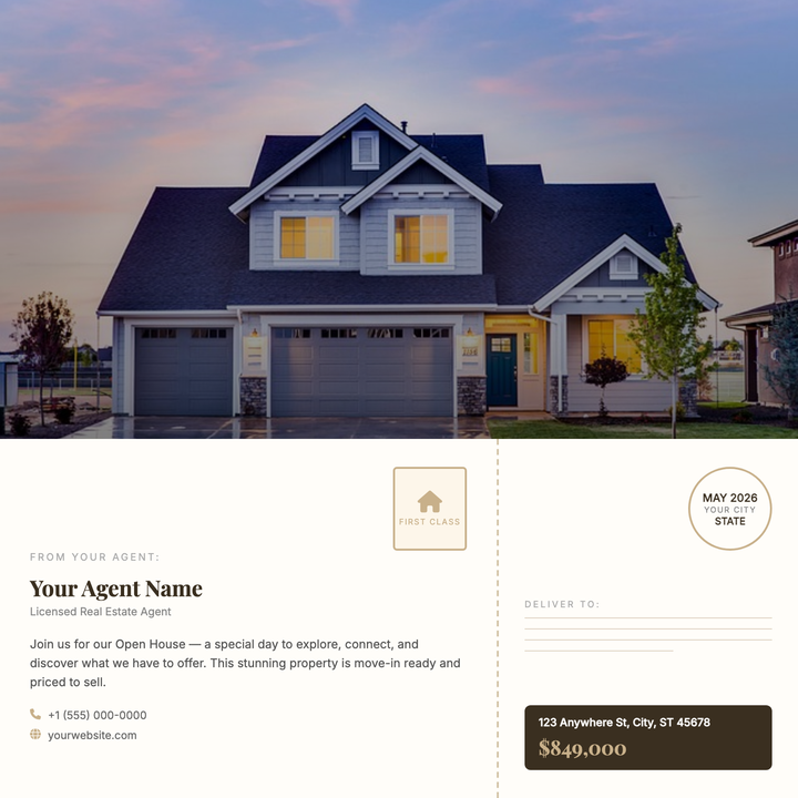
🏡 Real Estate Postcard
A direct-mail-style postcard layout split into a full-bleed property photo with a dark gradient scrim and bold Playfair Display typography, above a warm paper-toned back panel with agent details, address lines, and a decorative postmark. The perforated tear-edge strip and antique gold accents give it a boutique-brokerage feel. Built for just-listed announcements, open-house invites, and just-sold pieces where a strong hero photo leads the pitch.
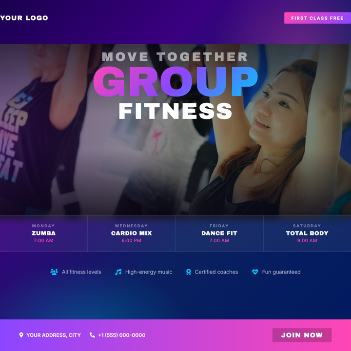
🏋️ Group Fitness Flyer
A deep indigo-to-navy diagonal gradient sets a neon-nightlife canvas, layered with radial magenta and cyan halos and a darkened action photo with edge-scrim treatment. Archivo Black headlines stack a 96px neon gradient "GROUP" above solid white "FITNESS" for bold typographic impact. Built-in frosted-glass schedule grid and a magenta-to-violet "Free Class" badge give studios everything they need to drive sign-ups in a single square post.