🎸 Live Music Flyer
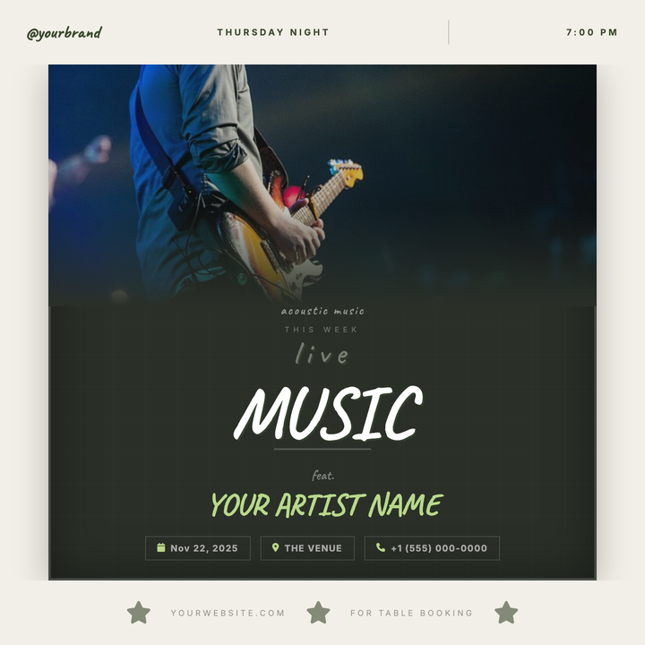
A chalkboard-style flyer framed in warm cream bands, with a concert photo that dissolves into a deep forest-green panel via a smooth gradient fade. Caveat handwriting and a muted lime-green accent on artist names give it an intimate, neighborhood-gathering feel. Built for acoustic nights, jazz residencies, and open mic events at cafés or small venues.
What our users say
Join thousands of satisfied users who trust AIFlyer for their design needs
I actually checked this out because I was curious. I randomly thought something together and aiflyer.ai did a pretty good job. I did a simple prompt for a Birthday Brunch Invitation for April 4th @12:30 I was impressed the text was accurate. DALLE still has trouble sometimes. So great job!

Aovythegreat
Event Planner
As a small business owner, I was skeptical about AI design tools, but AIFlyer exceeded my expectations. The designs are beautiful and the process is incredibly intuitive.

Michael
Small Business Owner in Austin, TX
AIFlyer.ai has been a game-changer for our marketing team. We've been able to create beautiful flyers and social media posts in no time.

Fun_Cobbler1939
Social Media Manager
Hi, I just subscribed for AIFlyer and was really impressed. Game-changer for our marketing team! We need to make a lot of flyers for our social media campaigns and this has been so helpful.

David
Marketing Manager
No credit card needed
More Templates to Explore

🌍 Earth Day Event Flyer
A mint-white square flyer built around a circular nature photo framed by soft concentric rings and floating leaf accents in forest green. Caveat script pairs with bold Inter all-caps for a handmade-but-polished feel, while info pills and activity tags keep event logistics clear. Ideal for community Earth Day celebrations, tree-planting days, and school green fairs.
✨ Microblading Studio Flyer
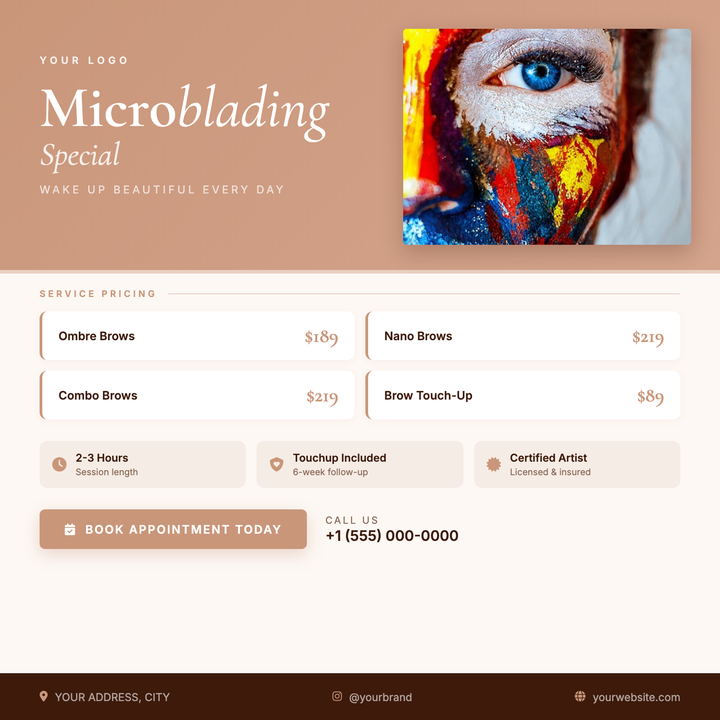
A rose-gold diagonal-gradient hero paired with a Cormorant Garamond serif headline gives this flyer an upscale, feminine edge suited to brow studios and permanent makeup artists. A prominent photo card showcases your work, while a structured pricing grid, icon-pill info strip, and rose-gold CTA button make services and booking details instantly scannable. Use it to promote appointment slots, limited-time pricing, or new-service launches.
🏥 Pediatric Clinic Flyer
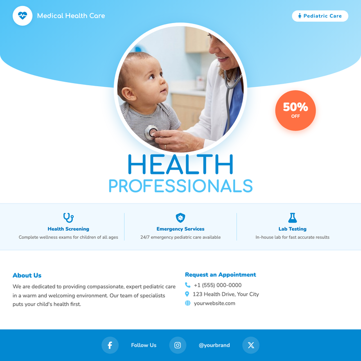
A warm, sky-blue gradient panel and circular photo focal point make this flyer feel approachable without sacrificing medical credibility. Rounded Comfortaa headlines, an urgency-driving discount bubble, and icon-accented contact and service cards give clinics everything they need. Built for new-patient campaigns, vaccination drives, or children's wellness open houses.
🎄 Holiday Bazaar Flyer
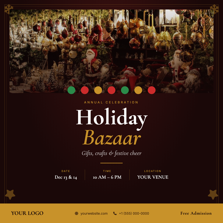
A deep crimson and burnished gold layout built for artisan markets and winter craft fairs. Cormorant Garamond serif display type stacks an eyebrow, bold headline, and italic subtitle above a gold rule and three-column info row for date, time, and location. A full-width photo panel with a scrim, festive bauble ribbon, and a solid gold bottom strip give the design candlelit, curated elegance.
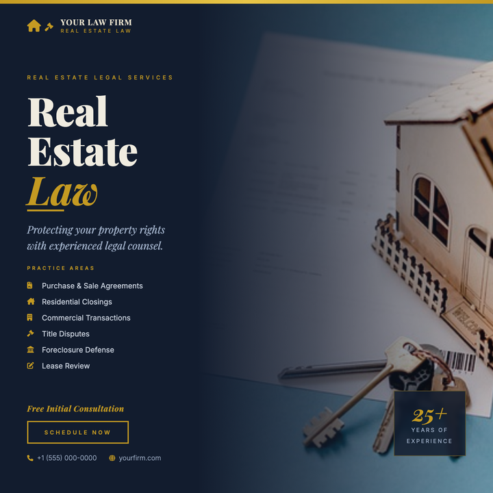
⚖️ Real Estate Lawyer Flyer
A navy-and-gold split-layout flyer built for law firms and legal advisors specializing in real estate. A full-bleed photo column blends into the dark background via a gradient scrim, while a 64px Playfair Display headline with italic gold accents commands immediate authority. Gold icon bullets list six practice areas, and a bordered CTA button drives consultation bookings.
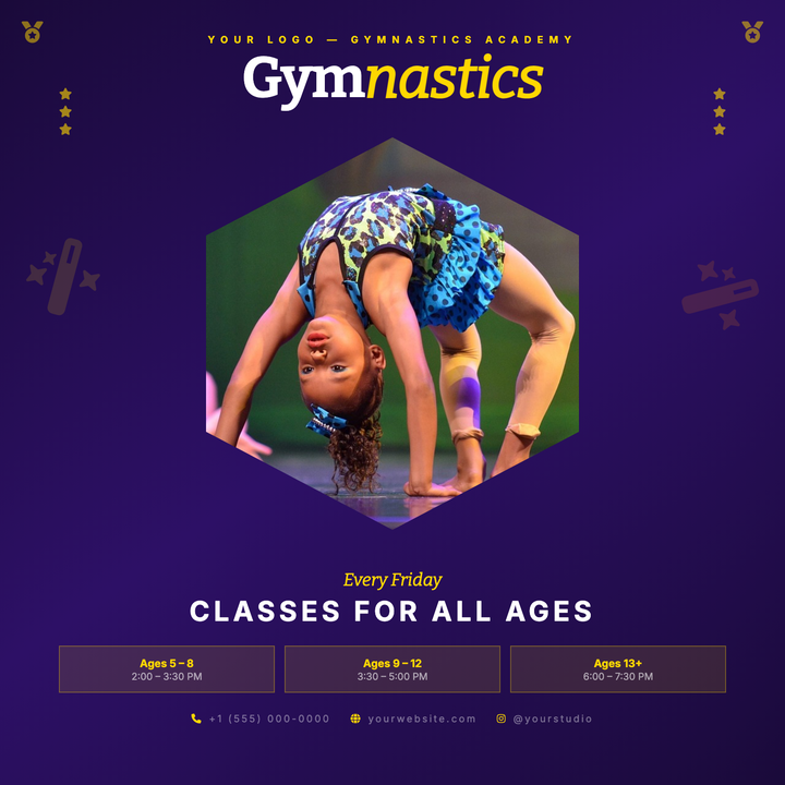
🤸 Gymnastics Class Flyer
A deep-purple diagonal gradient canvas frames a gold-rimmed hexagonal photo centerpiece, giving this template a trophy-like energy that grabs attention instantly. Bitter serif headlines at 58px anchor the top band, while age-tier boxes and scheduling copy fill the bottom third — everything a parent needs at a glance. Built for gymnastics academies, dance studios, and youth sports programs running enrollment or weekly-class promotions.
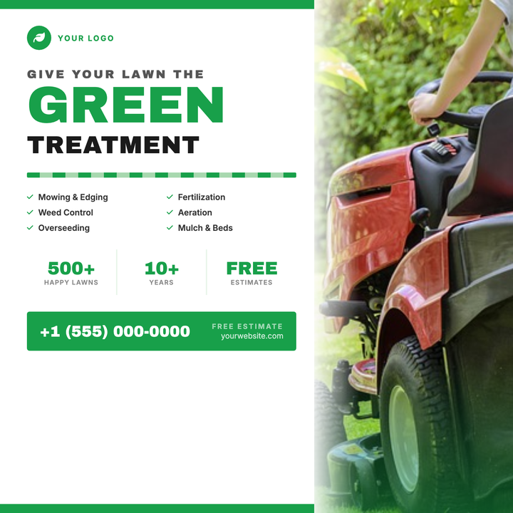
🌿 Lawn Care Service Flyer
A split-layout design with a crisp white copy column and a full-bleed grass photo strip, tied together by bold Archivo Black headlines in brand green and near-black. Service icons, a stats credibility row, and a high-contrast CTA strip make key details scannable at a glance. Built for lawn care and landscaping businesses running spring or fall door hanger, print, or social square campaigns.
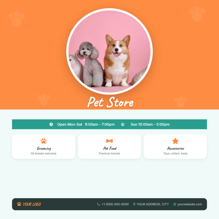
🐾 Pet Store Flyer
A warm orange-and-teal layout built for pet stores, grooming salons, and boutique pet supply shops. Features a circular hero photo, tiled paw-print overlay, Caveat script for brand personality, and a structured lower band with a hours ribbon, services grid, and contact bar. Ideal for grand openings, seasonal promos, or neighborhood awareness campaigns.
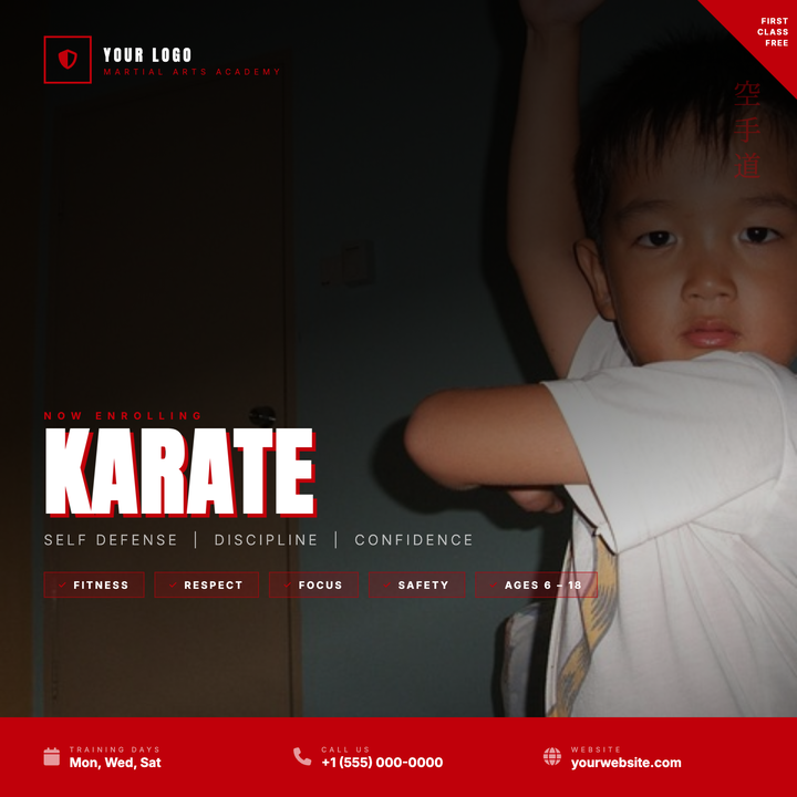
🥋 Karate Class Flyer
A full-bleed action-photo layout with a directional dark scrim keeps the left column sharp for bold Anton typography while letting the martial arts imagery breathe on the right. Crimson red drives all brand accents — corner slash badge, shield icon, eyebrow text, and bottom bar — while vertical kanji lettering along the right edge adds authentic depth. Built for martial arts schools and combat-sport studios running enrollment drives, free-trial offers, or open-house announcements.
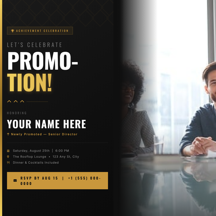
🎉 Promotion Party Flyer
A dark charcoal canvas with a corporate-gold left bar and bold Oswald display type makes this flyer instantly professional and premium. A split two-line headline dominates the layout, with the honoree's name, new title, and event details layered below in warm gold and white. Built for LinkedIn announcements, Instagram posts, or digital invitations celebrating a promotion, executive appointment, or awards-night milestone.
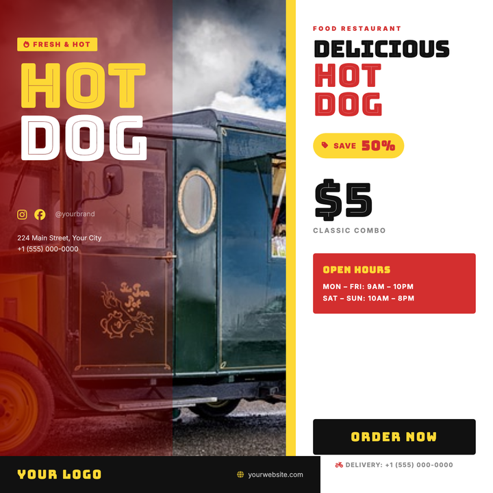
🌭 Hot Dog Stand Flyer
Bold Bungee Inline display type and a split photo-plus-white-panel layout make this flyer built for impulse. A full-bleed food photo dominates the left with a gradient scrim carrying the oversized hero headline, while the clean ivory right panel spotlights your product name, price, and hours. Ideal for hot dog stands, food trucks, and street vendors promoting a daily special or grand opening.

🛡️ Insurance Agent Flyer
A two-column layout with a steel-blue sidebar carrying your brand, services list, and contact details alongside a full-bleed hero photo with a soft blue-to-white scrim. Bold Inter typography pairs a navy h1 with a steel-blue accent span and divider rule to anchor the headline. Built for independent agents and local brokerages promoting coverage with a trust-first, brand-forward look.
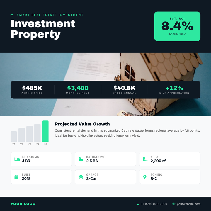
🏢 Investment Property Flyer
A data-forward layout built for financially motivated audiences, featuring a bold mint-green ROI callout box, full-bleed property photo with gradient scrim, and a floating stats bar bridging image to analytics. A light-surface data section houses a bar chart and six-tile property grid, while Archivo Black headings and charcoal-navy zones deliver an institutional-premium feel for brokers, investors, and crowdfunding listings.
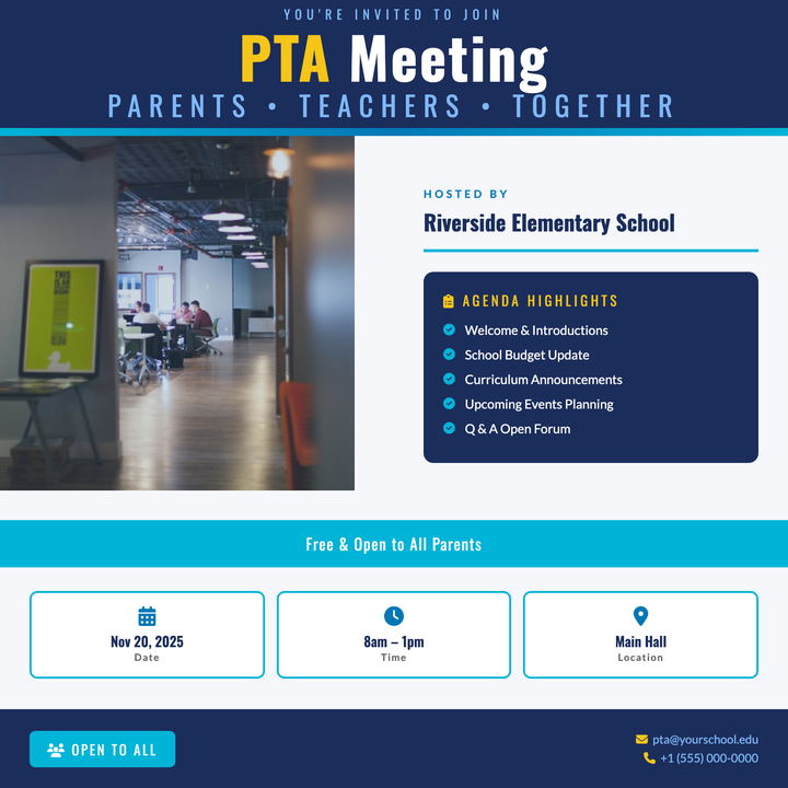
📋 PTA Meeting Flyer
A structured navy-and-teal layout built for school and civic gatherings, with a bold Oswald headline lockup, a dedicated agenda board, and three at-a-glance info cards for date, time, and location. A golden yellow accent highlights key callouts against the deep navy header band. Ideal for PTA meetings, parent info nights, and community forums that need to look organized and approachable.
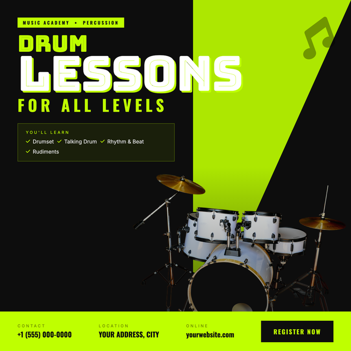
🥁 Drum Lesson Flyer
A high-energy two-tone layout built for drum instructors and music academies. Electric lime (#bfff00) slashes across a near-black canvas via a bold diagonal triangle, with Bungee Inline headlines up to 110 px commanding instant attention. A bleed drum photo, vignette fading, and a bottom event bar with contact, location, and sign-up callouts drive enrollment fast.
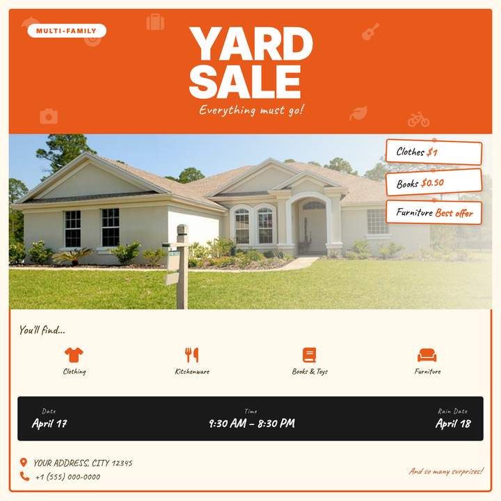
🏷️ Multi-Family Yard Sale Flyer
A warm cream-and-orange layout built for neighborhood yard sales and block garage sales. Caveat handwriting font, rotated price-tag callouts, and a category icon grid give it an approachable, handmade feel that's easy to scan from the street. The bold orange header band and textured icon watermarks keep the key details front and center.
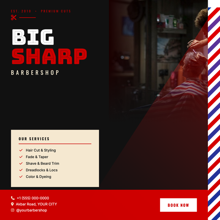
💈 Barbershop Flyer
Bold red-on-black design built for urban and classic barbershops. An animated barber-pole strip, oversized Bungee Inline headlines, and a red atmospheric light-cone over the model photo create instant attitude. Use it for grand openings, seasonal promos, or booking-drive posts where one strong call to action needs to own the frame.

👗 Clothing Store Flyer
A split-canvas layout pairs an editorial model photo with a refined left column anchored by an oversized Playfair Display italic headline. Warm off-white tones (#fafaf8), seamless photo-edge gradients, and a gold sale strip let boutique retailers broadcast seasonal promotions without sacrificing a premium mood. Category chip tags and a clean contact footer round out the full campaign message.
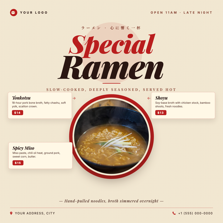
🍜 Ramen Shop Flyer
A warm cream-and-crimson layout built for Japanese ramen shops, izakayas, and noodle pop-ups. Playfair Display italic headlines (up to 116px) pair with Noto Serif JP accents for a traditional-yet-premium feel, while a medallion-style circular bowl hero anchors three side-by-side menu item cards—ideal for seasonal specials or new menu launches.
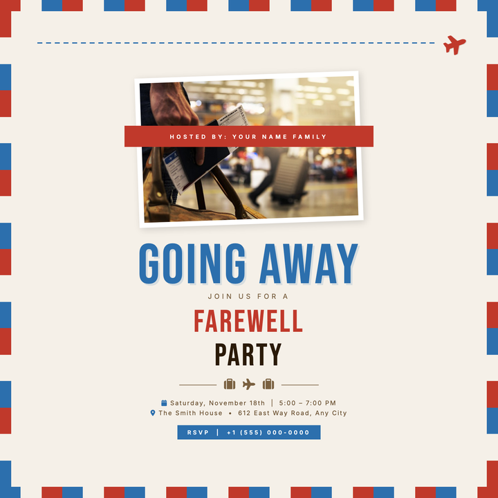
✈️ Going Away Party Flyer
A vintage airmail envelope layout on warm parchment (#f5f0e8) sets a nostalgic, travel-forward mood for bon voyage and farewell gatherings. Bebas Neue display type in cobalt and crimson anchors the headline, while a tilted photo frame and red ribbon host-credit label add tactile, postcard charm. Built for relocation sendoffs, study-abroad parties, and casual farewell receptions.
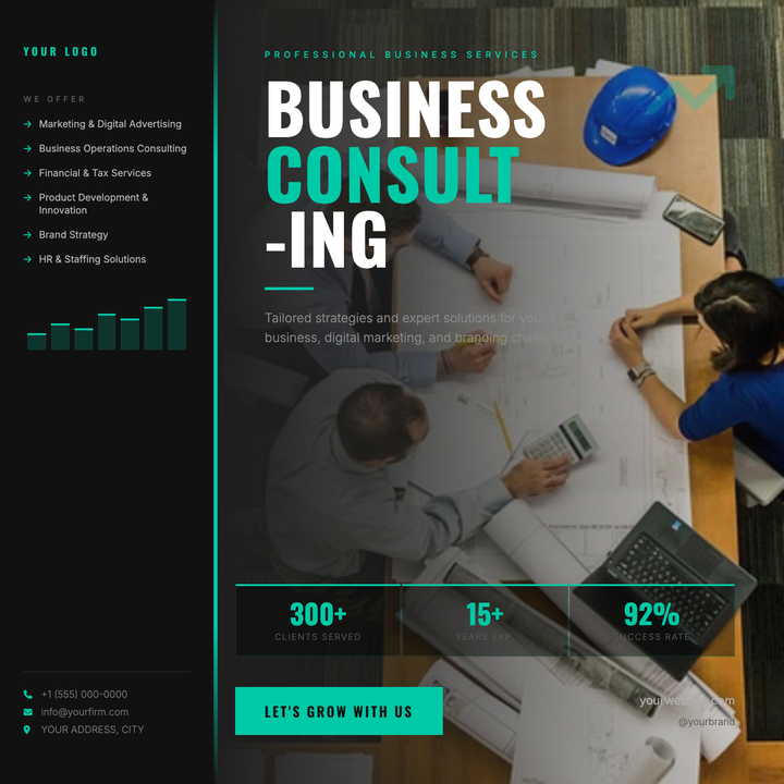
💼 Business Consultant Flyer
A structured two-zone layout with a near-black sidebar, razor-thin teal accent stripe, and full-bleed photo panel with gradient scrim. Bold white headline typography, teal-highlighted service list, and stat callouts project authority and data-backed credibility. Built for B2B consultancies, digital agencies, and financial advisories promoting new service lines or milestones.
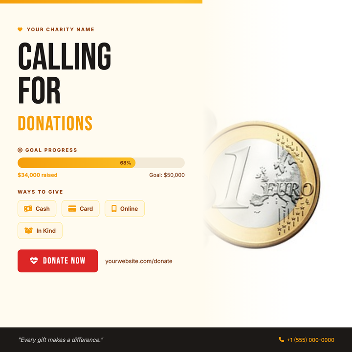
❤️ Donation Drive Flyer
A warm amber-and-cream square layout built for charity asks and community fundraisers. Bebas Neue headlines deliver urgency while a thermometer progress meter, donation-method chips, and a bold red CTA button guide donors from awareness to action. Ideal for shelter drives, emergency appeals, or any campaign where citing a real percent-to-goal matters.
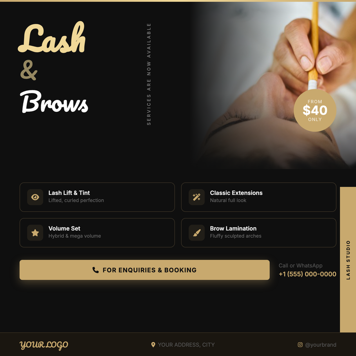
💅 Eyelash Lift Flyer
A deep-black canvas with Pacifico script headlines in luminous gold (#f0d898) makes the service name the instant focal point. A floating price badge overlaps the right-side photo panel for dimensional layering, while a 2×2 service grid and gold sidebar tab keep the offer scannable. Built for lash studios, brow bars, and boutique beauty salons announcing new services or limited-time pricing.

🎓 Career Day Flyer
Bold Anton typography splits "CAREER" in white and "DAY" in amber across a dark-field hero photo with a seamless scrim fade, instantly commanding attention. A sharp amber tagline strip divides the hero zone from logistical details — date, time, and location — displayed in a clean icon-and-value info row. Built for schools and campuses promoting career days or open houses to a mixed student-and-family audience.
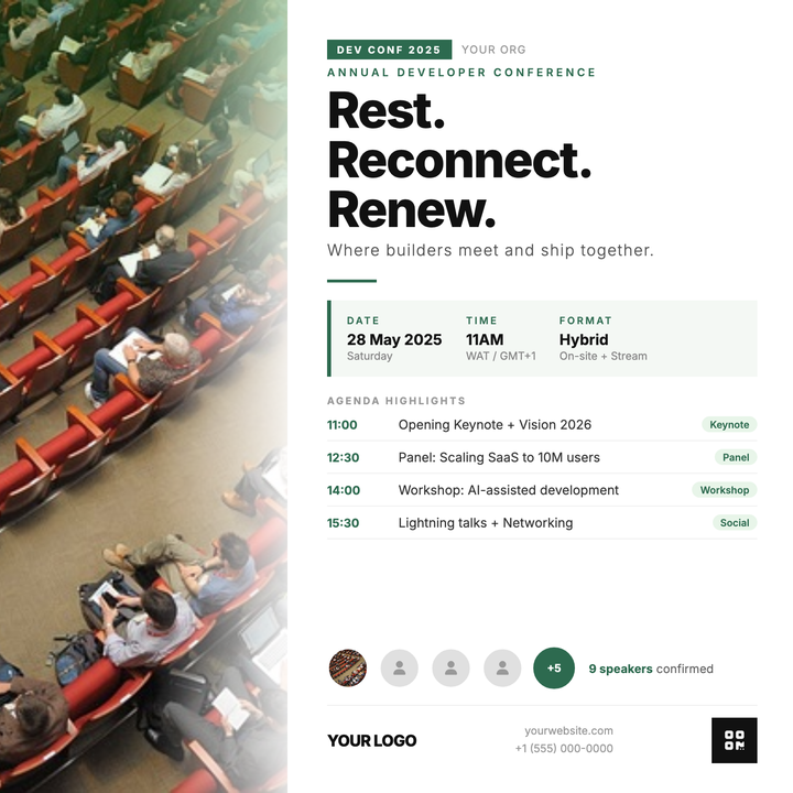
💻 Dev Conference Flyer
A magazine-style, two-zone layout built for developer conferences and engineering summits that need to surface agenda, speakers, and logistics at a glance. Forest-green accents (#2d6a4f) thread through the event tag, section divider, and meta block, while Inter at 800 weight anchors the headline. The photo-panel-to-content overlap creates layered depth without sacrificing readability.
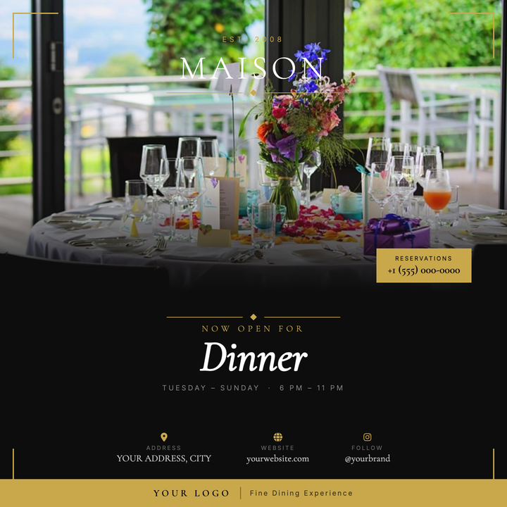
🍽️ Fine Dining Flyer
Elegant two-zone layout pairs a full-bleed food photo with a near-black (#0d0d0d) typographic panel, unified by a gold-scrim gradient fade. Gold corner brackets and a bold footer bar give the piece a formal, certificate-like structure, while a Cormorant Garamond italic headline and floating restaurant badge command attention. Built for fine-dining openings, chef's tasting menus, and seasonal dinner launches that need a refined, ceremonial tone.
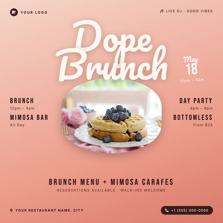
🍳 Brunch Event Flyer
A warm blush-to-terracotta diagonal gradient sets the tone for this lively brunch flyer, anchored by a bold 132px Pacifico script title and an oval photo frame for food or venue shots. A rotated date block at top-right adds playful energy. Built for restaurants, rooftop venues, and Sunday social events promoting bottomless mimosas or day-party brunches.

🛡️ Cybersecurity Workshop Flyer
Built for ethical hacking bootcamps, CTF competitions, and red-team trainings, this template channels a CLI-coded aesthetic with neon-green Orbitron headlines, Matrix rain CSS columns, and a dark #020b02 canvas. A macOS-style terminal bar, glowing #00ff41 accent text, and a photo panel blended via gradient scrim give it sharp technical authority. Ideal for reaching developers, IT pros, and security students who expect a serious, high-stakes visual tone.
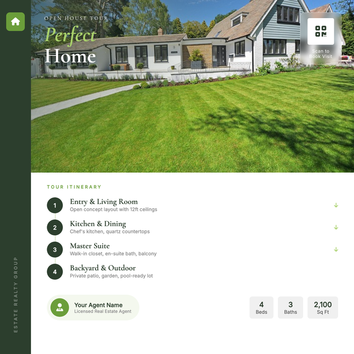
🏡 House Tour Flyer
A polished editorial layout built for open houses and private property showings. A full-width photo hero with a diagonal forest-green scrim draws the eye instantly, while Cormorant Garamond display type anchors the property title and numbered tour-stop itinerary below. The deep green sidebar, frosted-glass QR badge, and lime accent chips give agents a premium, print-ready look for Instagram posts or one-page handouts.
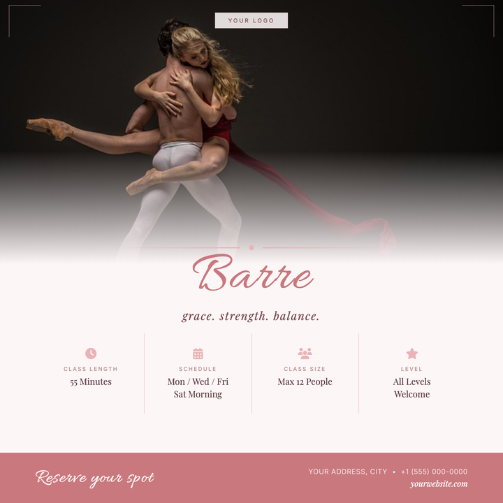
🩰 Barre Class Flyer
A soft rose and warm cream layout built for boutique barre and ballet-inspired fitness studios. The Allura script headline and Playfair Display accents give it an artisanal, elevated feel, while a four-column info grid keeps class details — schedule, location, pricing — clean and scannable. Ideal for class launches, recurring schedule promos, or small-group sign-up campaigns.