🍽️ Fine Dining Flyer
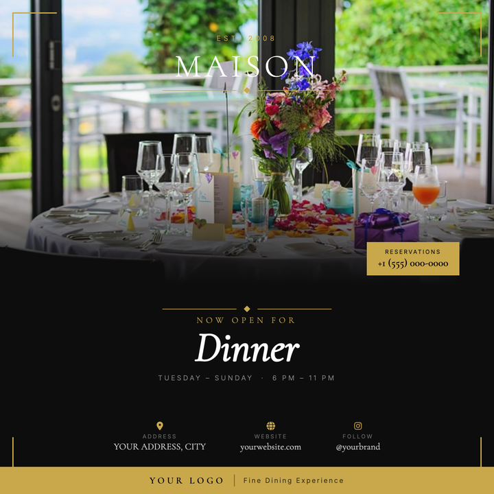
Elegant two-zone layout pairs a full-bleed food photo with a near-black (#0d0d0d) typographic panel, unified by a gold-scrim gradient fade. Gold corner brackets and a bold footer bar give the piece a formal, certificate-like structure, while a Cormorant Garamond italic headline and floating restaurant badge command attention. Built for fine-dining openings, chef's tasting menus, and seasonal dinner launches that need a refined, ceremonial tone.
What our users say
Join thousands of satisfied users who trust AIFlyer for their design needs
I actually checked this out because I was curious. I randomly thought something together and aiflyer.ai did a pretty good job. I did a simple prompt for a Birthday Brunch Invitation for April 4th @12:30 I was impressed the text was accurate. DALLE still has trouble sometimes. So great job!

Aovythegreat
Event Planner
As a small business owner, I was skeptical about AI design tools, but AIFlyer exceeded my expectations. The designs are beautiful and the process is incredibly intuitive.

Michael
Small Business Owner in Austin, TX
AIFlyer.ai has been a game-changer for our marketing team. We've been able to create beautiful flyers and social media posts in no time.

Fun_Cobbler1939
Social Media Manager
Hi, I just subscribed for AIFlyer and was really impressed. Game-changer for our marketing team! We need to make a lot of flyers for our social media campaigns and this has been so helpful.

David
Marketing Manager
No credit card needed
More Templates to Explore
🎵 Reggae Night Flyer
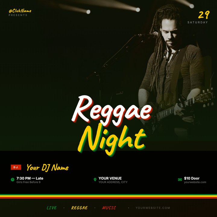
A deep forest-green-to-black gradient canvas with a full-bleed hero photo and scrim-fused title zone. Hand-script Caveat typography headlines the event in bold white and gold, while the Rasta tri-color bands (green, gold, red) anchor the bottom. Built for reggae nights, dancehall parties, and island-themed club events at small venues and beach bars.
🏡 First-Time Homebuyer Flyer
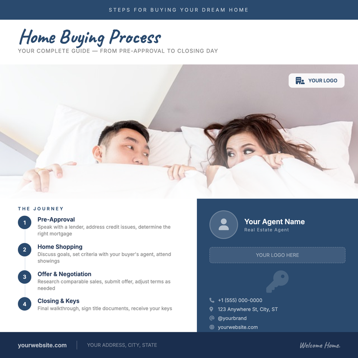
A structured real estate tile for agents guiding buyers through the purchase journey. The Caveat script headline and navy-on-white split layout balance warmth with credibility, while numbered step circles in #2a4a6e and a contrasting dark agent card make key info scannable. Ideal as a social ad or open-house leave-behind.
🎸 Charity Concert Flyer
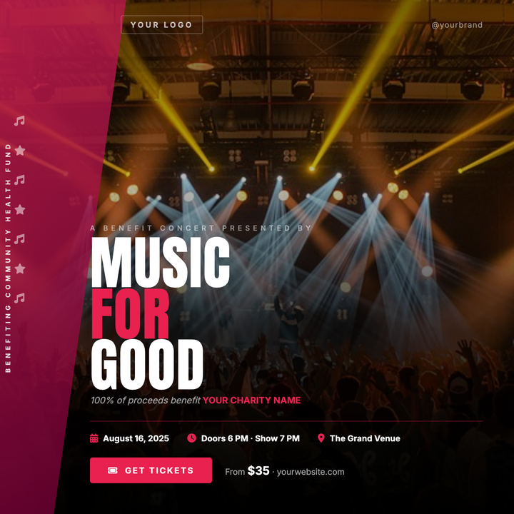
A dramatic full-bleed stage photo with a deep gradient scrim keeps the atmosphere alive while ensuring sharp text contrast. A crimson diagonal ribbon anchors cause branding on the left edge, and the bold 90px Anton headline commands instant attention. Built for benefit concerts, charity galas, and DJ fundraisers targeting adults and young professionals.
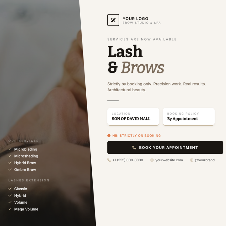
💆 Brow Studio Flyer
A moody split-panel layout built for appointment-driven beauty services — brow studios, lash bars, and boutique spas. A diagonal CSS slash divides a darkened editorial portrait from a warm off-white reading panel, while Bitter serif headlines and a dusty gold accent thread anchor the typographic hierarchy. Ideal for service menu rollouts, seasonal campaigns, and launch announcements where craft and precision matter.
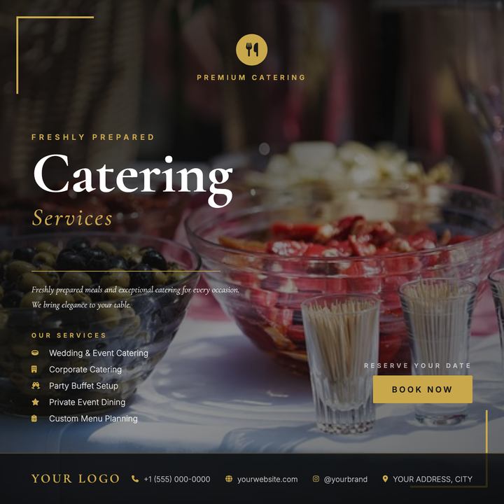
🍽️ Catering Service Flyer
A cinematic full-bleed food photo anchors this upscale catering flyer, with a dark gradient overlay ensuring legibility across bold Cormorant Garamond headlines at 92px. Gold corner brackets, a hairline rule, and warm #C9A84C accents throughout signal luxury hospitality at a glance. Built for wedding caterers, private chefs, and corporate event firms who need to communicate refinement before a word is read.
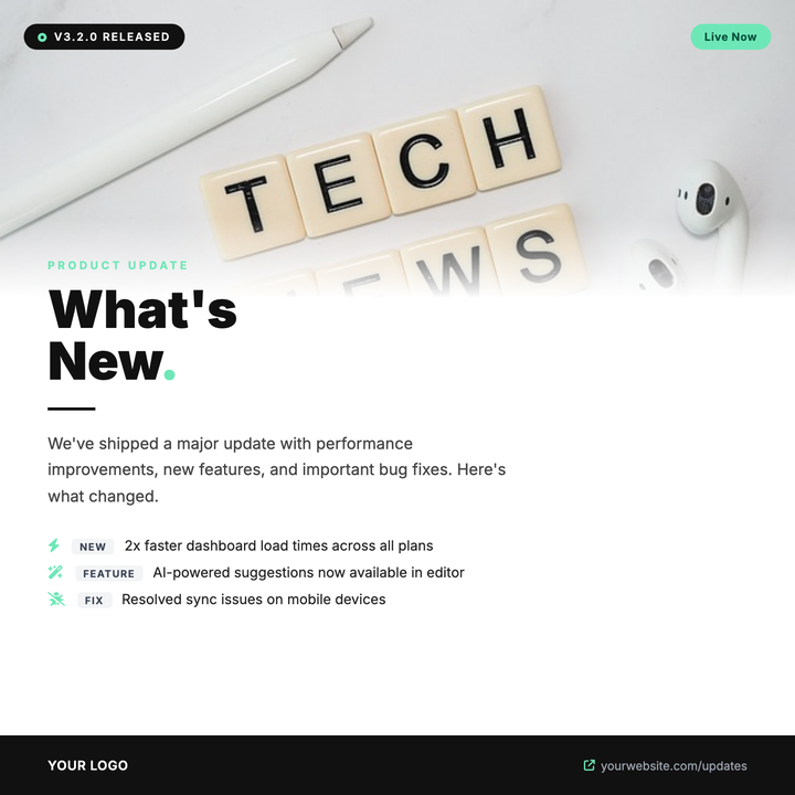
🚀 Product Update Flyer
Built for SaaS and software teams announcing version launches, feature drops, or patch notes. A full-bleed photo strip fades into a white canvas via a soft gradient, anchoring a bold 52px headline with mint-green accent highlights and a structured changelog list below. Dark pill badges call out version numbers and status at a glance, while the high-contrast dark-and-mint palette signals technical credibility.
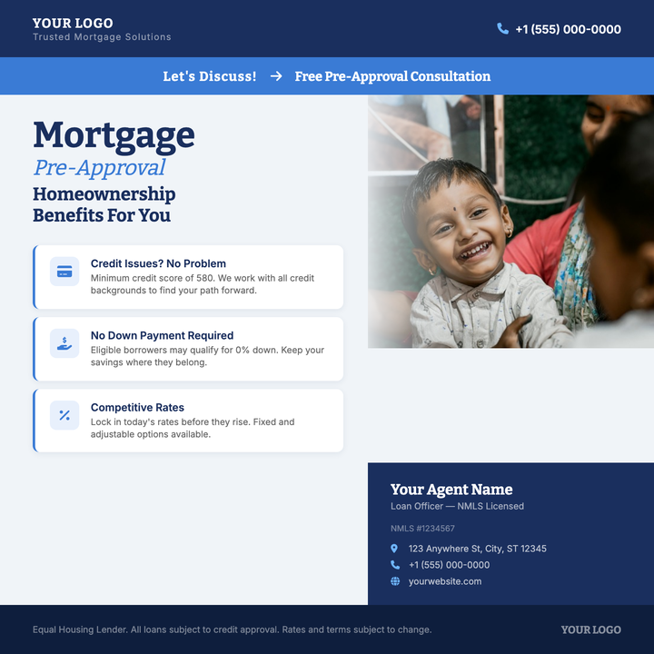
🏦 Mortgage Pre-Approval Flyer
Built for loan officers and mortgage brokerages promoting pre-approval consultations, VA/FHA programs, or open-house lending events. A deep navy header and agent credentials panel project institutional trust, while the accent-blue callout strip and three benefit cards with left-border highlights deliver the key message fast. Bitter serif headlines and a hero photo with a gradient scrim keep the layout polished across Instagram ads, PDF emails, and print handouts.
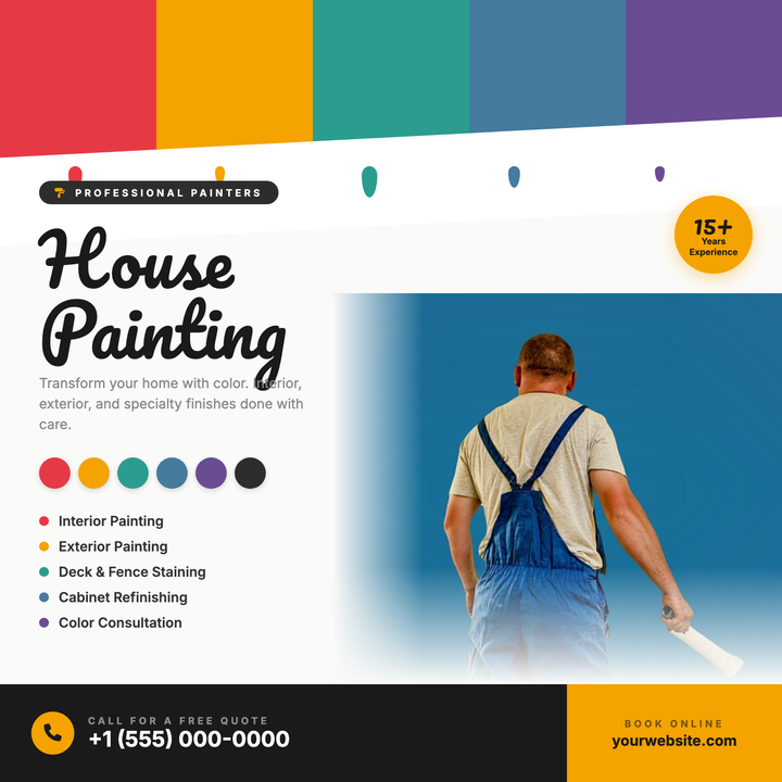
🖌️ House Painting Flyer
A craft-forward flyer built around a bold swatch bar, dripping paint accents, and color chip callouts that immediately signal painting expertise. The split layout pairs a right-side photo with left-aligned headline, services list, and amber CTA strip — making phone and web contacts impossible to miss. Ideal for residential or commercial painters running seasonal promos, neighborhood drops, or social media ads.
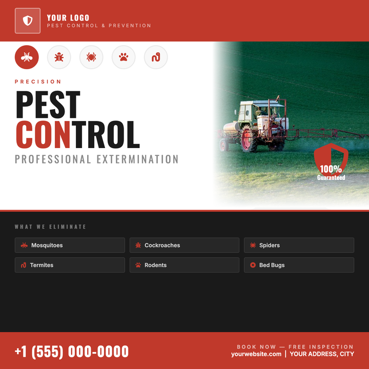
🐛 Pest Control Flyer
Bold crimson bands, an oversized Oswald headline, and a frosted-glass logo bar project authority for extermination and prevention services. Five pest-icon callouts and dark service chips clearly communicate treatment offerings at a glance. Ideal for door-hangers, print handouts, or social squares promoting seasonal mosquito, termite, or rodent campaigns.
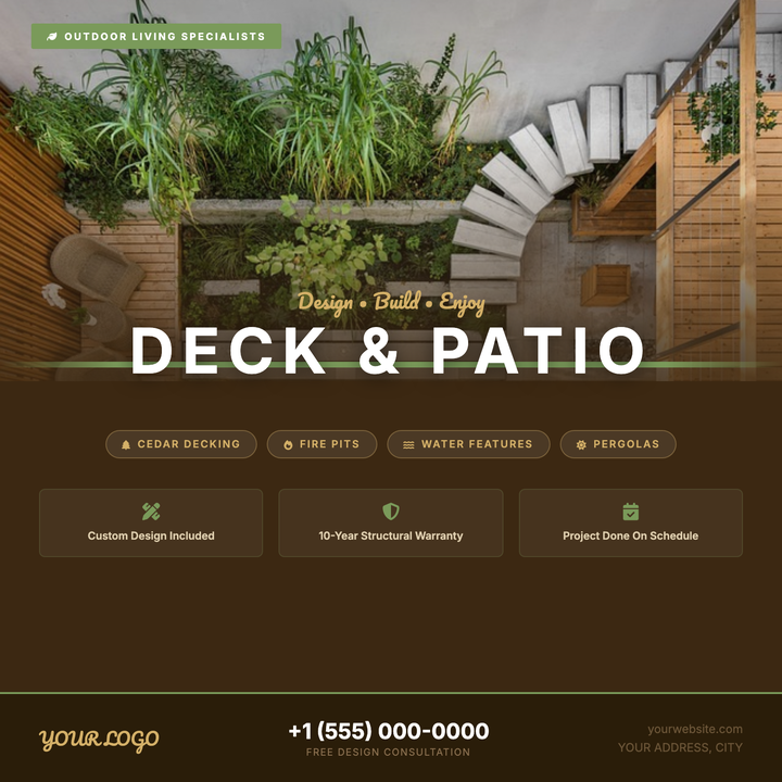
🪵 Deck & Patio Flyer
A warm rustic-modern layout built for deck builders and patio contractors. A full-bleed outdoor photo fades into a cedar-brown panel via a dark gradient scrim, anchored by a sage-green divider strap. Pacifico script paired with a bold all-caps Inter headline draws the eye immediately, while a structured feature grid and pill-style callouts keep the offer clear and conversion-ready.
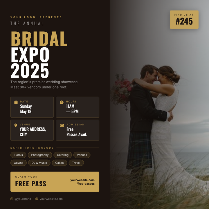
💍 Bridal Expo Flyer
A split-canvas layout pairs a full-bleed wedding photo with a dark brown editorial panel, unified by a seamless gradient scrim. Condensed Oswald headlines with gold-tinted accents and a two-column info-card grid make event details scannable at a glance. Built for bridal shows, wedding expos, and multi-vendor showcases that need formal-luxe authority on print or digital.
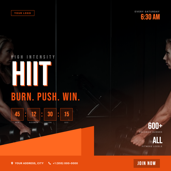
🏋️ HIIT Class Flyer
A dark, high-energy canvas built for HIIT classes, bootcamps, and interval training events. Diagonal orange slashes (#e84d0e/#ff6820) cut across a grayscale action photo with a dark-to-orange vignette scrim, while a 160px Bebas Neue headline with a hard drop-shadow commands the center. A countdown-clock row and session time stamp give athletes the details they need at a glance.
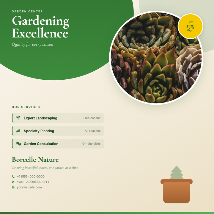
🌿 Garden Center Flyer
Bold organic green arches sweep across a warm cream gradient, framing a circular plant photo and a high-contrast yellow discount badge — ideal for seasonal sales and service menus. Warm-rustic serif headlines in crisp white sit over a deep forest-green field for strong readability, while a left-bordered services list keeps offerings scannable. Built for garden centers, nurseries, florists, and landscaping studios that lead with plant and arrangement photography.
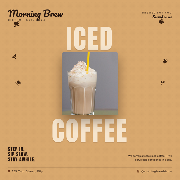
☕ Coffee Shop Flyer
A bold split-headline layout pairs oversized Anton type ("ICED" + "COFFEE") in pale cream against a warm caramel field, sandwiching a centered hero product photo for a deliberate top-to-bottom visual read. Pacifico script branding anchors the upper corners while scattered coffee bean icons add organic energy to the side margins. Built for cafés, cold-brew launches, and seasonal iced-beverage promos — equally at home as an Instagram square or in-store print poster.
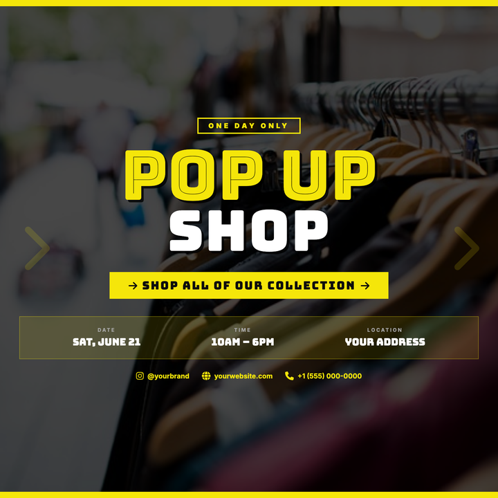
🛍️ Pop-Up Shop Flyer
Built for time-limited retail activations and streetwear drops, this template layers bold Bungee Inline display type at 110px over a darkened full-bleed photo. Neon-yellow top and bottom bars, oversized chevron accents, and a high-contrast #f5e60a arrow callout band drive urgency. Ideal for urban brands and boutique launch events that need boldness over subtlety.
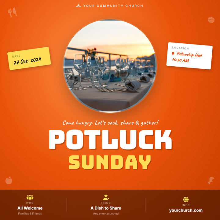
🍽️ Church Potluck Flyer
A warm, fire-orange radial background and bold 96px Bungee display type set a festive, welcoming tone for congregation meal events. Rotated sticky-note cards in accent yellow and white flank a circular photo, while a blurred bottom bar surfaces key event details at a glance. Built for churches, fellowship dinners, harvest suppers, or neighborhood food drives where an approachable, hand-crafted look matters.
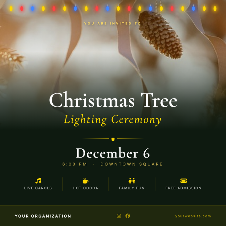
🎄 Christmas Tree Lighting Flyer
A ceremonial holiday flyer built on a deep forest-green canvas with Cormorant Garamond serif display type and decorative gold string-light motifs. A full-bleed photo with a scrim gradient, layered gold divider, and elegant italic date callouts create a warm, formal feel. Ideal for municipal, nonprofit, or community tree lighting events at downtown squares, churches, or neighborhood gatherings.
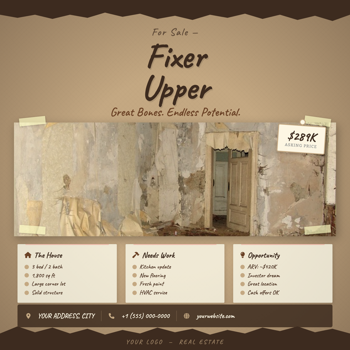
🔨 Fixer-Upper Listing Flyer
A kraft-paper broadside aesthetic with torn dark edges, a taped center photo, and oversized Caveat handwriting typography gives this template an honest, down-to-earth character. Warm earth tones—tan, espresso brown, and sienna—frame the asking price in a floating price tag and property details in notebook-style cards. Built for investor flips, estate sales, and distressed-property open houses where authenticity sells faster than polish.
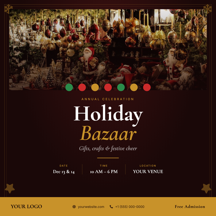
🎄 Holiday Bazaar Flyer
A deep crimson and burnished gold layout built for artisan markets and winter craft fairs. Cormorant Garamond serif display type stacks an eyebrow, bold headline, and italic subtitle above a gold rule and three-column info row for date, time, and location. A full-width photo panel with a scrim, festive bauble ribbon, and a solid gold bottom strip give the design candlelit, curated elegance.
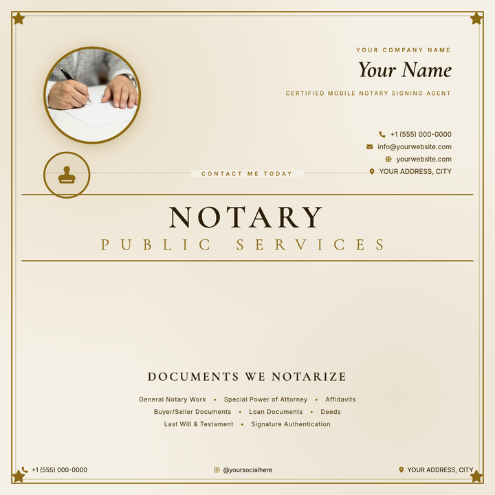
📜 Notary Service Flyer
A parchment-cream flyer built for mobile notaries and certified signing agents who want to lead with personal credibility. A circular portrait, gold-bordered credential block, and 52 px Cormorant Garamond headline anchor the formal document aesthetic, while nested gold rules and corner star ornaments reinforce trustworthiness. Ideal for Instagram, Facebook, or print promotion of solo legal-document practices.
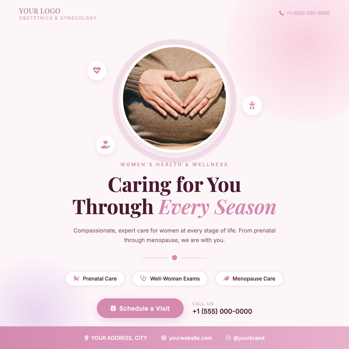
🌸 OB-GYN Practice Flyer
A warm rose-toned flyer built around a circular provider headshot with a soft halo ring, floating icon bubbles, and Playfair Display headlines. The blush-to-lavender blob gradients and medium rose accent (#d48aaf) create a reassuring, modern-elegant tone. Ideal for OB-GYN practices, midwifery centers, and women's health clinics promoting new providers or booking appointments.
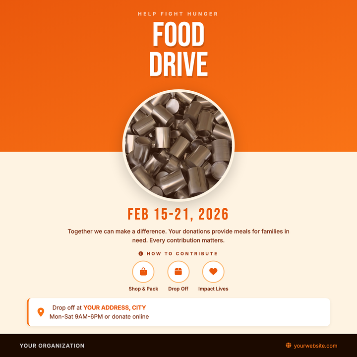
🥫 Food Drive Flyer
Built for community donation events, this template pairs a bold Bebas Neue headline on a burnt-orange diagonal gradient with a circular food photo that bridges into a warm cream lower zone. A dates bar, three-step icon row, and drop-off location card give donors all the logistical details at a glance. Ideal for nonprofits, faith groups, and civic organizations running food, hygiene, or supply drives.
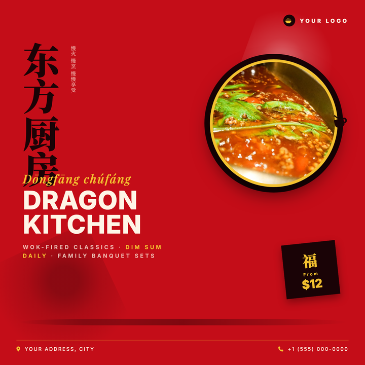
🥢 Chinese Restaurant Flyer
Built on a bold imperial red canvas, this template pairs oversized vertical Han calligraphy with a gold-ringed circular dish photo for instant cultural authority. Ivory Playfair italic and heavy Inter type stack a three-tier menu callout, while a rotated price-chop seal closes the lower corner. Ideal for dim sum kitchens, banquet promotions, or Instagram launch posts.
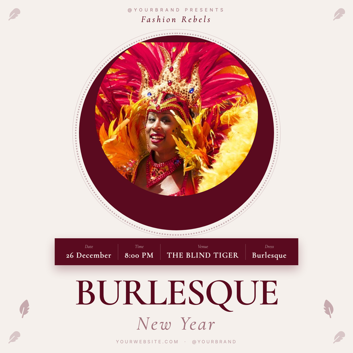
🎭 Burlesque Show Flyer
A vintage-poster layout built on cream paper tones with a deep burgundy accent, featuring a circular performer photo medallion framed by decorative lace rings. Cormorant Garamond serif typography drives the bold wordmark, while a ghost-label info strip keeps event details legible and elegant. Ideal for burlesque nights, cabaret showcases, or theatrical club events that need an invitation-like atmosphere.
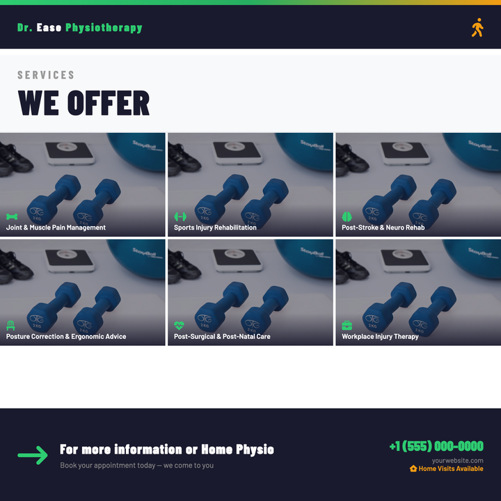
🦴 Physical Therapy Flyer
A navy-and-green clinic flyer built around a 3×2 photo grid, each cell showcasing a distinct service with a gradient label footer and icon accent. Bold condensed headlines establish editorial authority above the grid, while the bottom triptych aligns a motion-arrow CTA, tagline, and contact details. Designed for physiotherapy and rehab clinics promoting service breadth on Instagram, digital ads, or in-app cards.
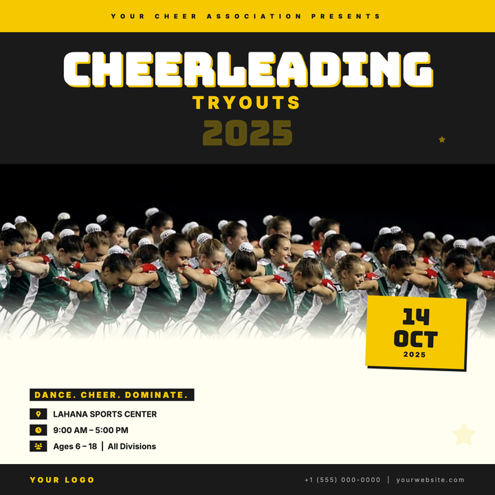
📣 Cheerleading Tryout Flyer
Built for cheer, dance, and squad tryout announcements, this bold template leads with a Bungee Inline headline at 72px against a near-black band, making the event name impossible to miss. A golden yellow date badge — tilted 2° with a hard drop shadow — anchors the tryout date as the primary CTA. The high-chroma #f5c800 and #1a1a1a palette delivers stadium-ready contrast for both Instagram feeds and printed gym flyers.
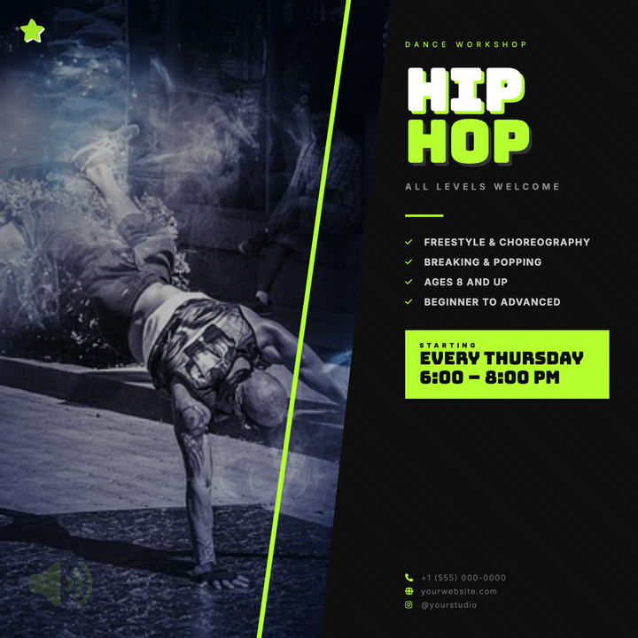
🕺 Hip-Hop Dance Flyer
A split-panel layout with a diagonal photo block and skewed neon-yellow accent bar delivers instant street-culture energy. Bold Bungee Inline headlines dominate the right panel alongside a date callout, bullet features, and contact details — all tied together by a sharp #b5ff2e thread. Built for dance crews, studio showcases, and urban battle nights that need to pop on social feeds or printed posters.
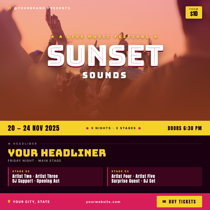
�festival Music Festival Flyer
A bold split-canvas layout pairs a full-bleed hero photo — washed in a magenta-to-orange gradient scrim — with a deep maroon lower zone for lineup and ticket details. Bungee Inline headlines at 110px command attention, while the golden yellow date strip and vivid magenta bottom bar keep price and schedule impossible to miss. Built for promoters announcing outdoor EDM, indie, or beach festival events where visual heat and ticket-sale clarity both matter.
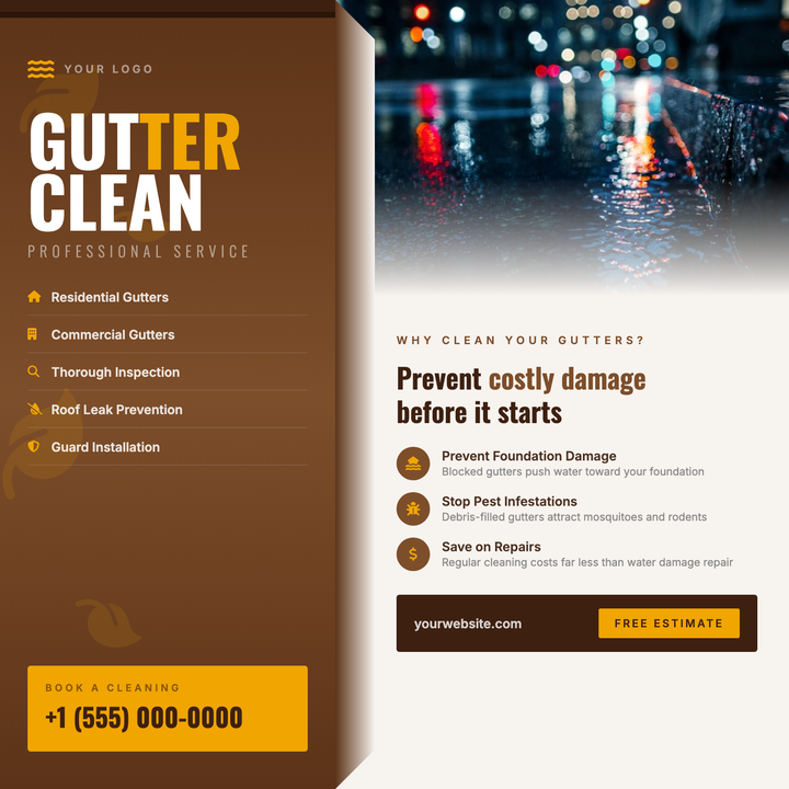
🍂 Gutter Cleaning Flyer
A bold split-panel layout built for fall home-services campaigns, featuring a deep rust-brown left column with Oswald Bold headlines and an amber gold CTA box, paired with a warm cream right panel for educational copy and a photo with a soft bottom fade. Leaf motifs and a gutter-channel detail reinforce the seasonal theme. Ideal for local contractors running autumn gutter cleaning, roof maintenance, or exterior property-prep promotions.
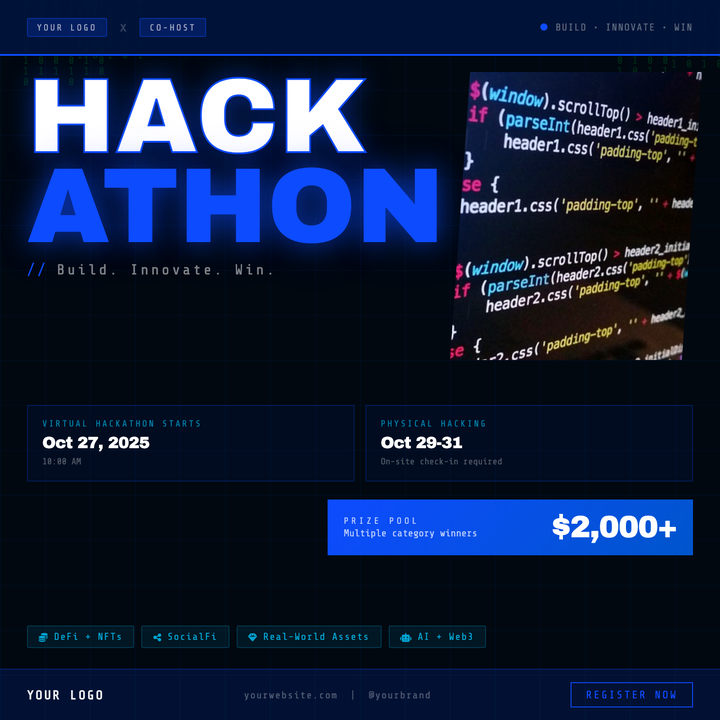
💻 Hackathon Event Flyer
Built for coding competitions and developer sprints, this dark-mode square flyer pairs 118px Archivo Black display type in white and electric blue (#0d4bff) with a binary code rain backdrop and dot-grid texture. A parallelogram photo cutout, prize gradient card, and cyan track pills organize key event details at a glance. Ideal for university organizers, corporate sponsors, and Web3 buildathons needing an urgent, tech-native look.