🎀 Gender Reveal Flyer
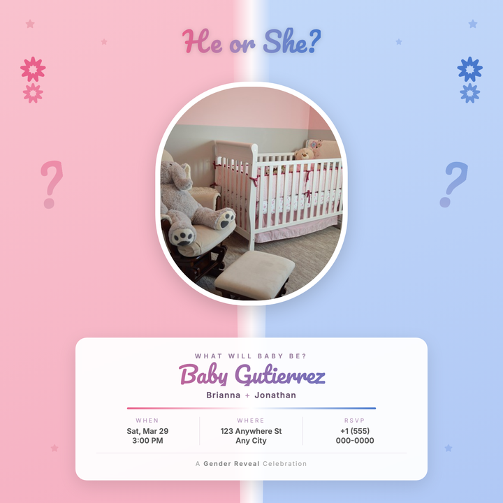
A bilateral pink-and-blue split-panel design with a soft diagonal seam, Pacifico script headline, and frosted-glass info card for baby name and event details. A centered oval portrait commands the focal point, flanked by decorative question marks and festive balloon clusters. Built for parents and event planners crafting warm, whimsical reveal invitations for print or Instagram.
What our users say
Join thousands of satisfied users who trust AIFlyer for their design needs
I actually checked this out because I was curious. I randomly thought something together and aiflyer.ai did a pretty good job. I did a simple prompt for a Birthday Brunch Invitation for April 4th @12:30 I was impressed the text was accurate. DALLE still has trouble sometimes. So great job!

Aovythegreat
Event Planner
As a small business owner, I was skeptical about AI design tools, but AIFlyer exceeded my expectations. The designs are beautiful and the process is incredibly intuitive.

Michael
Small Business Owner in Austin, TX
AIFlyer.ai has been a game-changer for our marketing team. We've been able to create beautiful flyers and social media posts in no time.

Fun_Cobbler1939
Social Media Manager
Hi, I just subscribed for AIFlyer and was really impressed. Game-changer for our marketing team! We need to make a lot of flyers for our social media campaigns and this has been so helpful.

David
Marketing Manager
No credit card needed
Frequently Asked Questions
More Templates to Explore
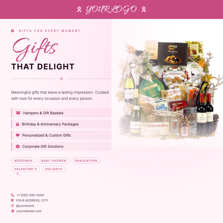
🎁 Gift Shop Flyer
A warm blush-to-cream layout built for boutique gift shops and artisan retailers. A deep-rose ribbon banner anchors the brand at the top, while an Allura script headline floats in front of a soft-blended product photo. Specialty item lists and occasion tags make it easy to highlight curated offers for Valentine's Day, Mother's Day, or holiday promotions.
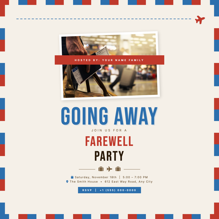
✈️ Going Away Party Flyer
A vintage airmail envelope layout on warm parchment (#f5f0e8) sets a nostalgic, travel-forward mood for bon voyage and farewell gatherings. Bebas Neue display type in cobalt and crimson anchors the headline, while a tilted photo frame and red ribbon host-credit label add tactile, postcard charm. Built for relocation sendoffs, study-abroad parties, and casual farewell receptions.
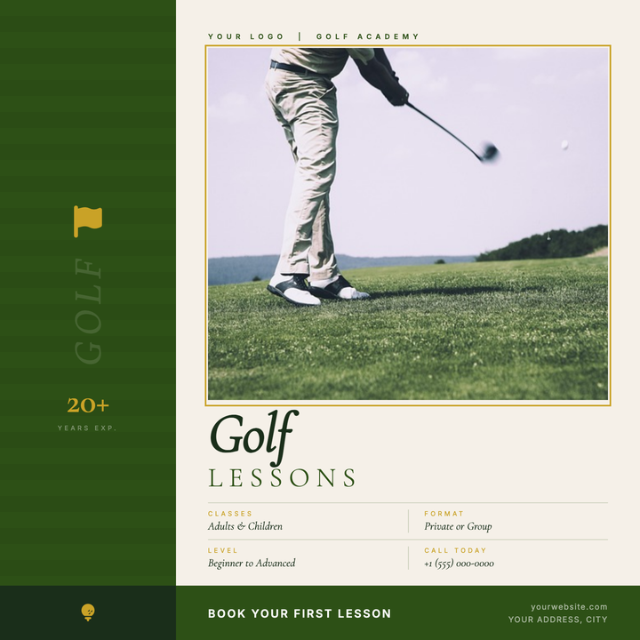
⛳ Golf Lesson Flyer
A premium two-zone layout with a deep fairway-green sidebar, gold-framed instructor photo, and Cormorant Garamond italic display type. Gold accents on credential badges, frame borders, and detail labels signal prestige, while Inter labels keep the layout clean and legible. Built for golf academies, private instructors, and country club lesson programs announcing seasonal clinics or new session openings.
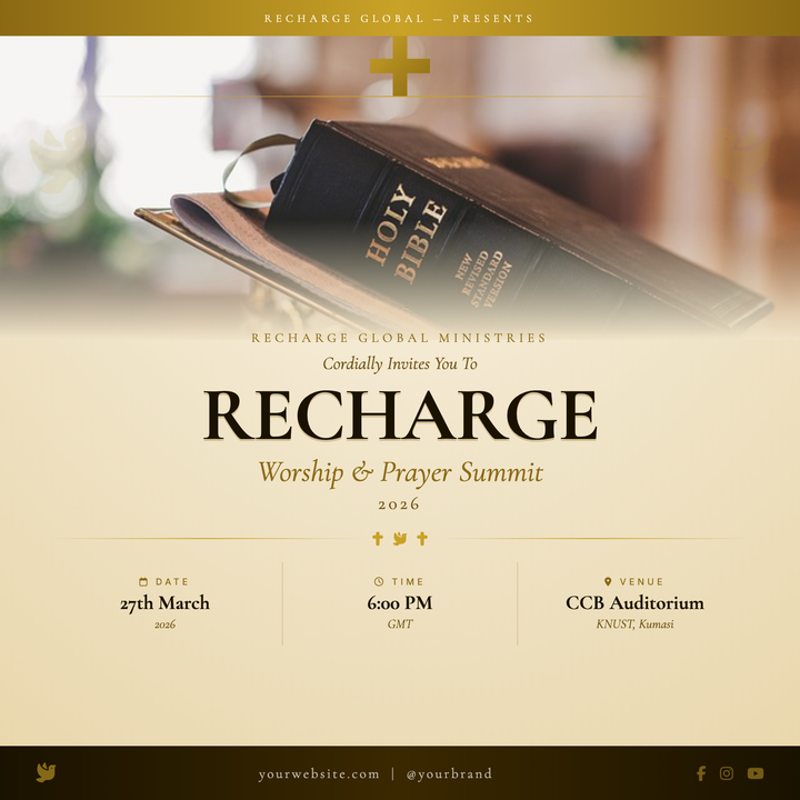
✝️ Gospel Concert Flyer
A reverent, ceremonial flyer built for gospel concerts, worship nights, and church conferences. Features a full-bleed photo hero softened by a parchment cream fade, a gold clip-path cross emblem, subtle dove watermarks, and Cormorant Garamond serif headlines in deep near-black. A three-column info grid cleanly surfaces date, time, and venue details.
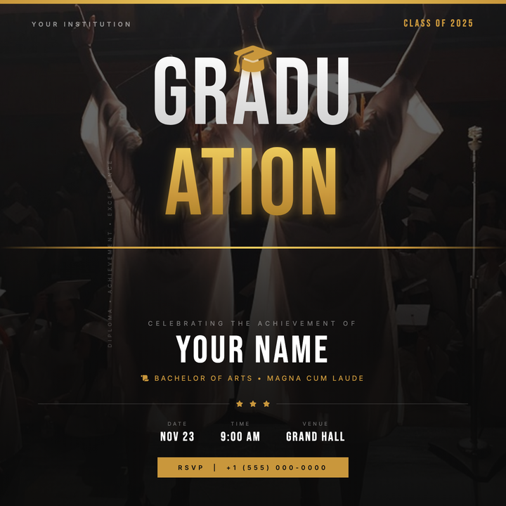
🎓 Graduation Party Flyer
A cinematic, dark-themed graduation flyer built around a split gold-and-white Bebas Neue wordmark, full-bleed photo texture, and a deep graphite-to-black radial background. Gold accent bars, a centered cap icon, and a structured lower panel highlight the graduate's name, degree, and event details with institutional polish. Ideal for commencement announcements, honors night invites, and senior class celebration posts.
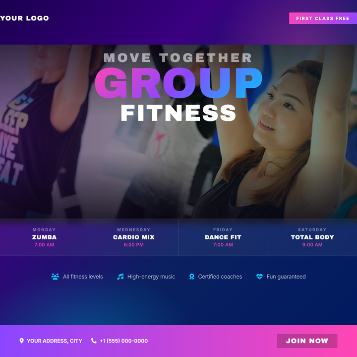
🏋️ Group Fitness Flyer
A deep indigo-to-navy diagonal gradient sets a neon-nightlife canvas, layered with radial magenta and cyan halos and a darkened action photo with edge-scrim treatment. Archivo Black headlines stack a 96px neon gradient "GROUP" above solid white "FITNESS" for bold typographic impact. Built-in frosted-glass schedule grid and a magenta-to-violet "Free Class" badge give studios everything they need to drive sign-ups in a single square post.
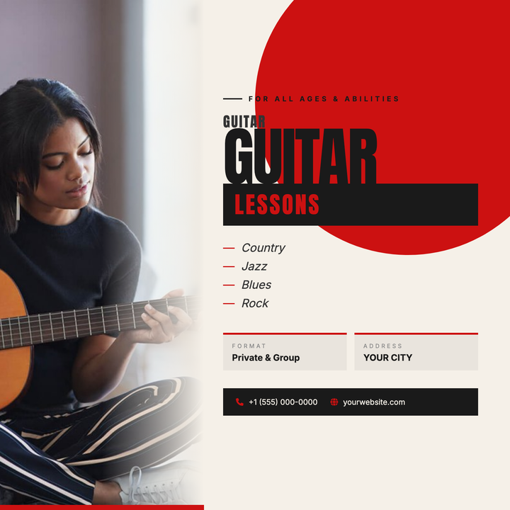
🎸 Guitar Lesson Flyer
A bold, street-poster-style square flyer built for guitar instructors and music studios. A full-bleed instrument photo bleeds into a warm cream content zone via a smooth edge fade, while a crimson quarter-circle explodes from the upper-right corner for instant visual energy. Stacked Anton headlines, an inverted "lessons" badge, and a dark contact bar keep the message sharp and scannable.
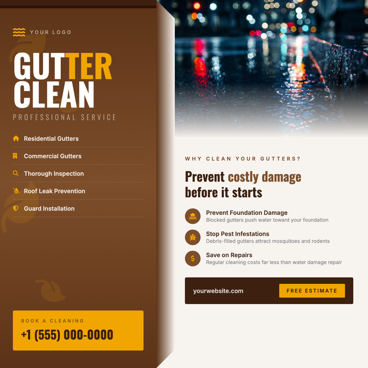
🍂 Gutter Cleaning Flyer
A bold split-panel layout built for fall home-services campaigns, featuring a deep rust-brown left column with Oswald Bold headlines and an amber gold CTA box, paired with a warm cream right panel for educational copy and a photo with a soft bottom fade. Leaf motifs and a gutter-channel detail reinforce the seasonal theme. Ideal for local contractors running autumn gutter cleaning, roof maintenance, or exterior property-prep promotions.
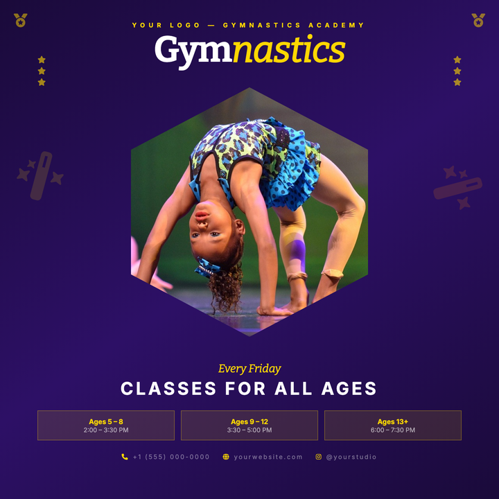
🤸 Gymnastics Class Flyer
A deep-purple diagonal gradient canvas frames a gold-rimmed hexagonal photo centerpiece, giving this template a trophy-like energy that grabs attention instantly. Bitter serif headlines at 58px anchor the top band, while age-tier boxes and scheduling copy fill the bottom third — everything a parent needs at a glance. Built for gymnastics academies, dance studios, and youth sports programs running enrollment or weekly-class promotions.
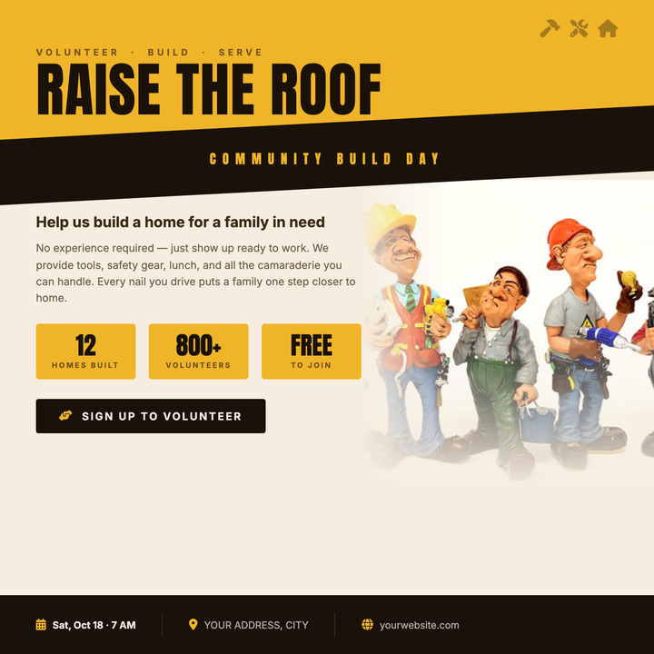
🔨 Habitat Build Day Flyer
Built for nonprofit construction events and community volunteer drives, this template uses a bold Anton headline at 72px, a diagonal dark slash cutting across an amber header block, and stat boxes that surface key event details at a glance. The warm cream canvas and construction-site color palette — amber yellow, near-black, and cream — read as urgent and mission-driven. Tool icon accents in the top corner reinforce the worksite energy without going corporate.
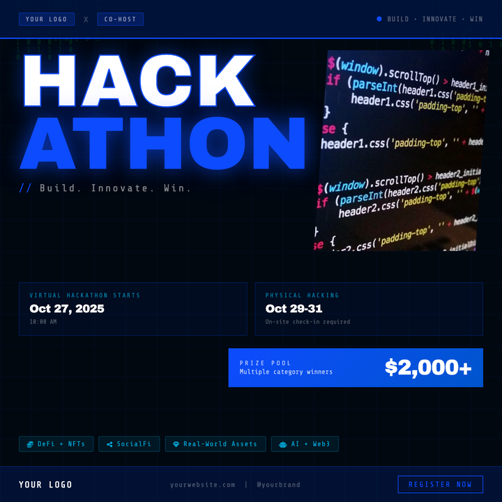
💻 Hackathon Event Flyer
Built for coding competitions and developer sprints, this dark-mode square flyer pairs 118px Archivo Black display type in white and electric blue (#0d4bff) with a binary code rain backdrop and dot-grid texture. A parallelogram photo cutout, prize gradient card, and cyan track pills organize key event details at a glance. Ideal for university organizers, corporate sponsors, and Web3 buildathons needing an urgent, tech-native look.
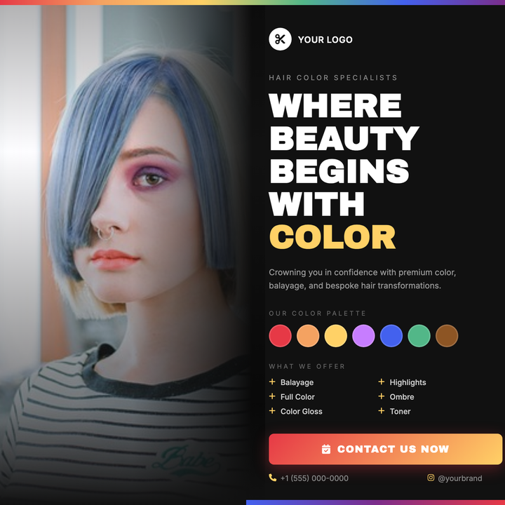
💇 Hair Color Salon Flyer
A dark-studio layout with a full-bleed portrait photo that fades seamlessly into a deep #111 right panel. Bold gold-yellow headlines and a six-stop rainbow swatch strip give chromatic flair, while a descending grey type hierarchy (white → #999 → #666) keeps services and contact details easy to scan. Built for color salons, balayage studios, and stylist portfolio promos.
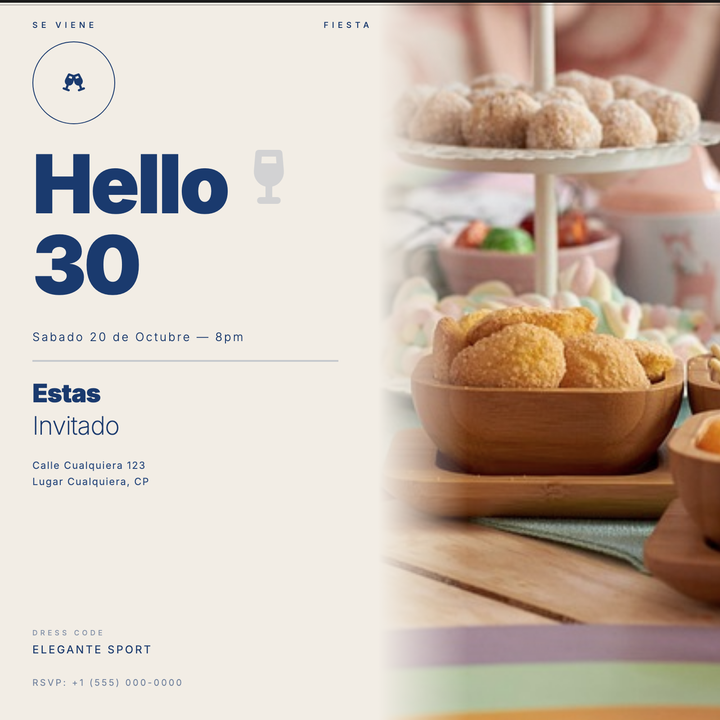
🎂 30th Birthday Invitation
A split-panel editorial design with a warm ecru background and full-bleed photo half, feathered seamlessly into the cream surface. Bold 90px weight-900 headline type commands the left column, anchored by art-deco double rules and spaced-caps labels. Built for milestone cocktail parties, lounge dinners, and rooftop celebrations with a sophisticated, understated mood.
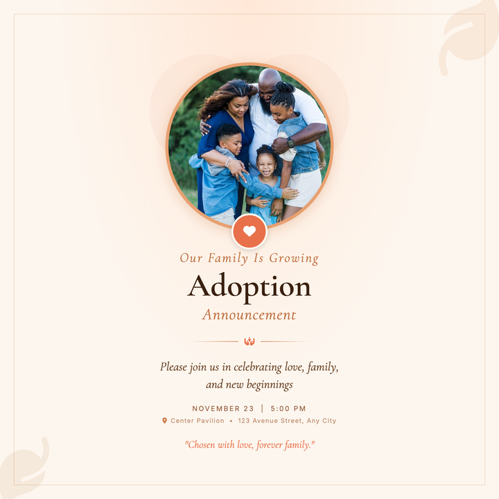
🏠 Adoption Announcement Flyer
A warm amber-peach circular portrait layout with Cormorant Garamond serif typography, botanical leaf accents, and a coral heart badge bridging photo to text. Designed for families announcing an adoption finalization or baby welcome, it balances ceremonial elegance with personal tenderness. Ideal for sharing with close family and friends in print or digital form.
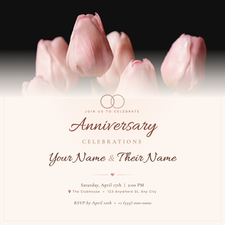
💍 Anniversary Party Flyer
A warm blush-and-cream canvas with a full-width photo fade, interlocking rings motif, and Allura cursive headlines sets a heartfelt, vintage-modern tone. Dusty clay-rose accents tie together the decorative border, petal dividers, and Cormorant Garamond subtext for elegant typographic layering. Ideal for anniversary parties, vow renewals, and engagement reveals where the mood calls for romance over formality.
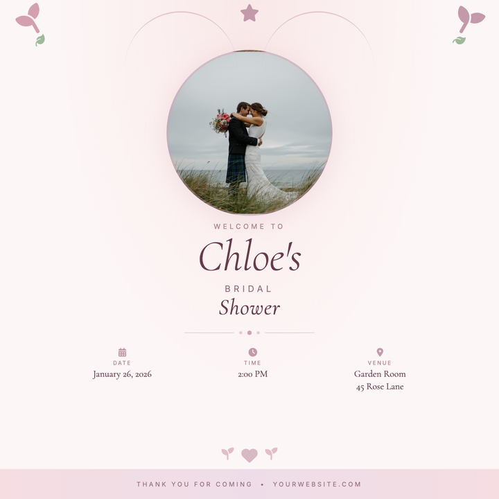
💐 Bridal Shower Flyer
A portrait-centered bridal shower announcement built around a circular photo well, botanical icon crown, and italic Cormorant Garamond typography. Warm blush-to-rose gradients and a pearl divider create a handcrafted, ceremonial feel. Ideal for bridal showers, engagement teas, or bride-to-be brunches where the honoree's name and face take center stage.
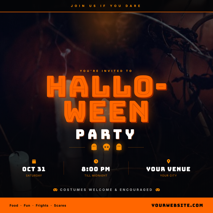
🎃 Halloween Party Flyer
Built for nightclub bashes, bar crawls, and costume parties, this template layers a full-bleed moody photo under an orange radial moon glow and a deep black gradient scrim. Bungee Inline display type punches through the darkness, while the near-black surface palette keeps all event details crisp. Sized for Instagram square posts and digital invitations.
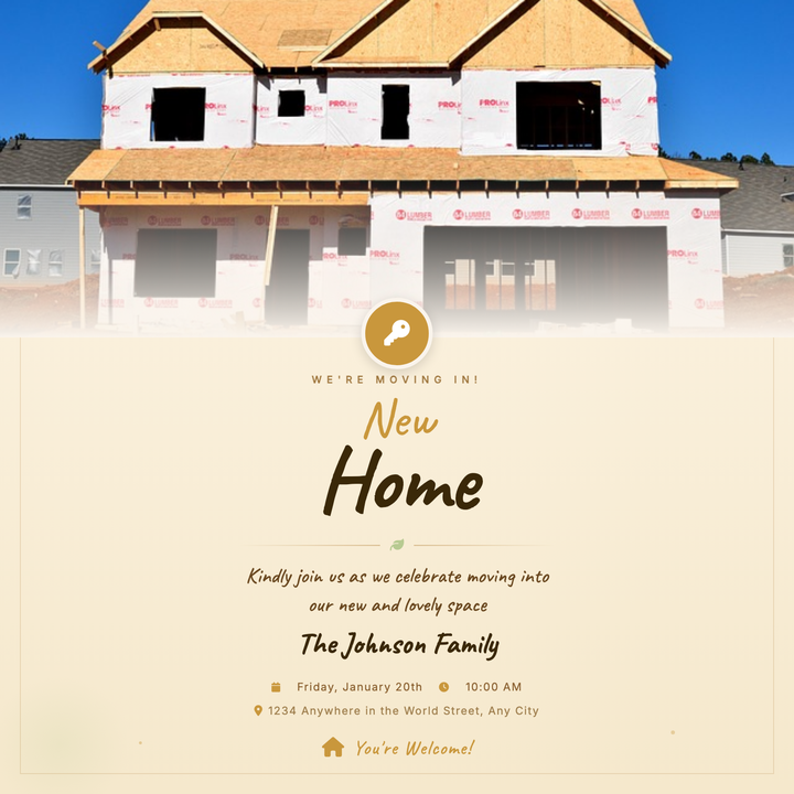
🏠 Housewarming Party Flyer
A warm, handcrafted flyer built around a full-bleed home exterior photo that fades into a parchment ivory canvas. A gold key badge bridges the two zones, while Caveat script headlines, sage green leaf accents, and amber-gold details create an intimate, celebratory feel. Ideal for housewarming parties, family relocations, or cozy domestic gatherings shared with close friends and neighbors.
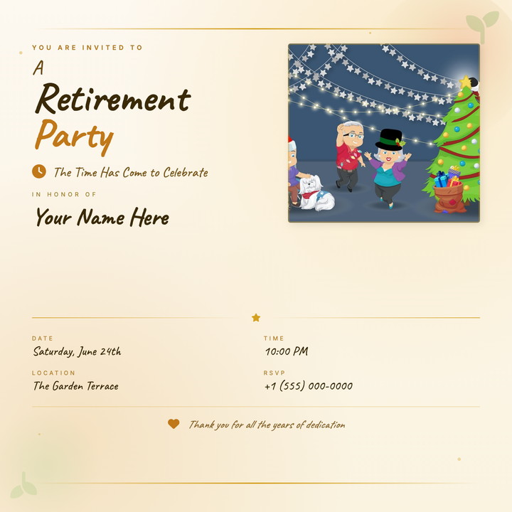
🎉 Retirement Party Flyer
A warm parchment-cream canvas with bold Caveat display headlines and a dedicated photo block makes this flyer feel handcrafted and personal. Gold accent rules, soft floral corner washes, and a structured details grid keep the honoree's name front and center. Built for retirement parties, long-service farewells, and milestone celebration brunches.
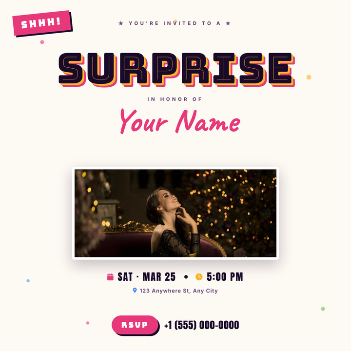
🎉 Surprise Party Flyer
Bold Bungee Inline headline and hot-pink Caveat script put the honoree's name front and center on a warm cream, confetti-dotted canvas. A centered photo panel with drop shadow, Anton date strip, and a pink RSVP pill keep logistics clear at a glance. Built for surprise birthdays and milestone celebrations where a fun, informal tone lands best.
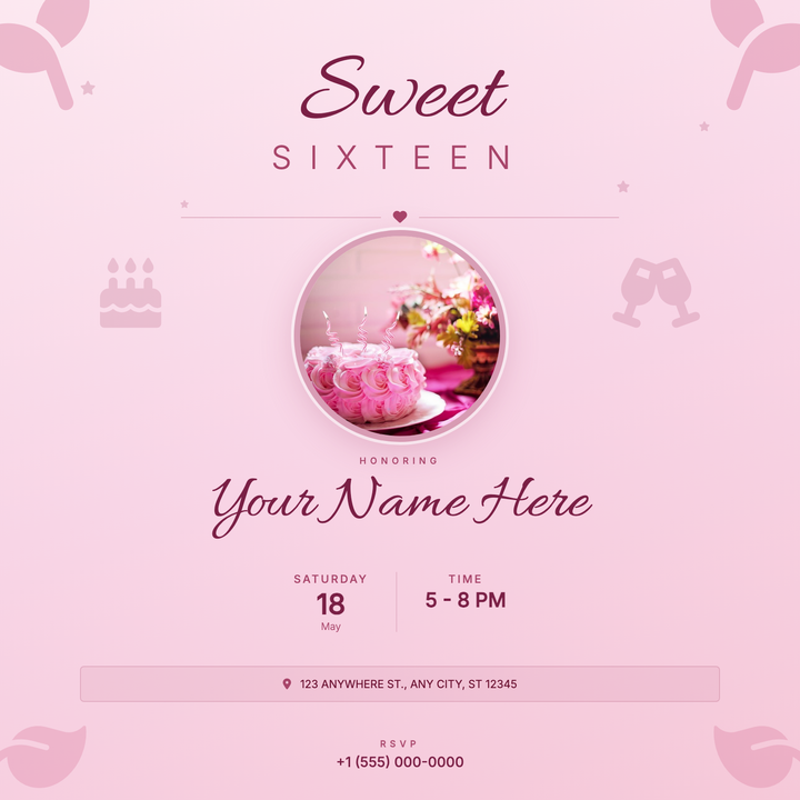
🎀 Sweet 16 Invitation
A warm rose-pink square invite built around a circular portrait photo, Allura script headlines, and delicate floral corner accents. Ideal for teen milestone birthdays, family-hosted receptions, or boutique celebration announcements where a feminine, modern-romantic tone is key. Stacks name, date, time, and address in a clean typographic spine — no design experience needed.
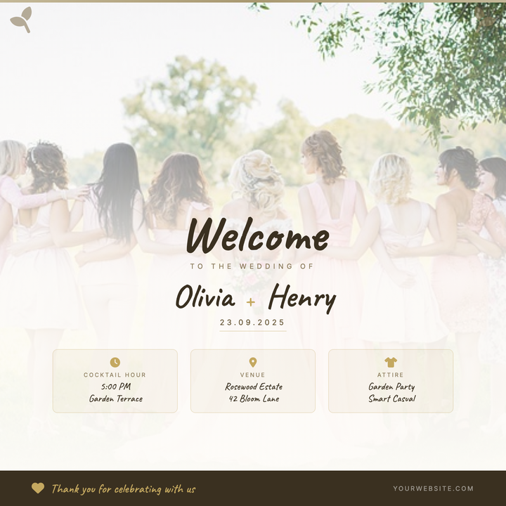
💍 Wedding Welcome Party Flyer
A warm, botanical-style welcome flyer featuring hand-script Caveat typography, soft gold accents, and a full-bleed photo that fades into a parchment-cream surface. Three structured detail cards organize venue logistics beneath the couple's names, keeping romance and readability in balance. Ideal for garden, rustic-chic, or boho weddings — works as printed venue signage or a shared digital invite.
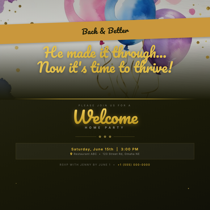
🏡 Welcome Home Party Flyer
A dark-gold luxury layout built for heartfelt homecoming celebrations — military reunions, hospital discharges, or milestone returns. A full-bleed lifestyle photo bleeds seamlessly into a warm charcoal lower half via a gradient overlay, while 52px and 64px Pacifico script headlines in layered gold tones anchor the sentimental mood. Scattered gold confetti dots and a tilted banner ribbon add a celebratory, keepsake-quality feel.
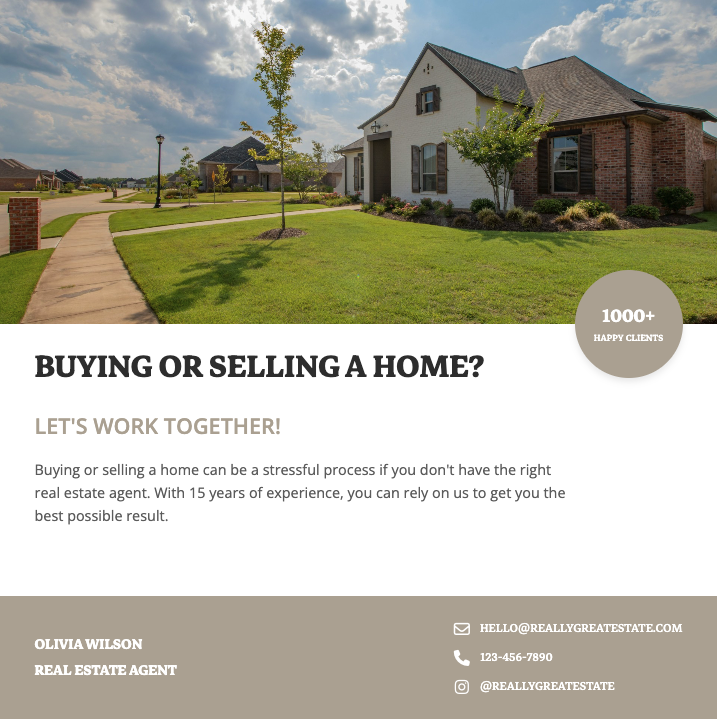
🏠 Real Estate Flyer
Professionally designed real estate flyer templates that showcase properties with high-resolution photos, virtual tour QR codes, and compelling property details. Perfect for real estate agents looking to attract buyers with visually stunning listings that highlight square footage, amenities, and neighborhood highlights for maximum engagement.
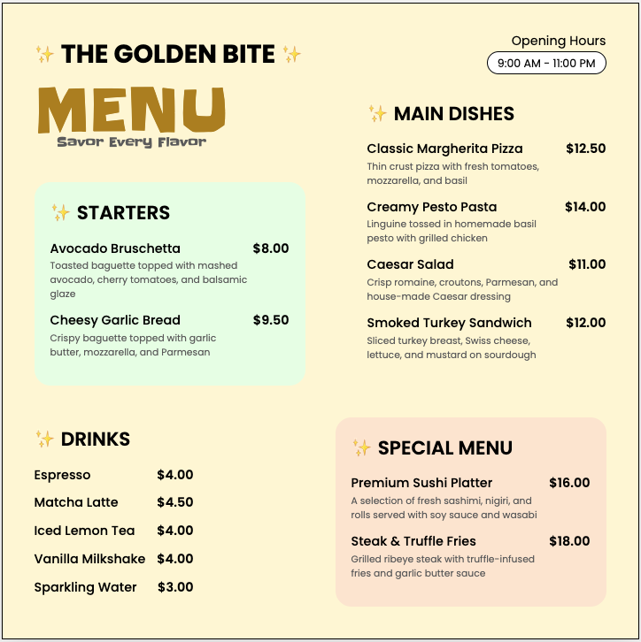
🍴 Restaurant Menu Design
Appetizing restaurant flyer templates featuring food photography that highlights your signature dishes, specials, and happy hour deals. These customizable menu designs help restaurants increase orders with clear pricing, dietary labels, and scannable QR codes linking to online ordering systems or reservation platforms.
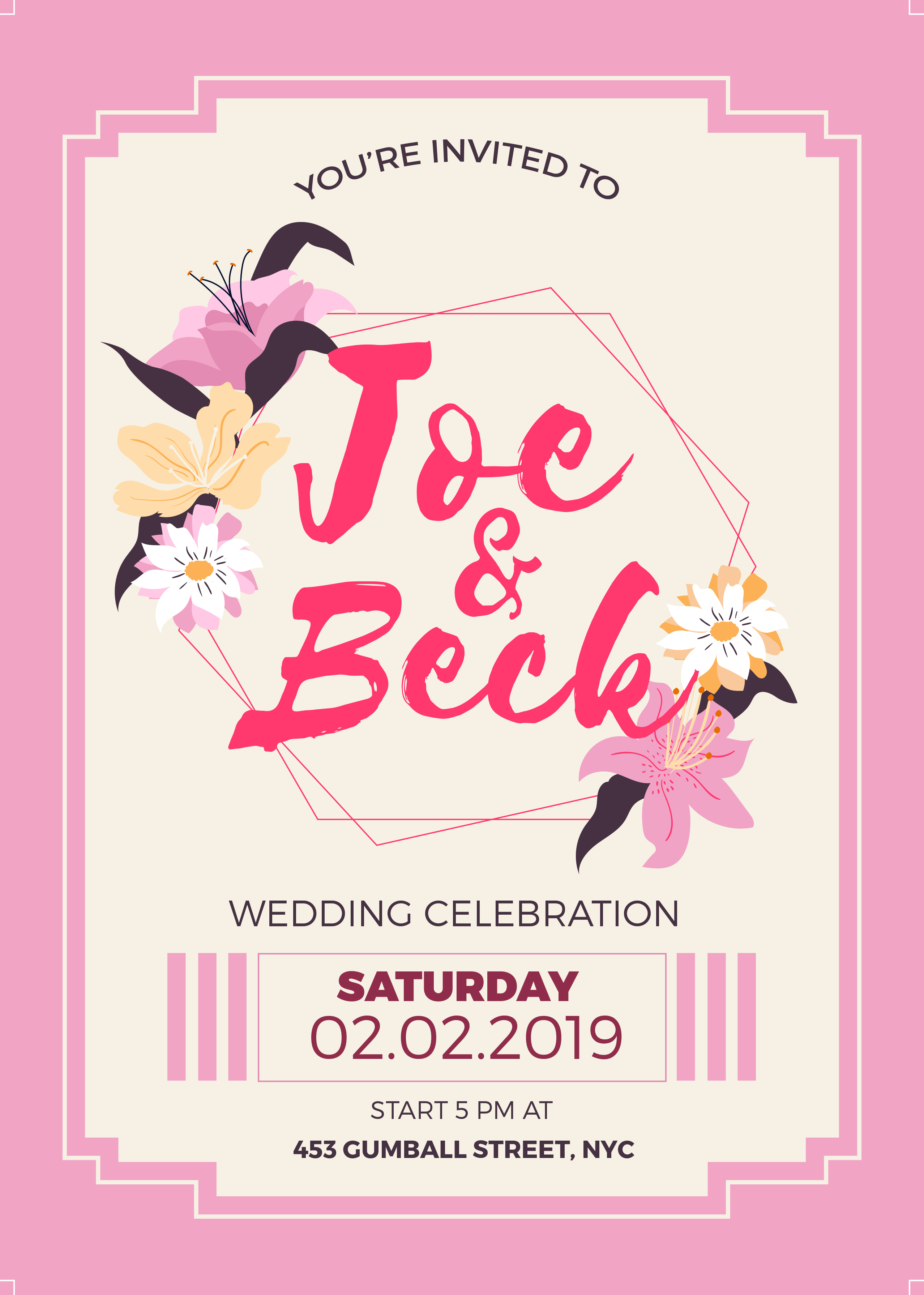
💍 Wedding Invitation
Elegant wedding flyer templates featuring romantic typography, floral motifs, and premium paper textures for save-the-dates, invitations, and RSVP cards. These designs help couples communicate wedding details like venue maps, dress codes, and registry information while setting the tone for their special day.

🎓 Graduation Flyer
Celebratory graduation flyer templates featuring academic motifs like diplomas, caps, and school colors for announcements, party invites, and ceremony programs. These designs help schools and families highlight graduate achievements, event schedules, and memorable quotes while incorporating photo collages of school memories.

🛍️ Retail Sale Flyer
High-converting retail flyer templates showcasing products with clean grids, discount badges, and limited-time offer countdown timers. These promotional designs help stores drive foot traffic and online sales by highlighting bestsellers, bundle deals, and loyalty program benefits with attention-grabbing visuals.
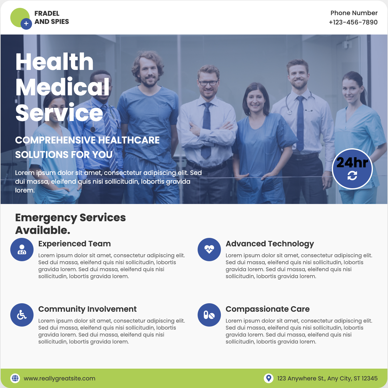
🏥 Medical Practice Flyer
Trust-building medical flyer templates featuring clean layouts, doctor profiles, and service icons for clinics, dentists, and specialists. These HIPAA-compliant designs help healthcare providers explain treatment options, showcase patient testimonials, and promote wellness events with professional yet approachable aesthetics.

🎭 Theater Event Flyer
Dramatic theater flyer templates featuring play titles in bold typography, cast headshots, and moody lighting effects for performances. These artistic designs help venues sell tickets by highlighting show dates, venue maps, and critic reviews while capturing the essence of dramatic productions.