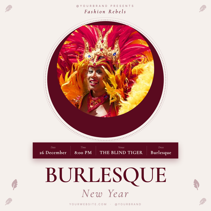
🎭 Burlesque Show Flyer
A vintage-poster layout built on cream paper tones with a deep burgundy accent, featuring a circular performer photo medallion framed by decorative lace rings. Cormorant Garamond serif typography drives the bold wordmark, while a ghost-label info strip keeps event details legible and elegant. Ideal for burlesque nights, cabaret showcases, or theatrical club events that need an invitation-like atmosphere.
What our users say
Join thousands of satisfied users who trust AIFlyer for their design needs
I actually checked this out because I was curious. I randomly thought something together and aiflyer.ai did a pretty good job. I did a simple prompt for a Birthday Brunch Invitation for April 4th @12:30 I was impressed the text was accurate. DALLE still has trouble sometimes. So great job!
Aovythegreat
Event Planner
As a small business owner, I was skeptical about AI design tools, but AIFlyer exceeded my expectations. The designs are beautiful and the process is incredibly intuitive.
Michael
Small Business Owner in Austin, TX
AIFlyer.ai has been a game-changer for our marketing team. We've been able to create beautiful flyers and social media posts in no time.
Fun_Cobbler1939
Social Media Manager
Hi, I just subscribed for AIFlyer and was really impressed. Game-changer for our marketing team! We need to make a lot of flyers for our social media campaigns and this has been so helpful.
David
Marketing Manager
No credit card needed
More Templates to Explore
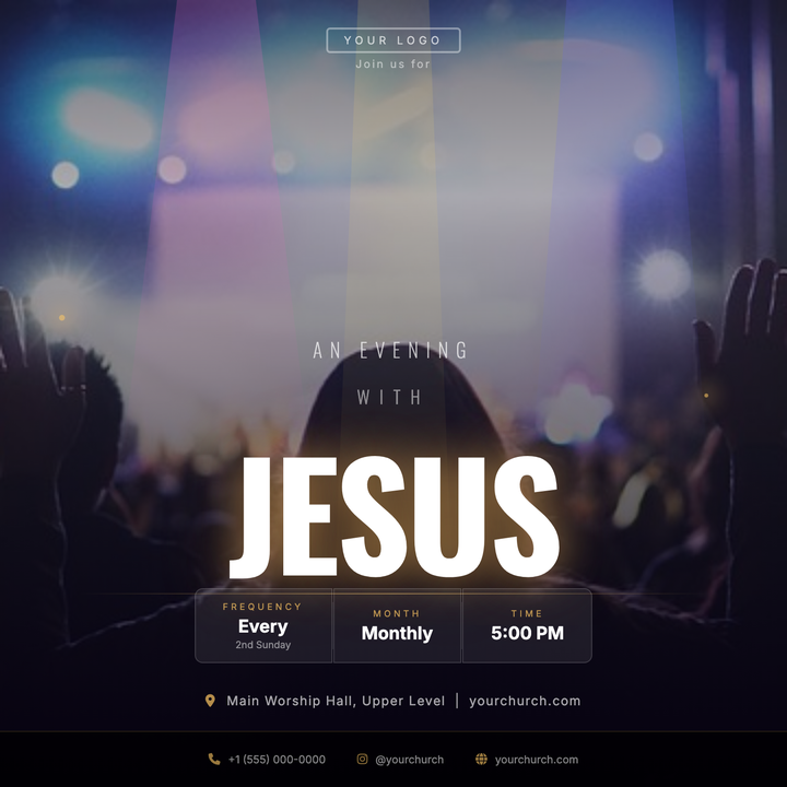
🙌 Worship Night Flyer
A cinematic square flyer built for evening worship services and church concert events. Features a concert silhouette photo under a deep-void dark scrim, clip-path spotlight beams, and a dominant 148 px Oswald Bold headline glowing in warm gold—drawing the eye straight to your devotional theme. Frosted-glass schedule pills and a radial rule line keep service details organized beneath the focal word.
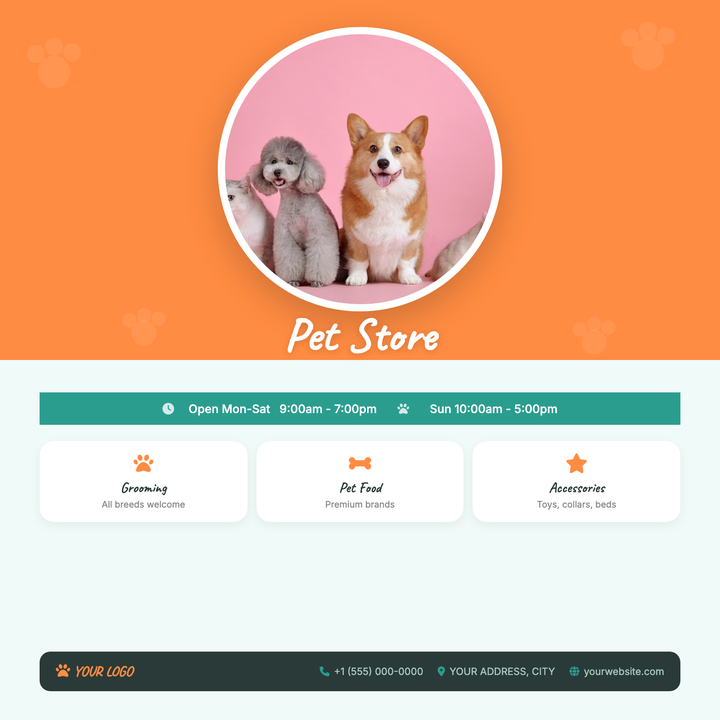
🐾 Pet Store Flyer
A warm orange-and-teal layout built for pet stores, grooming salons, and boutique pet supply shops. Features a circular hero photo, tiled paw-print overlay, Caveat script for brand personality, and a structured lower band with a hours ribbon, services grid, and contact bar. Ideal for grand openings, seasonal promos, or neighborhood awareness campaigns.
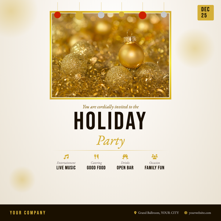
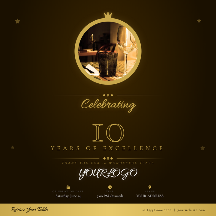
🎉 Office Holiday Party Flyer
A champagne radial background, metallic gold photo frame, and bold Bebas Neue headline give this 800×800 invite an upscale festive tone. Hanging ornaments along the top, an at-a-glance date chip, and a four-column details row keep all event info organized. Built for corporate holiday parties, year-end galas, and staff celebrations.
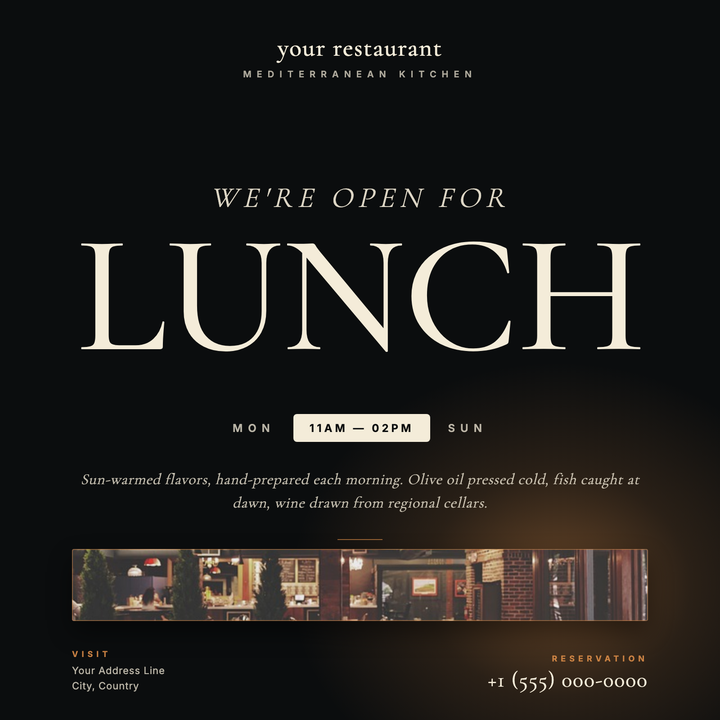
🍽️ Mediterranean Restaurant Flyer
A dark, candlelit layout built around a commanding 188px Cormorant Garamond serif headline and warm amber glow for upscale Mediterranean dining. Cream-on-near-black typography, an hours pill callout, and a cinematic radial bloom set a ceremonial mood. Ideal for announcing lunch service, seasonal menus, or reservations-only tasting nights.
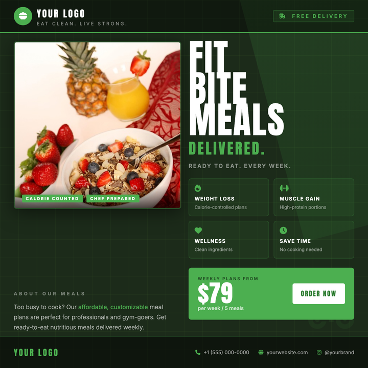
🥗 Meal Prep Flyer
A dark forest-green canvas with a bold Anton headline, 2×2 benefit grid, and a prominent price-CTA bar drives instant attention for meal prep and nutrition delivery brands. A square food photo card with gradient scrim overlay anchors the left column, while accent green (#4CAF50) highlights icons, tags, and callouts throughout. Built for fitness audiences and health-conscious professionals who need one clear subscription offer and a visible price point.
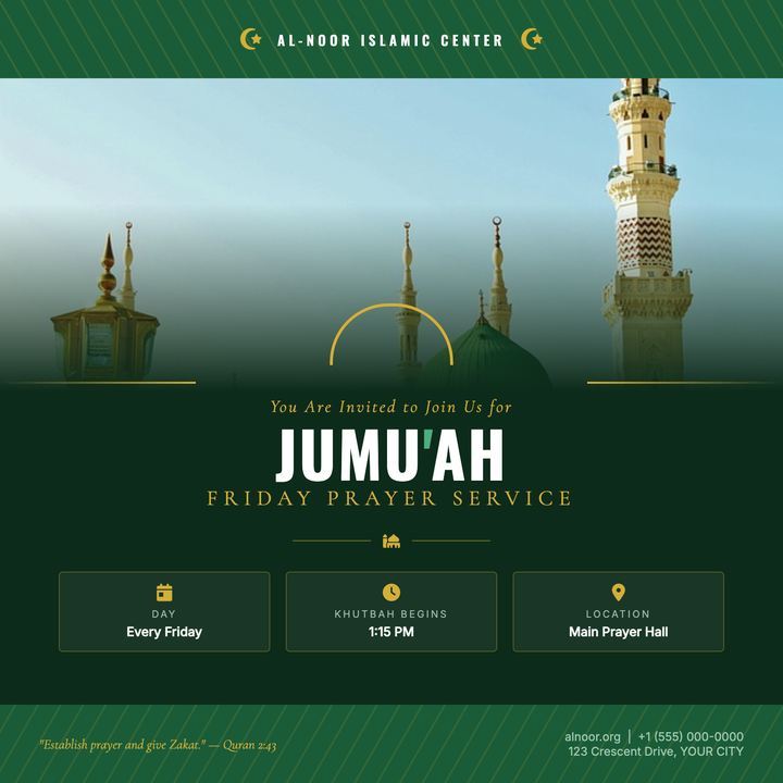
🕌 Mosque Service Flyer
A ceremonial deep-green-and-gold layout built for Islamic community announcements — Jum'ah, Eid, and Ramadan programs. A full-width photo slot fades into the dark canvas via a gradient scrim, while a gold horseshoe-arch accent bridges the image and text zones. Oswald headlines, Cormorant Garamond scripture lines, and a three-column info grid give every service detail a reverent, structured presence.
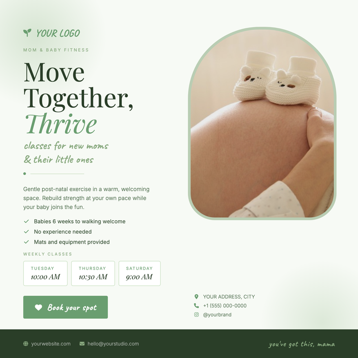
🤱 Mom & Baby Fitness Flyer
Designed for postnatal fitness studios and baby-and-me yoga classes, this flyer pairs a warm lifestyle photo with a soft sage palette and Caveat handwriting to build instant trust. Schedule cards, a feature list, and a bold CTA button guide new mothers from class details to sign-up. The pale frost background and mid-green accents keep the mood empathetic, modern, and community-focused.
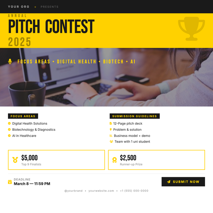
🏆 Pitch Competition Flyer
A bold yellow-and-black layout built for startup pitch competitions, demo days, and accelerator calls-for-entries. Bebas Neue headlines command attention in the top zone, while a ghost trophy icon adds thematic weight. Prize boxes, submission deadlines, and a two-column focus block keep all critical details organized in the clean white lower section.
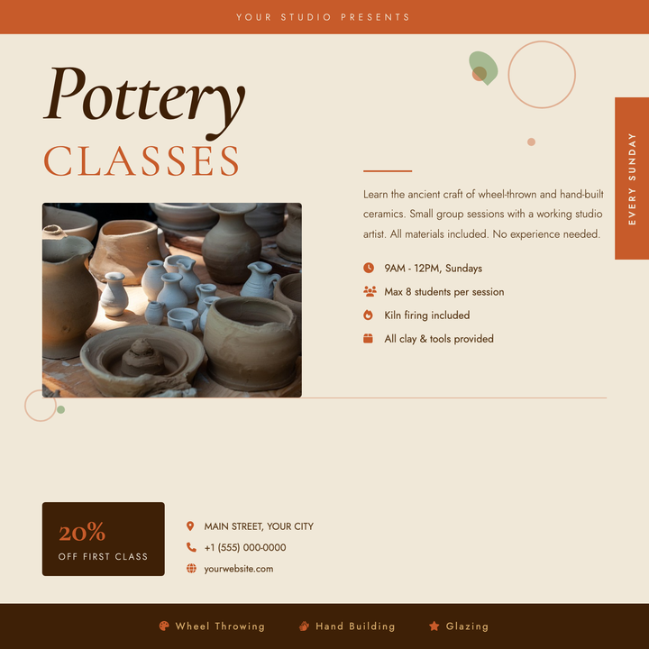
🏺 Pottery Class Flyer
A warm terracotta-and-parchment layout built for artisan studios and craft workshops. The oversized italic Cormorant Garamond headline pairs with spaced-caps type to anchor the upper-left, while a photo panel, icon-tagged class details, and a discount badge guide students from inspiration to sign-up. Organic circle and leaf accents add handmade texture without crowding the copy.
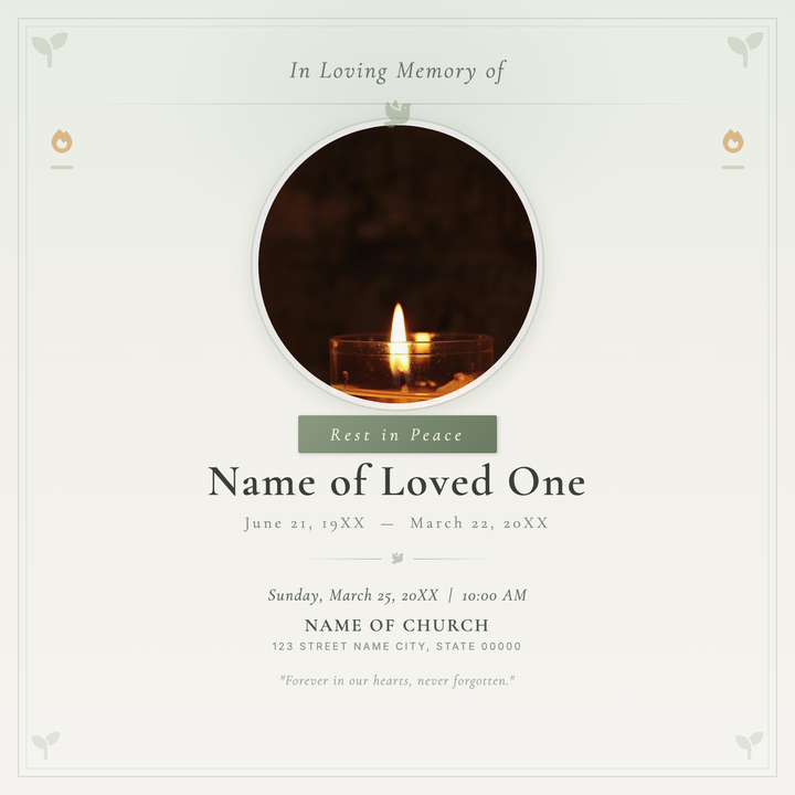
🕊️ Memorial Service Flyer
A calm, reverent layout built around a circular portrait framed by flanking candle motifs and soft sage borders, all set in Cormorant Garamond serif typography. The sage-to-off-white gradient background and amber-gold candle flame accent strike a timeless, dignified tone. Designed for funeral announcements, celebration-of-life gatherings, and church or parish memorial keepsakes.
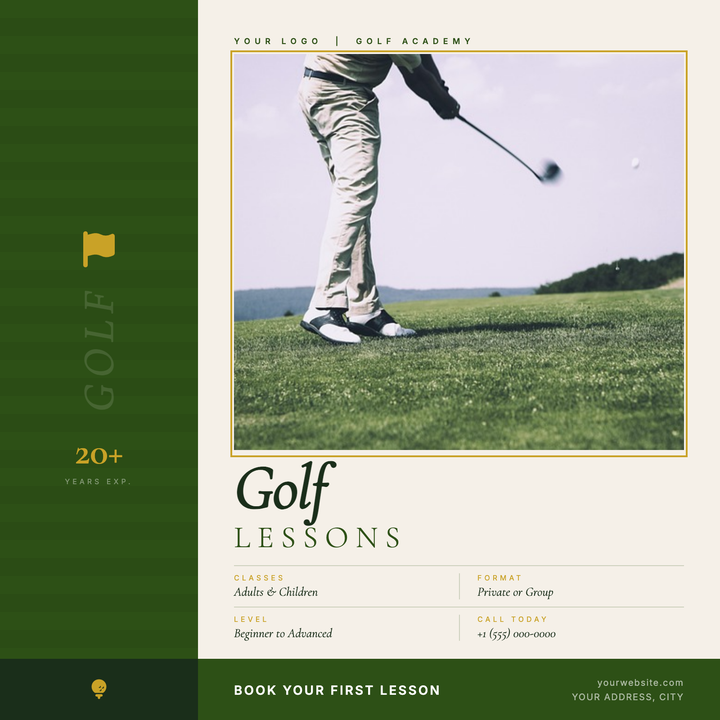
⛳ Golf Lesson Flyer
A premium two-zone layout with a deep fairway-green sidebar, gold-framed instructor photo, and Cormorant Garamond italic display type. Gold accents on credential badges, frame borders, and detail labels signal prestige, while Inter labels keep the layout clean and legible. Built for golf academies, private instructors, and country club lesson programs announcing seasonal clinics or new session openings.
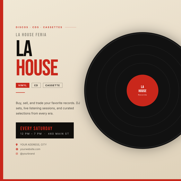
🎵 Record Store Flyer
Built for indie record stores, vinyl fairs, and release parties, this template pairs a bold 100px Bebas Neue headline with an oversized vinyl graphic that bleeds off the right edge for instant visual tension. A warm parchment gradient background and recurring red accents — side band, bottom strip, and label overlay — deliver a convincing analog-poster aesthetic. Format badges and a structured left column keep event details scannable in a single pass.
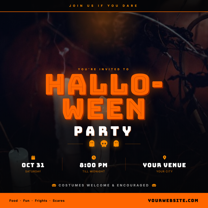
🎃 Halloween Party Flyer
Built for nightclub bashes, bar crawls, and costume parties, this template layers a full-bleed moody photo under an orange radial moon glow and a deep black gradient scrim. Bungee Inline display type punches through the darkness, while the near-black surface palette keeps all event details crisp. Sized for Instagram square posts and digital invitations.
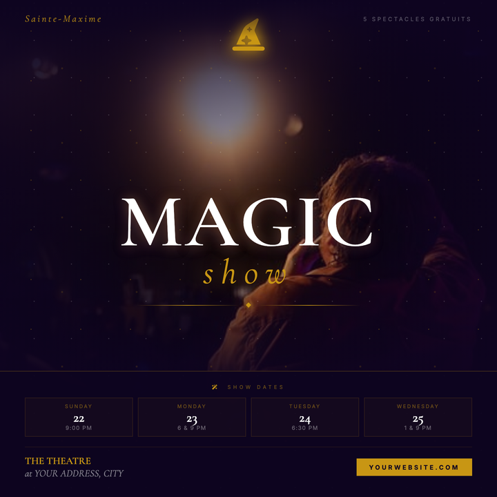
🎩 Magic Show Flyer
A cinematic dark-mystical flyer built on a deep violet-black canvas with a gold starfield overlay and full-bleed atmospheric photo scrim. The 120px Cormorant Garamond serif headline and italic gold "show" lockup command center stage, while a hat icon medallion and line-diamond-line ornament add theatrical polish. Designed for magicians, illusionists, and cabaret headliners running multi-night engagements.
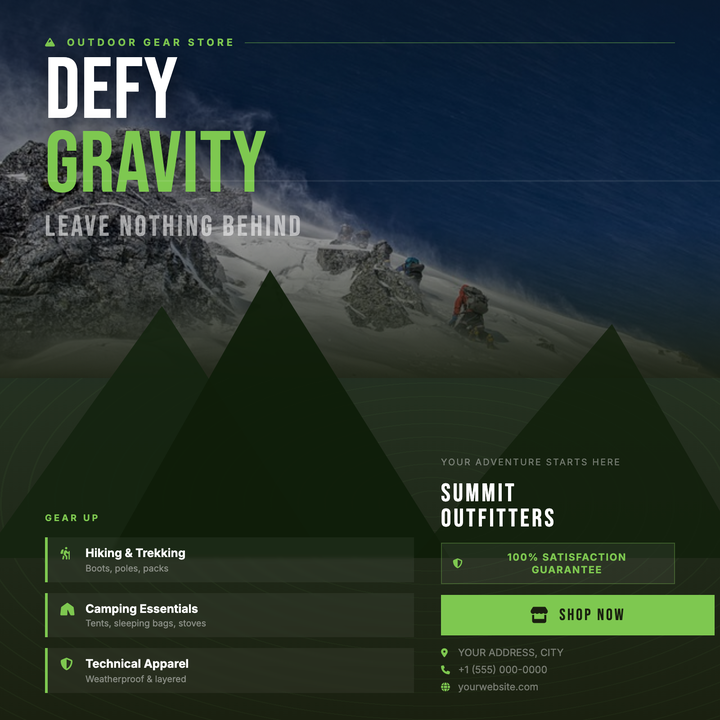
🏔️ Outdoor Gear Store Flyer
A rugged dark-wilderness layout built on a navy-to-olive gradient with layered mountain silhouettes and a dimmed landscape photo that blends seamlessly into the scene. Massive 96px Bebas Neue headlines and a single lime-green (#7ec850) accent on feature titles, borders, and the CTA button drive visual focus. Built for outdoor retailers, gear brands, and expedition companies promoting launches, grand openings, or seasonal sales.
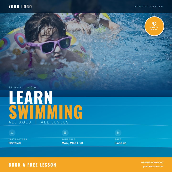
🏊 Swimming Lesson Flyer
A deep navy-to-cyan gradient canvas with CSS wave motifs creates an immersive aquatic backdrop for swim schools, community pools, and summer camps. Oswald bold headlines in warm amber pop against the cool blue field, while a frosted top bar and circular safety badge reinforce trust. Built for seasonal enrollment pushes, free-trial promos, and new-session launches.
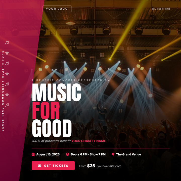
🎸 Charity Concert Flyer
A dramatic full-bleed stage photo with a deep gradient scrim keeps the atmosphere alive while ensuring sharp text contrast. A crimson diagonal ribbon anchors cause branding on the left edge, and the bold 90px Anton headline commands instant attention. Built for benefit concerts, charity galas, and DJ fundraisers targeting adults and young professionals.
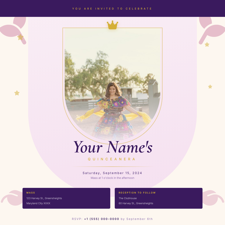
👑 Quinceañera Invitation
An arched portrait frame in soft blush rose gradients, trimmed with a 2px gold ring and topped with a crown icon, gives this invitation an heirloom, keepsake quality. Royal purple anchors the top band and ceremony details block, while Cormorant Garamond serif typography and gold rule accents carry the elegant hierarchy from name to RSVP. Built for quinceañeras, sweet sixteens, and formal debut parties where the design needs to feel as memorable as the occasion.
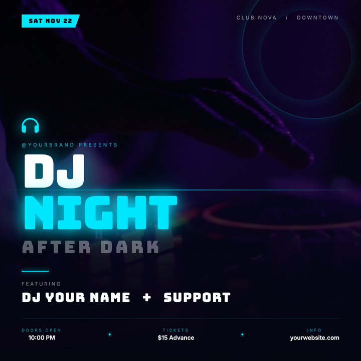
🎧 DJ Night Flyer
Built on a deep navy-black canvas with a vivid cyan accent, this template layers a full-bleed photo under a dark gradient scrim, keeping bold Bungee headlines and DJ details crisp and legible. Neon halo rings, a cyan scan-line divider, and glowing text shadows give the layout a premium-underground club feel. Ideal for DJ residencies, electronic music showcases, and late-night events targeting an 18–35 crowd.
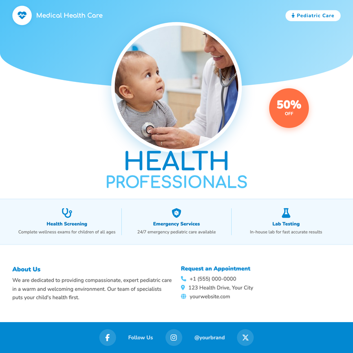
🏥 Pediatric Clinic Flyer
A warm, sky-blue gradient panel and circular photo focal point make this flyer feel approachable without sacrificing medical credibility. Rounded Comfortaa headlines, an urgency-driving discount bubble, and icon-accented contact and service cards give clinics everything they need. Built for new-patient campaigns, vaccination drives, or children's wellness open houses.
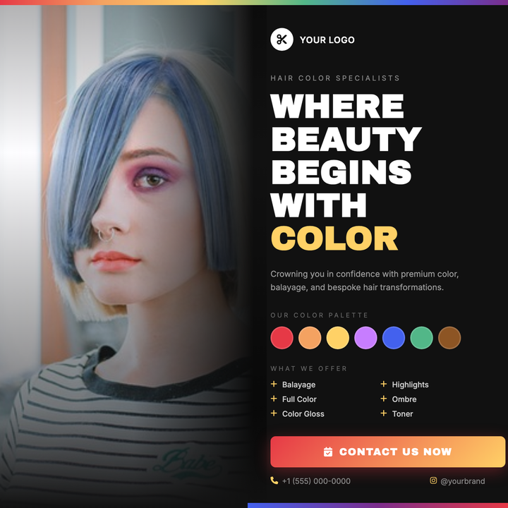
💇 Hair Color Salon Flyer
A dark-studio layout with a full-bleed portrait photo that fades seamlessly into a deep #111 right panel. Bold gold-yellow headlines and a six-stop rainbow swatch strip give chromatic flair, while a descending grey type hierarchy (white → #999 → #666) keeps services and contact details easy to scan. Built for color salons, balayage studios, and stylist portfolio promos.
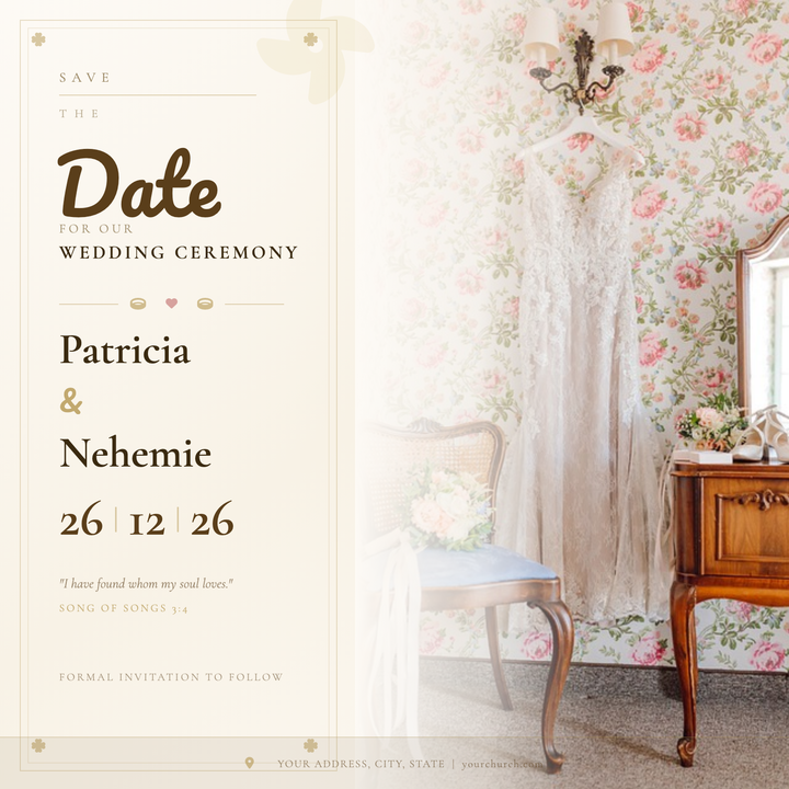
💍 Church Wedding Flyer
A formal save-the-date layout with a full-bleed couple photo on the right, softly dissolved into an ivory parchment panel via a warm gradient fade. Double gold border frames, Cormorant Garamond serif headings, and Pacifico script accents give it a timeless, ceremonial feel. Built for religious ceremonies and cathedral receptions where a print-first, classic aesthetic matters.
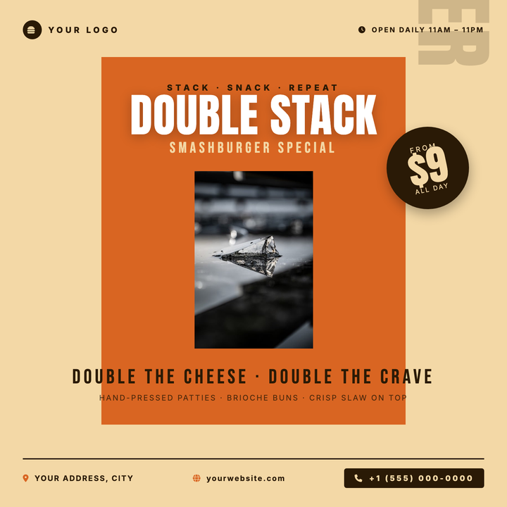
🍔 Burger Joint Flyer
Bold burnt-orange panel and oversized burger photography create instant appetite appeal. Anton headlines stacked against cream and white drive a punchy hierarchy, while a rotated price-burst badge locks in the CTA. Built for burger restaurants, fast-casual spots, and limited-time smash-stack promos.
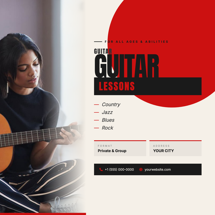
🎸 Guitar Lesson Flyer
A bold, street-poster-style square flyer built for guitar instructors and music studios. A full-bleed instrument photo bleeds into a warm cream content zone via a smooth edge fade, while a crimson quarter-circle explodes from the upper-right corner for instant visual energy. Stacked Anton headlines, an inverted "lessons" badge, and a dark contact bar keep the message sharp and scannable.
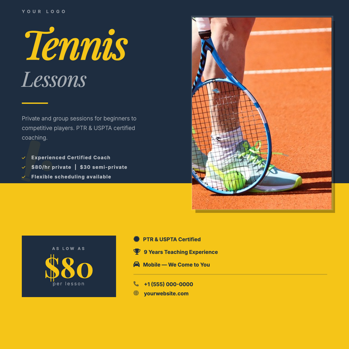
🎾 Tennis Lesson Flyer
A bold navy-and-yellow split-panel layout built for coaches and instructors who need to communicate credentials, pricing, and contact details fast. A tall portrait photo bridges both panels on the right, while Playfair Display headlines, a yellow rule accent, and a bullet list stack cleanly on the left. Ideal for private lessons, clinics, or any sport instruction service.
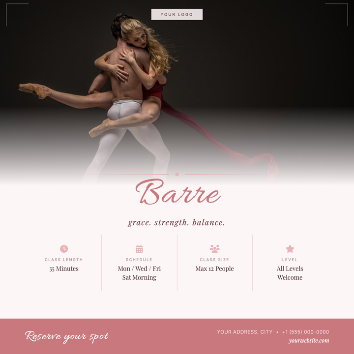
🩰 Barre Class Flyer
A soft rose and warm cream layout built for boutique barre and ballet-inspired fitness studios. The Allura script headline and Playfair Display accents give it an artisanal, elevated feel, while a four-column info grid keeps class details — schedule, location, pricing — clean and scannable. Ideal for class launches, recurring schedule promos, or small-group sign-up campaigns.
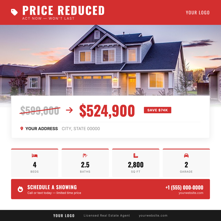
🏷️ Price Reduced Flyer
Built for motivated-seller listings where the new number needs to hit first. A full-width red alert header and bold Oswald price block surface the reduced figure instantly, while four stat tiles display key property or vehicle details at a glance. The photo-to-white fade and elevated price card keep the layout clean and data-forward.
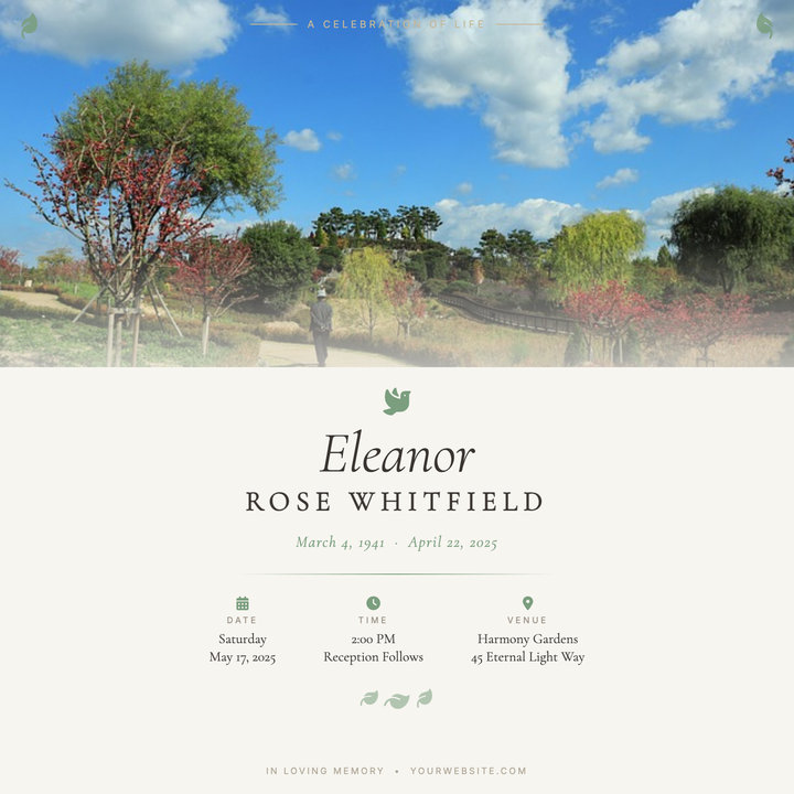
🕊️ Celebration of Life Flyer
A warm, reverent layout built around a full-bleed portrait photo that dissolves into a cream-white content panel through a soft gradient. Cormorant Garamond italic headlines and spaced-cap surnames pair with sage green dove and botanical leaf accents for a quietly elegant tone. Ideal for memorial services, church tributes, and garden-venue receptions that need a printed program or shareable digital flyer.
🍽️ Restaurant Anniversary Flyer
A candlelit, deep-brown-and-gold design built for upscale restaurant milestone celebrations. A circular medallion photo frame, 160px outline anniversary numeral, and Allura-script typography create a ceremonial focal point, while ornate gold rule dividers and an amber radial glow add layered elegance. Ideal for fine-dining anniversaries, wine bar galas, and chef-driven tasting evenings.
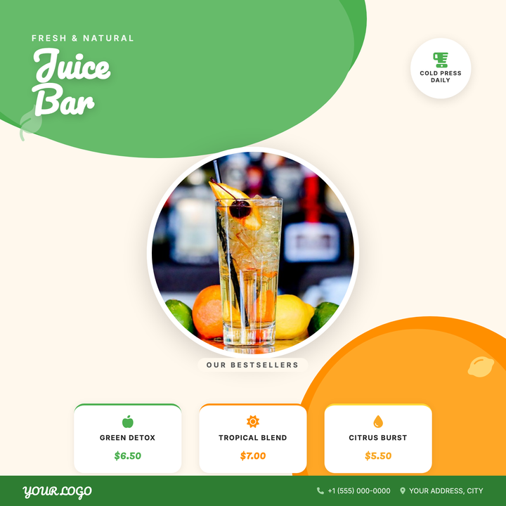
🥤 Juice Bar Flyer
A vibrant 800×800 social square built for juice bars and smoothie shops showcasing three signature menu items with prices. Diagonal green-to-amber arcs frame a circular hero photo, while Pacifico headlines and pill-shaped labels give the layout a fresh, artisanal feel. Use it to promote a seasonal menu drop, weekend pop-up, or bestseller lineup.