🎡 County Fair Flyer
Built for community fairs, town festivals, and summer carnivals, this template channels nostalgic vintage Americana with circus-style display lettering, marquee bulb borders, and a bold red-and-blue color scheme on aged-cream paper. A full-bleed hero photo panel, rotated ticket stub callout, and offset drop-shadow info cards handle dates, times, and location at a glance. The six-column attractions strip keeps event highlights scannable without cluttering the headline hierarchy.

What our users say
Join thousands of satisfied users who trust AIFlyer for their design needs
I actually checked this out because I was curious. I randomly thought something together and aiflyer.ai did a pretty good job. I did a simple prompt for a Birthday Brunch Invitation for April 4th @12:30 I was impressed the text was accurate. DALLE still has trouble sometimes. So great job!

Aovythegreat
Event Planner
As a small business owner, I was skeptical about AI design tools, but AIFlyer exceeded my expectations. The designs are beautiful and the process is incredibly intuitive.

Michael
Small Business Owner in Austin, TX
AIFlyer.ai has been a game-changer for our marketing team. We've been able to create beautiful flyers and social media posts in no time.

Fun_Cobbler1939
Social Media Manager
Hi, I just subscribed for AIFlyer and was really impressed. Game-changer for our marketing team! We need to make a lot of flyers for our social media campaigns and this has been so helpful.

David
Marketing Manager
No credit card needed
Frequently Asked Questions
More Templates to Explore

🧶 Craft Fair Flyer
A warm kraft-paper canvas with SVG bunting, a rounded photo card, and Caveat handwritten typography sets a handmade, community feel instantly. Deep walnut headlines, a dark ribbon venue callout, and icon-and-label feature cells keep vendors and visitors informed at a glance. Built for artisan markets, holiday bazaars, and neighborhood makers' fairs.

🧁 Cupcake Shop Flyer
A bold social-square layout built around an elliptical product photo frame with a deep pink drop-shadow, set against a hot-pink top panel and clean white lower half. Scattered pill badges and a high-contrast price tag in dark berry keep key details readable at a glance. Ideal for boutique cupcake shops, dessert pop-ups, and seasonal flavor launches where image-first presentation and pricing need to share one canvas.

💻 Cyber Monday Sale Flyer
A deep near-black canvas with electric-cyan circuit grid lines and a radial blue glow sets a high-voltage digital mood. Bold Inter 900 headline type contrasts with a light-weight secondary line, while a gradient pill badge spotlights the discount and a three-column stats row seals the deal. Built for tech retailers, SaaS promos, and electronics drops that need urgency without sacrificing polish.

🛡️ Cybersecurity Workshop Flyer
Built for ethical hacking bootcamps, CTF competitions, and red-team trainings, this template channels a CLI-coded aesthetic with neon-green Orbitron headlines, Matrix rain CSS columns, and a dark #020b02 canvas. A macOS-style terminal bar, glowing #00ff41 accent text, and a photo panel blended via gradient scrim give it sharp technical authority. Ideal for reaching developers, IT pros, and security students who expect a serious, high-stakes visual tone.

🍽️ Daily Specials Flyer
A fire-gradient canvas in amber, burnt orange, and crimson gives this menu flyer bold street-market energy. Bebas Neue headlines and Playfair Display italic subtext anchor the hierarchy, while floating cream cards (each with a thumbnail, dish name, and right-aligned price) keep the four specials scannable. Built for restaurants, food trucks, and catering brands running daily social posts or printed table cards.

🏕️ Day Camp Flyer
Built for outdoor youth programs, this square flyer pairs a full-bleed nature photo with a rustic earth-tone layout anchored by saddle brown and espresso panels. A hexagonal scout-badge motif and Playfair Display italic headline with muted-gold accents give the design a heritage feel. The persistent footer strip keeps registration contact info always visible—ideal for Instagram ads or printed sign-up flyers.

🌈 Daycare Center Flyer
A warm, playful flyer built for childcare providers, preschools, and family playcenters. Features a Caveat script eyebrow, bold 72 px Nunito Black logotype, and a pastel sky-to-white gradient that blends seamlessly with the rounded photo panel. Pastel pink and sunshine yellow accent blocks highlight key enrollment info and services at a glance.
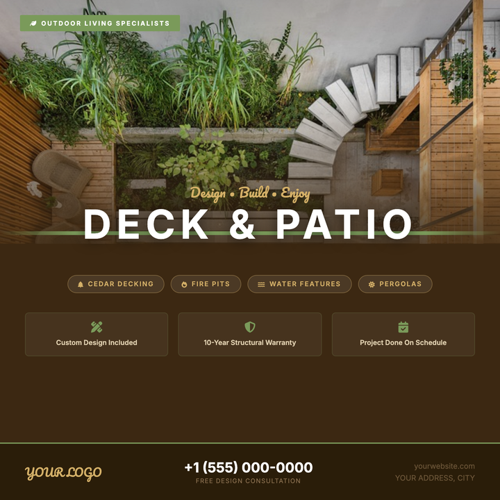
🪵 Deck & Patio Flyer
A warm rustic-modern layout built for deck builders and patio contractors. A full-bleed outdoor photo fades into a cedar-brown panel via a dark gradient scrim, anchored by a sage-green divider strap. Pacifico script paired with a bold all-caps Inter headline draws the eye immediately, while a structured feature grid and pill-style callouts keep the offer clear and conversion-ready.

🥪 Deli Menu Flyer
A kraft-paper textured layout with Bebas Neue headlines, dashed dividers, and a rotated stamp badge that telegraphs handcrafted, old-school character. Menu item rows with icon badges and price labels make daily specials easy to scan, while a pinned photo card and warm espresso-brown footer anchor the design. Built for neighborhood delis, sandwich counters, and casual lunch spots promoting seasonal offerings.

🦷 Dental Cleaning Special
A deep-navy canvas blends a dental-office photo into a structured service grid via a seamless gradient overlay, keeping the layout clinical yet approachable. A rotated yellow price-stamp circle commands immediate attention over the photo-to-body transition, anchoring the fixed-price offer. Built for dental clinics running a cleaning promotion, the 3-column service tile grid and four trust badges give patients everything they need at a glance.
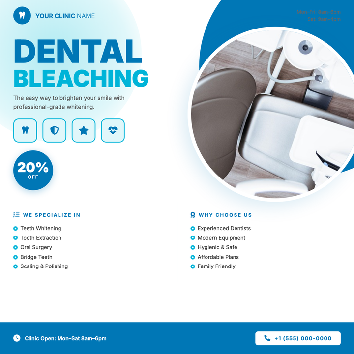
🦷 Dental Office Flyer
A clean, clinical-friendly layout built around a bold cyan-and-blue headline, circular patient portrait, and a prominent discount badge — ideal for whitening promos or treatment offers. Four icon tiles bridge the headline to a scannable two-column service list, while the deep `#0077b6` footer anchors the call-to-action. Suits family dental practices and upscale cosmetic smile-design campaigns alike.

🧴 Dermatology Clinic Flyer
A split-column editorial layout pairs a full-bleed photo hero with a warm parchment content panel, separated by a luminous gold seam. Cormorant Garamond headlines and a muted `#1a1a1a` anchor tone give the design a modern-luxury feel, while a gold circle badge highlights intro discounts. Built for dermatology clinics, medical spas, and skincare brands promoting consultations or seasonal treatment offers.

🎒 After-School Program Flyer
A bold crimson header with Archivo Black typography and a golden clock badge instantly communicate program time and energy. The wide photo panel with scrim gradient anchors a five-circle feature row, making activities scannable at a glance. Built for community centers, recreation departments, and schools announcing youth enrollment.

🎉 Block Party Flyer
Bold Caveat lettering stacked three lines tall — with the oversized "BLOCK" headline dominating the canvas — over a darkened cover photo and a deep burnt-orange lower panel. A torn-paper wave SVG bridges the two bands, while lemon-yellow accents highlight performers, feature chips, and the date pill. Built for neighborhoods, community organizers, and local promoters who need maximum street-level impact in print and on social feeds.
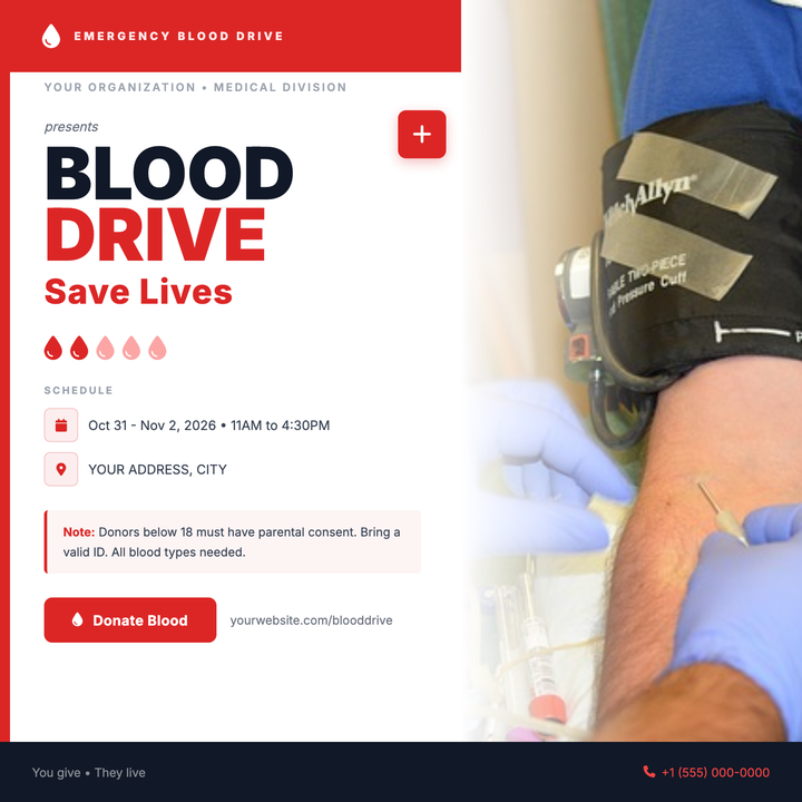
🩸 Blood Drive Flyer
A bold, clinically urgent layout built for blood drives and donor recruitment campaigns. Deep red headers, heavyweight 72px Inter headlines, and a structured schedule block project institutional credibility, while a full-bleed photo panel and vivid #dc2626 CTA button drive immediate action. Ideal for hospital systems, Red Cross chapters, or corporate wellness teams promoting donation events.

🧹 Chimney Sweep Flyer
Built on a dark charcoal-and-warm-gold palette with Bitter serif display type, this template pairs a full-bleed photo zone with an ember-lit scrim and a four-column services row below. A corner seal and discount badge frame the image symmetrically, communicating trade authority at a glance. Ideal for local chimney sweep, fireplace inspection, or home heating businesses running fall or pre-winter seasonal promotions.
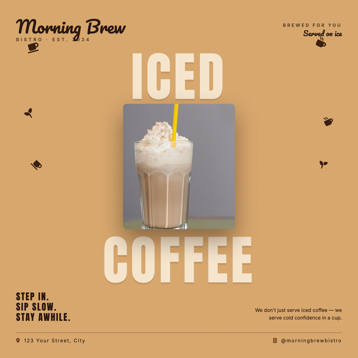
☕ Coffee Shop Flyer
A bold split-headline layout pairs oversized Anton type ("ICED" + "COFFEE") in pale cream against a warm caramel field, sandwiching a centered hero product photo for a deliberate top-to-bottom visual read. Pacifico script branding anchors the upper corners while scattered coffee bean icons add organic energy to the side margins. Built for cafés, cold-brew launches, and seasonal iced-beverage promos — equally at home as an Instagram square or in-store print poster.

🥏 Disc Golf Tournament Flyer
Built for local tournaments and park course events, this flyer pairs a bold Oswald headline stack with a circular hero photo framed by a dashed disc ring. Three badge-style info cards highlight key event details, while a gold-accented callout box and centennial badge anchor the deep-green grass band. The forest-green and sky-blue palette keeps the mood active, friendly, and community-focused.
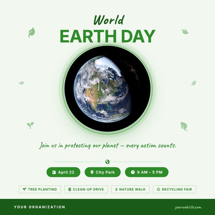
🌍 Earth Day Event Flyer
A mint-white square flyer built around a circular nature photo framed by soft concentric rings and floating leaf accents in forest green. Caveat script pairs with bold Inter all-caps for a handmade-but-polished feel, while info pills and activity tags keep event logistics clear. Ideal for community Earth Day celebrations, tree-planting days, and school green fairs.

🪵 Fence Installation Flyer
A trade-professional layout built for fencing contractors and gate installers who need to drive direct-call response. Deep forest green headers and a warm gold accent highlight key stats and your phone number, while a full-bleed product photo fades organically into the cream background. Works across door hangers, yard signs, and social square ads.

🛍️ Flea Market Flyer
Built on a kraft-paper diagonal gradient with Caveat script headlines and Bitter serif accents, this template brings a handmade, community feel to any recurring marketplace event. Rust-red bunting pennants and a framed photo block anchor the layout, while the schedule box and stall ribbon put day, time, and location front and center. Ideal for flea markets, farmers' markets, vintage fairs, and weekend craft pop-ups.

💐 Florist Shop Flyer
A warm rose-pink layout built for local florists and artisan floral studios. A full-width photo banner fades seamlessly into the content zone via a soft gradient scrim, while an Allura script headline and botanical accent shapes set a romantic, handcrafted mood. Ideal for Mother's Day pre-orders, Valentine's Day campaigns, or wedding-season promotions with a single call-to-action.
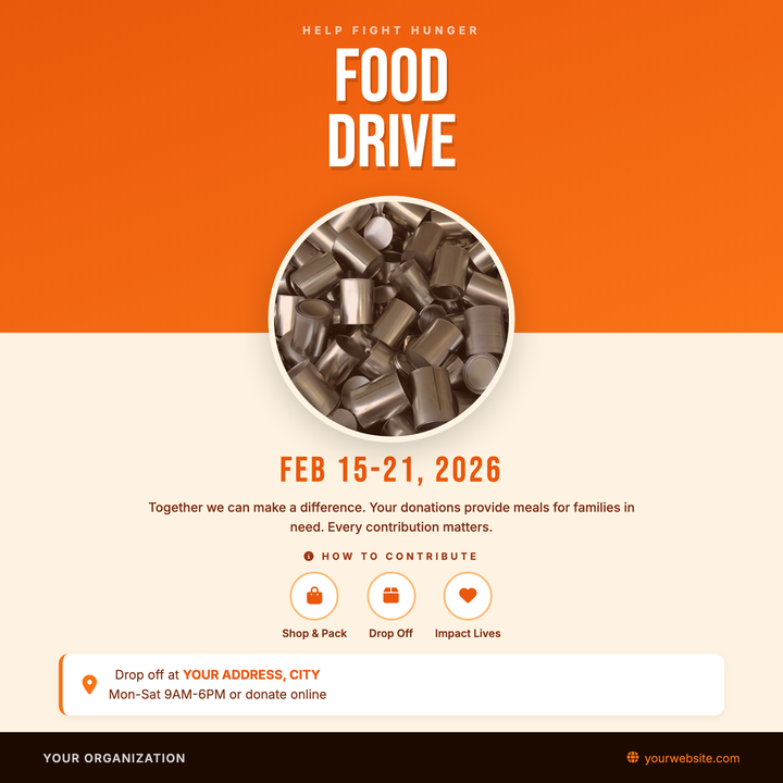
🥫 Food Drive Flyer
Built for community donation events, this template pairs a bold Bebas Neue headline on a burnt-orange diagonal gradient with a circular food photo that bridges into a warm cream lower zone. A dates bar, three-step icon row, and drop-off location card give donors all the logistical details at a glance. Ideal for nonprofits, faith groups, and civic organizations running food, hygiene, or supply drives.

🍽️ Food Festival Flyer
Built on a dark wood-grain texture with oversized Bebas Neue typography, this template pairs a bold white "FOOD" and amber gold "FEST" headline over a vignette-edged photo for instant visual impact. A structured bottom section layers date, details, and cuisine-category flags — ideal for multi-vendor markets, street food fairs, and community tasting weekends. The warm #F4A820 gold accent throughout gives it a premium-casual culinary feel.

🏷️ Garage Sale Flyer
Bold all-caps stacked headline and a rotated price-tag circle grab attention instantly, while warm kraft-toned backgrounds give the layout a friendly, handmade feel. A centered photo panel with a fade-blend overlay sits above date pills and wrapping category tags, keeping logistics easy to scan. Built for garage sales, yard sales, and neighborhood thrift pop-ups that need a clear, energetic print-or-post handout.
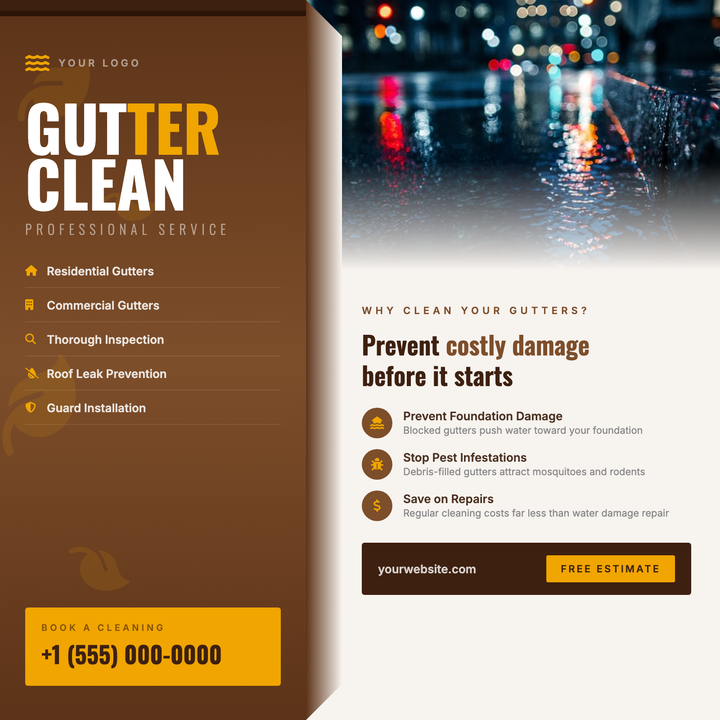
🍂 Gutter Cleaning Flyer
A bold split-panel layout built for fall home-services campaigns, featuring a deep rust-brown left column with Oswald Bold headlines and an amber gold CTA box, paired with a warm cream right panel for educational copy and a photo with a soft bottom fade. Leaf motifs and a gutter-channel detail reinforce the seasonal theme. Ideal for local contractors running autumn gutter cleaning, roof maintenance, or exterior property-prep promotions.

🎃 Haunted House Flyer
Built on a near-black radial gradient canvas with deep violet warmth, this 800×800 social square pairs Creepster display type at three dramatic sizes with a neon-purple accent and moonlit photo zone. Cobweb corner ornaments and symmetrical date chips frame the image, while a ghost-row separator divides event credits from ticketing details. Ideal for haunted attractions, gothic club nights, and horror-themed seasonal promotions.
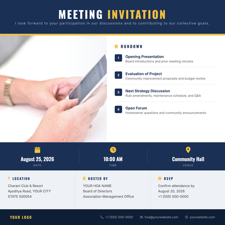
🏘️ HOA Meeting Flyer
A structured, navy-and-amber flyer built for homeowners associations, condo boards, and neighborhood councils. Bold Oswald headers and numbered agenda items give the layout institutional authority, while a full-bleed photo column with a soft scrim adds visual weight. Logistics — date, time, location — are spotlighted in a high-contrast info band for at-a-glance clarity.

❄️ HVAC Service Flyer
A bold split-canvas design with a deep navy-to-blue cold half and a red-to-amber warm half, divided by a crisp white center line. A full-bleed central photo band with scrim overlays anchors the layout, while mirrored service lists and a 90 px headline deliver instant category clarity. Built for HVAC contractors running pre-season tune-up campaigns or emergency service pushes with a clear phone CTA footer.
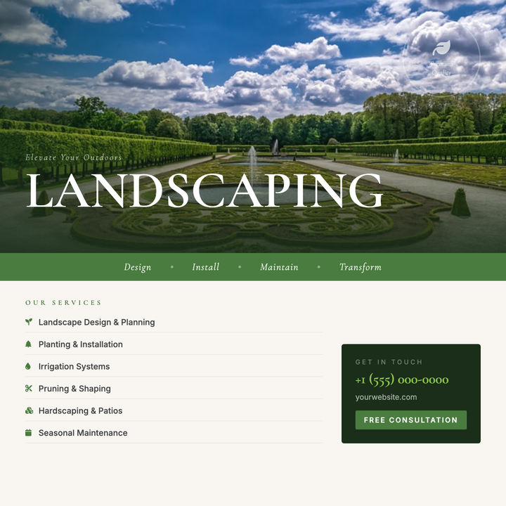
🌿 Landscaping Service Flyer
A photo-forward layout with an 82px Cormorant Garamond headline riding the seam between a full-bleed environmental image and a warm cream info zone. A moss-green tagline band and lime-accented italic draw the eye to your key offer, while a structured services column and contact card keep details crisp. Built for landscaping, garden design, and hardscape contractors running seasonal promos or lead-gen campaigns.